One of the more “sticky” myths in the stock market is that of staying fully invested so you don’t miss the best days.
Charts like this are common among fans of buy and hold strategies:
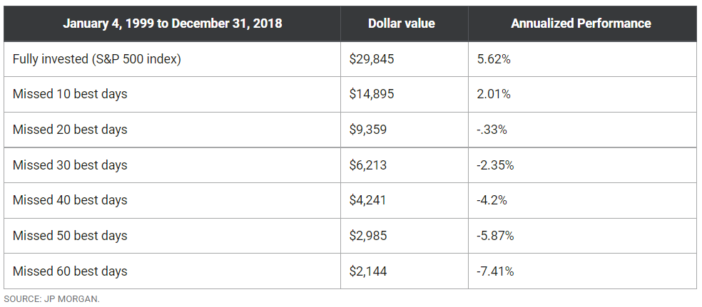
However, what charts like this fail to mention is that the best days often follow the worst days.
There are some powerful arguments that missing BOTH the best and worst days can be beneficial:
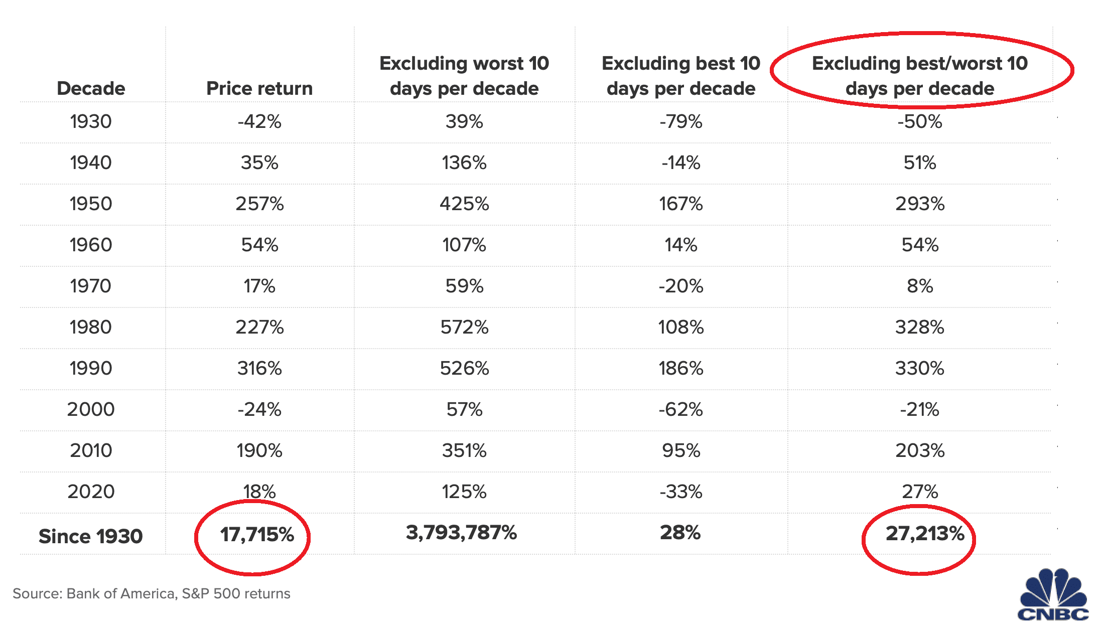
How can an investor miss both the best and the worst days?
Applying a 200-day moving average as a signal to exit the market has worked surprisingly well.
The majority of the best and worst days occur when the stock market is trading below its 200-day moving average.
Below is the Dow Jones Index going back to January 1, 1929. The red arrows represent the 10 worst days and the green arrows are the 10 best days.
The orange vertical lines are the times when one of these 10 best/worst days occurred ABOVE the 200-day moving average:
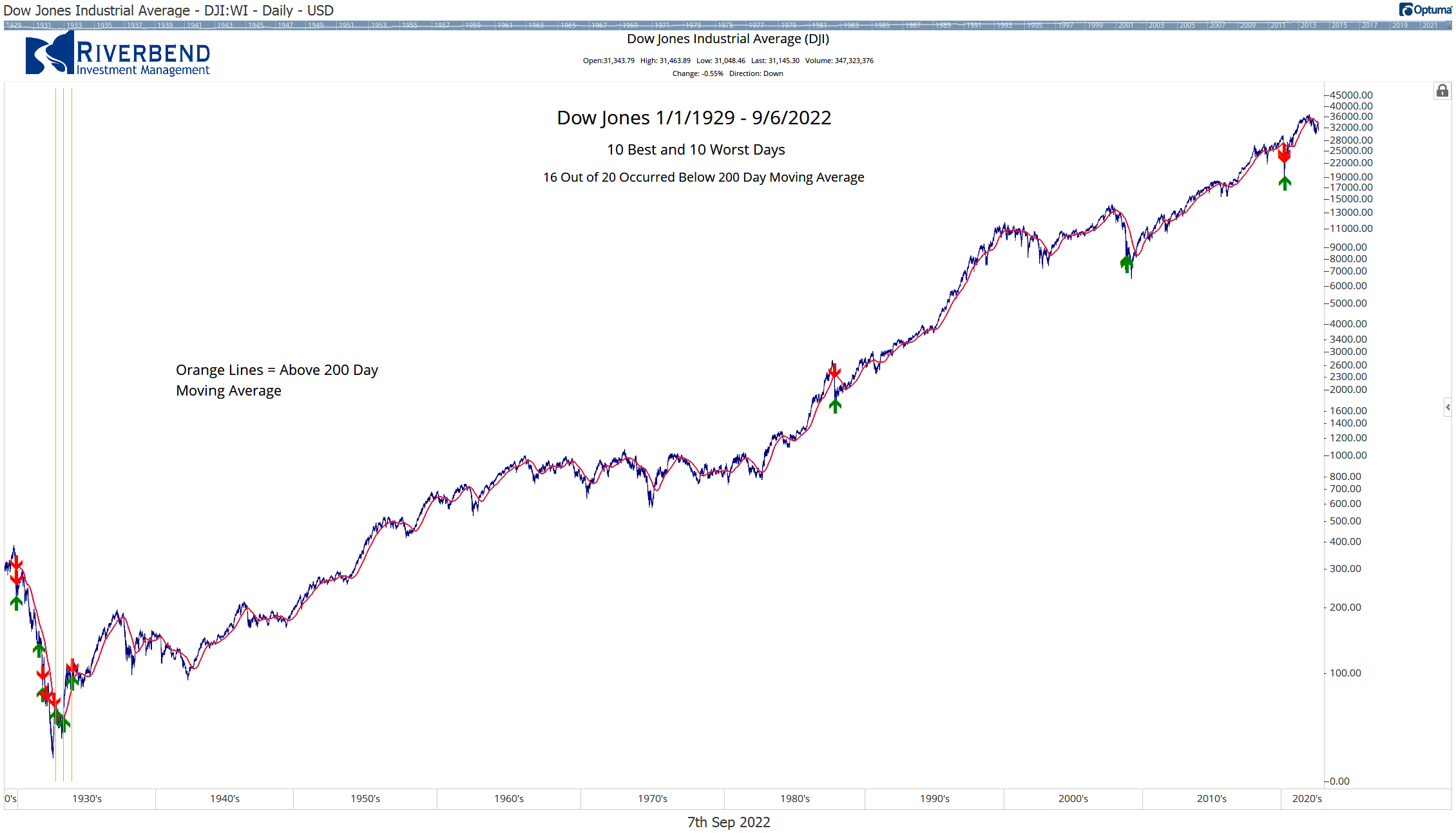
16 out of 20 days occurred below the 200-day moving average. All occurring in the 1930s
If we move ahead to a more “modern” time and use the 1940s as a starting point, 19 out of 20 best and worst days occur below the 200-day moving average:
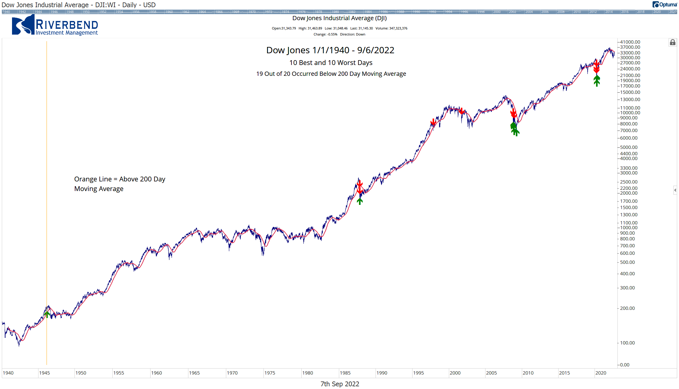
For investors looking for a way to better manage risk in their portfolio, using a 200-day moving average as an exit signal may add a layer of protection and allow them to sleep better at night.


