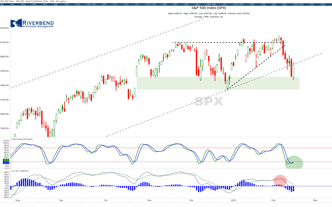
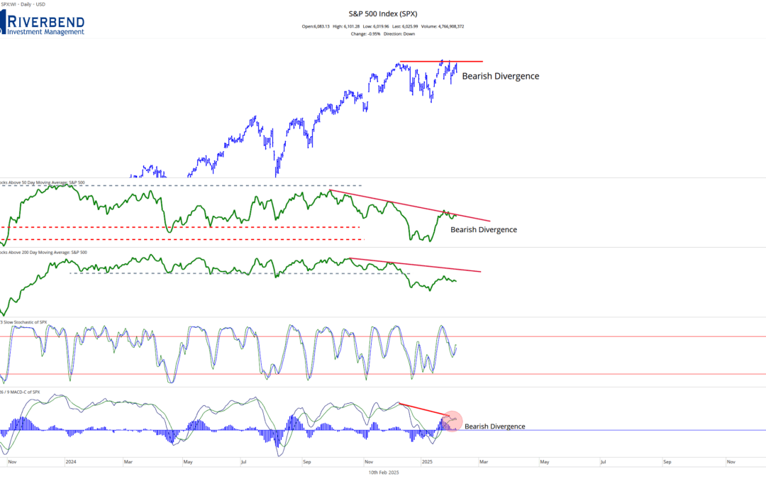
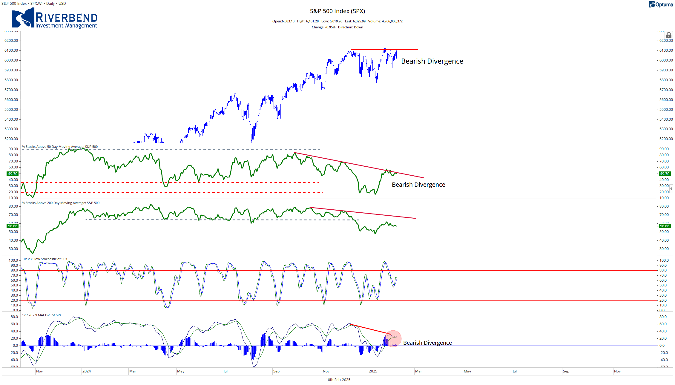
Since early December, the S&P 500 has been range-bound, accompanied by a weakness in market breadth. The number of stocks trading above their respective 50-day and 200-day moving averages continues to decline, indicating underlying weakness in the stock market.
The chart below shows a sideways pattern in the S&P 500, as well as a downward trend in the number of stocks trading above their 50-day and 200-day moving averages:

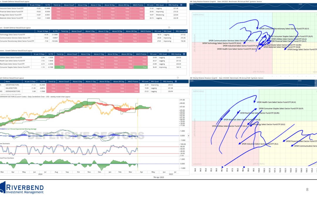
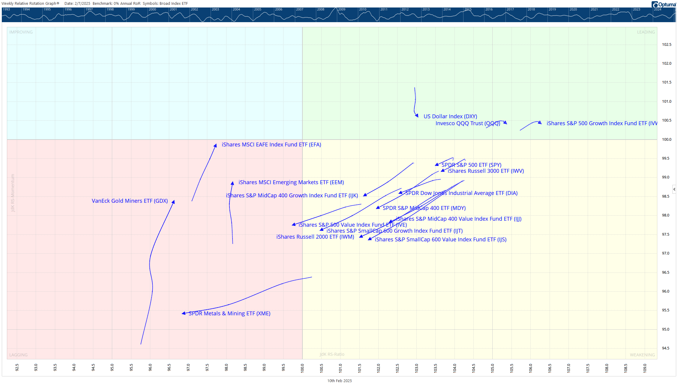
One of my favorite tools, which I use daily, is Relative Rotation Graphs (RRG). They allow us to view the rotation of the stock market and allows us to see which areas have increasing momentum and rising relative strength.
Typically, I focus on weekly RRG charts since the timeframe in my investment models is weeks to months instead of hours to days.
If you are unfamiliar with RRGs, please check out this post: “How to Use Relative Rotation Graphs for Selecting the Best Sectors”.
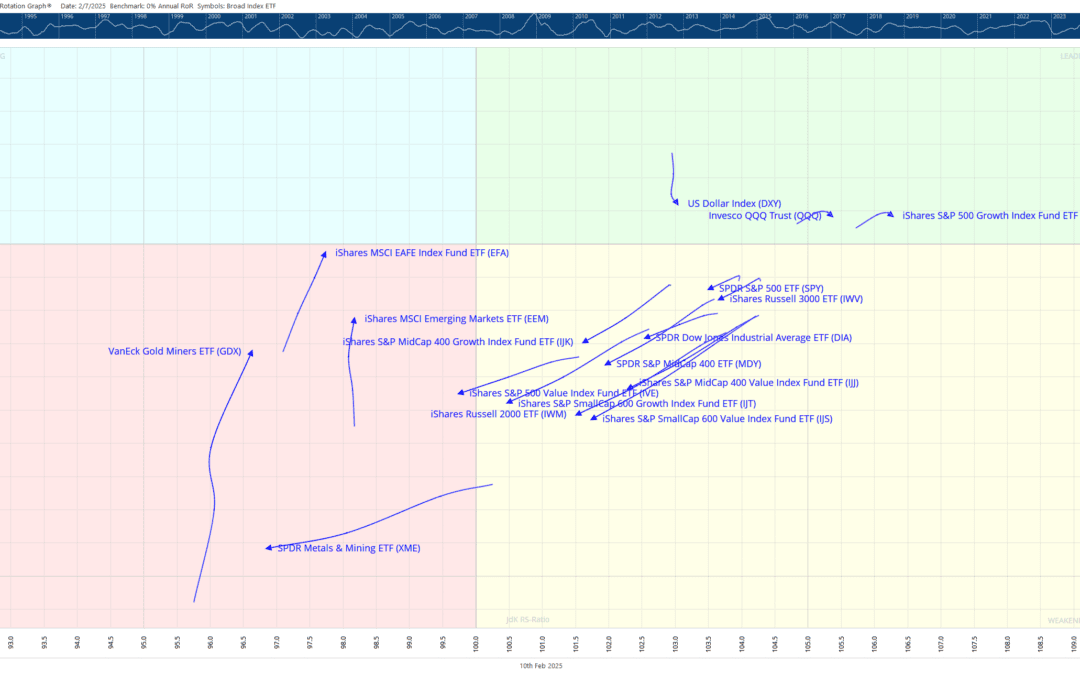
Looking back to the beginning of December, the RRG shows the beginning of this sideways trading range:
The above chart shows us the slowing and rotation of the major indices, which I like to track. The trend for the major US indices is starting the initial stages of rotation into the lower right-hand, weakening quadrant.
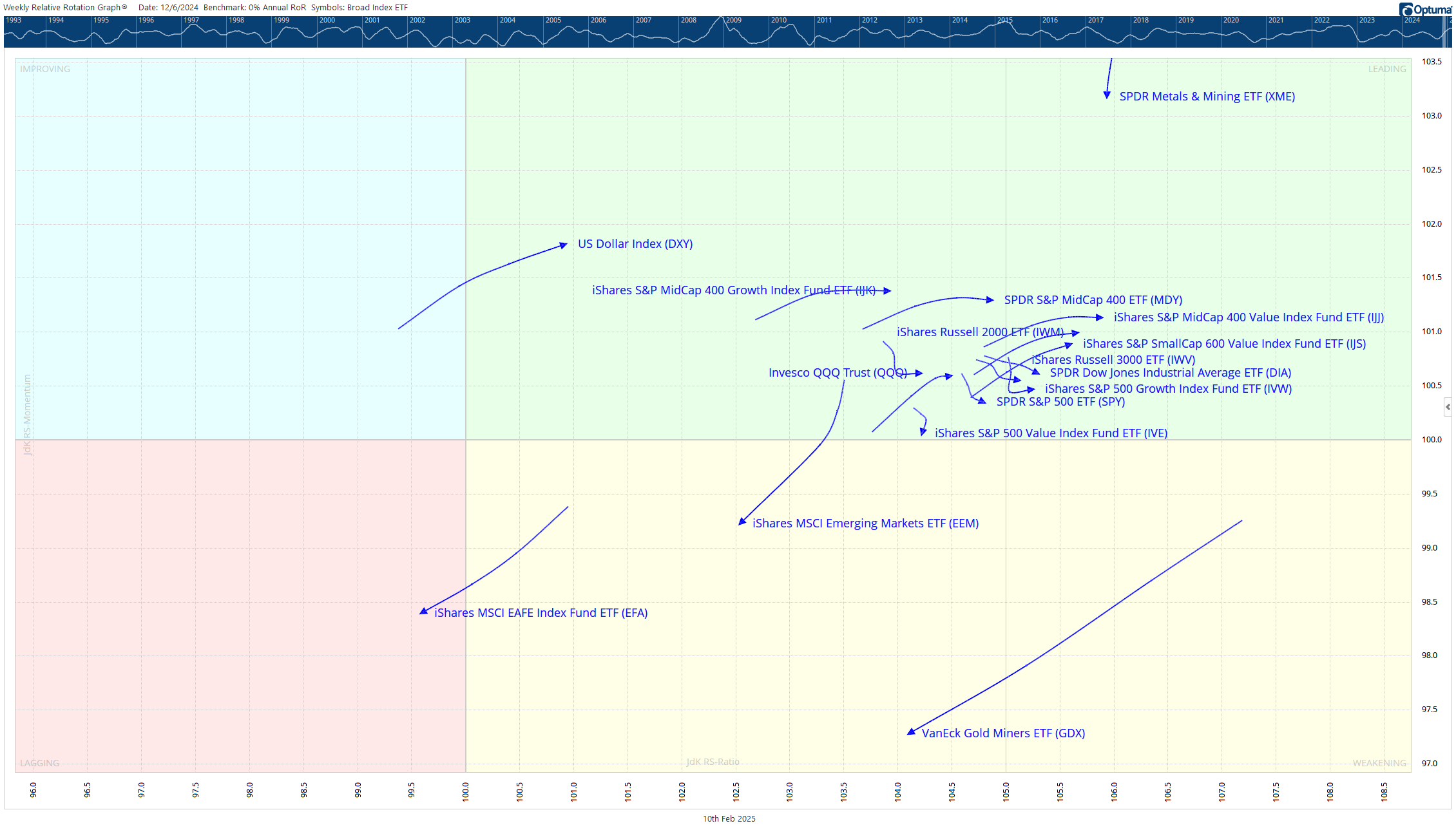
Fast forward to today, the RRG is showing the continued rotation towards the lagging quadrant:
I tend to look for opportunities when sectors/stocks are in the lagging quadrant and have begun to rotate in an NW direction towards the upper right, leading quadrant.
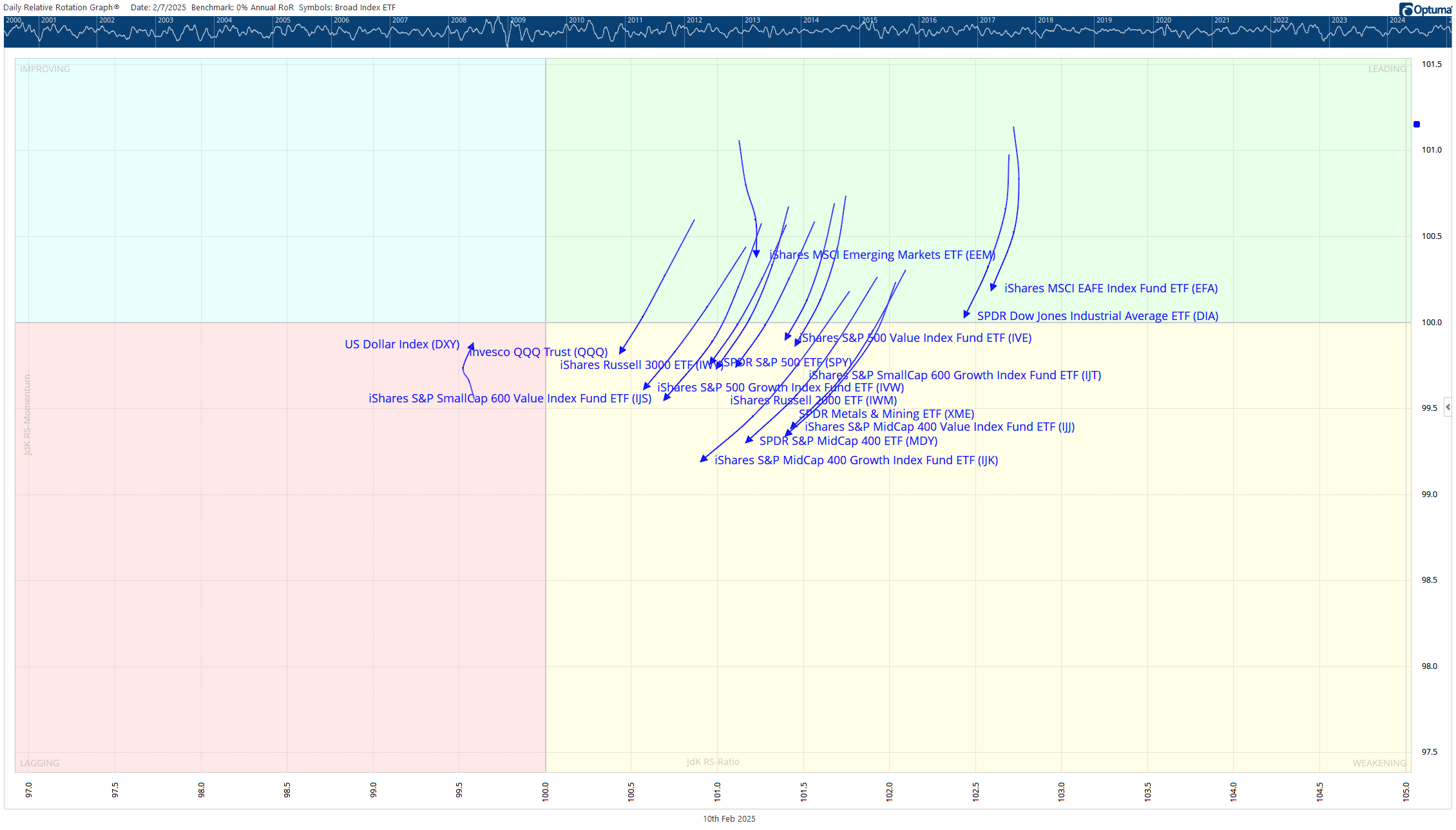
Currently, the majority of the indices are not there yet, indicating more hesitation among investors. However, taking a look at the daily version of the above RRG charts, we can see similar weakness as the majority of sectors are in the weakening quadrant:
As the sectors within the daily relative rotation graph rotate into the lagging, then improving quadrant, we may begin to see an opportunity in the weekly RRG chart indicating an end to the sideways trading pattern and a resumption of the upward trend of the S&P 500 index.
John Rothe, CMT
2/10/2025