How to Use Relative Rotation Graphs for Selecting the Best Sectors

How to Use Relative Rotation Graphs for Selecting the Best Sectors

Investing in the right sector can be a key determinant of success in the financial markets. However, with numerous sectors and subsectors (let’s not forget about international markets) to choose from, selecting which sectors to allocate in a portfolio can be a bit overwhelming.

Traditional approaches such as fundamental analysis and technical indicators provide valuable insights, but they may not capture the dynamic nature of sector rotation, and if they do it is sometimes well into an already established trend.

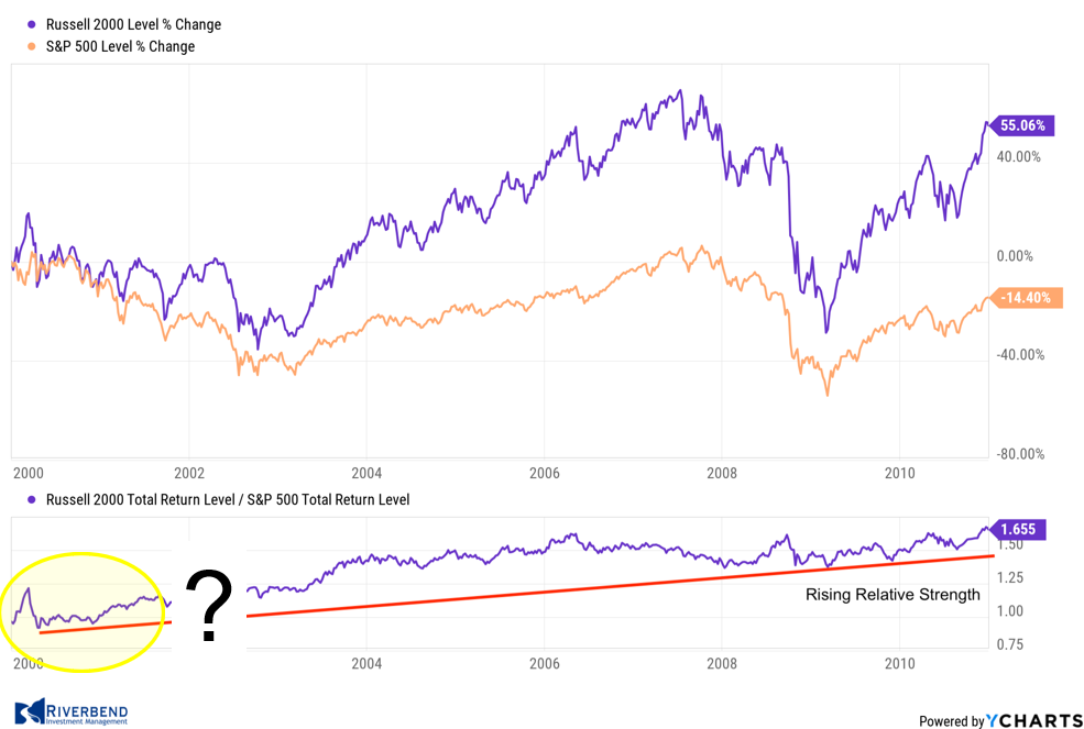
During the period between 2000-2010, small-caps outperformed their large-cap counterparts. Looking at a relative strength chart, like the one below, it becomes obvious which area to favor.

However, the problem arises when we try to decide in real-time (instead of hindsight) when the trend begins.

chart showing relative strength


I have found relative rotation graphs (RRG) to be a great tool to help understand sector rotation within a specific market, for example comparing the sectors that make up the S&P 500 index.

RRG charts can provide early insight into which sectors are outperforming a particular index, which sectors are strengthening, and which may become leadership areas to focus on.

This helps to eliminate the problem of deciding when the “trend” begins.

What are Relative Rotation Graphs?

Relative Rotation Graphs (RRGs) are powerful tools that depict the relative strength and momentum of different sectors or asset classes.

Developed by Julius de Kempenaer, RRGs provide a visual representation of how sectors are rotating over time, allowing investors to assess their performance relative to a benchmark index.

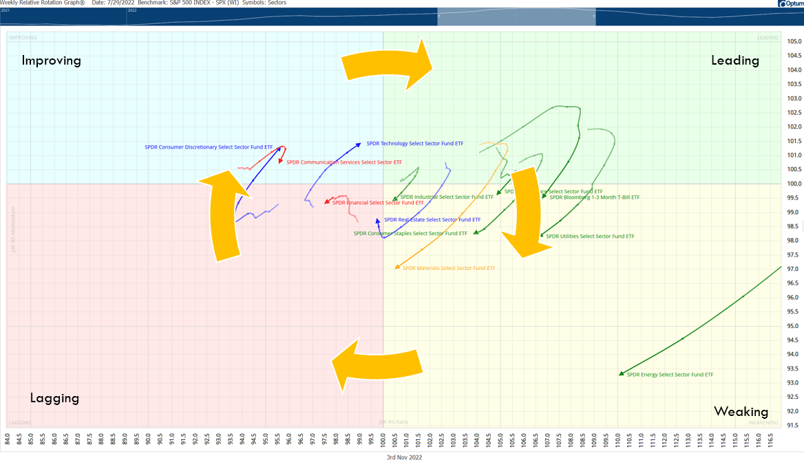
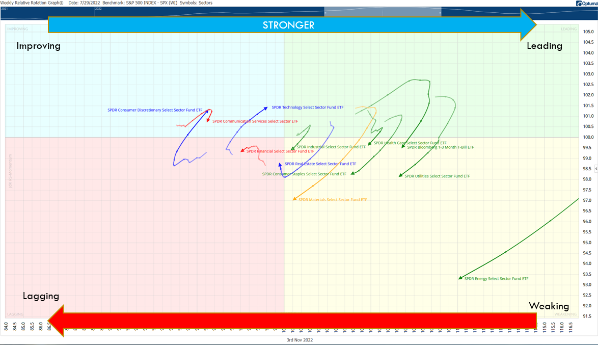
Typically sectors will rotate in a clockwise fashion around an index, such as the S&P 500:

clockwise rotation of rrg chart


The x-axis of an RRG represents the relative strength of a sector, while the y-axis signifies its momentum.

Each sector is represented by a point on the graph, and the direction and curvature of the lines connecting these points indicate the rotation of sectors over time.

How to Use Relative Rotation Graphs (RRG) to Identify Strong Sectors

By analyzing RRGs, investors can determine the most favorable sectors for investment.

image of relative rotation graph

Here’s how RRGs can assist in this process:

  1. Visual Representation: RRGs offer a visually intuitive representation of sector rotation. They provide a clear depiction of which sectors are leading, lagging, improving, or weakening over time. This visual representation helps investors identify emerging trends and potential investment opportunities.
  2. Relative Strength Analysis: The x-axis of an RRG measures relative strength, which compares a sector’s performance against a benchmark index. Sectors with a positive slope on the x-axis are outperforming the benchmark, while those with a negative slope are underperforming. Investors can focus on sectors with a positive slope to identify potential investment opportunities.
  3. Momentum Analysis: The y-axis of an RRG measures momentum, which determines the speed and direction of a sector’s price movement. Sectors with a positive slope on the y-axis are exhibiting positive momentum, indicating potential upward price movement.
  4. Rotation Analysis: The direction and curvature of lines connecting the sectors’ points on an RRG indicate their rotation patterns. Sectors moving from the “Weakening” quadrant to the “Leading” quadrant are displaying improving strength and momentum.


    Improving Portfolio Performance Using RRGs

    In the quest to add alpha, investors are constantly seeking innovative strategies to gain a competitive edge. Relative Rotation Graphs (RRGs) have emerged as a popular tool for analyzing sector rotation dynamics and identifying potential investment opportunities among traders and investors.

    So, is there evidence available to show us if RRGs may provide an opportunity to add alpha to a portfolio?

    Numerous studies have shown the benefits of using RRGs in portfolio selection:

    1. Enhanced Sector Selection:

    One of the primary advantages of utilizing RRGs for investment decisions is the ability to identify sectors with strong relative strength and positive momentum.

    By focusing on sectors in the “Leading” quadrant of an RRG, investors can select areas of the market that exhibit robust performance compared to the broader benchmark.

    This approach has the potential to improve investment returns by targeting sectors that are on an upward trajectory.

    A study conducted by Hsu et al. (2017) examined the effectiveness of RRGs in sector rotation strategies. The research found that RRG-based strategies consistently outperformed buy-and-hold strategies, providing evidence of the enhanced sector selection capabilities of RRGs.

    1. Dynamic Portfolio Management:

    RRGs enable investors to adapt their portfolios dynamically based on changing market conditions. By monitoring the rotation of sectors on an RRG, investors can identify when sectors are losing strength or momentum, potentially indicating the need for portfolio adjustments.

    This flexibility allows investors to capitalize on emerging opportunities while minimizing exposure to underperforming sectors, enhancing overall portfolio performance.

    A research paper by Deshmukh et al. (2019) explored the efficacy of RRGs in managing portfolios. The study demonstrated that RRG-based strategies achieved superior risk-adjusted returns compared to traditional buy-and-hold strategies.

    The dynamic nature of RRGs allows for more efficient portfolio management by taking advantage of sector rotation dynamics.

    1. Early Identification of Trends:

    RRGs provide a unique advantage by visually displaying the rotation patterns of sectors. By observing sectors transitioning from the “Weakening” quadrant to the “Leading” quadrant, investors can identify sectors that are beginning to exhibit improved strength and momentum.

    This early identification of emerging trends allows investors to enter positions at an opportune time, potentially capturing substantial gains as the sector gains momentum.

    In a research study by Narang et al. (2020), the authors investigated the performance of RRG-based strategies in capturing trend reversals.

    The study found that RRG-based strategies outperformed traditional momentum strategies, demonstrating the effectiveness of RRGs in identifying trends early.

    1. Risk Mitigation:

    While RRGs excel in identifying sectors with strong performance, they can also act as risk management tools. By monitoring sectors in the “Lagging” or “Weakening” quadrants, investors can identify areas of the market that are underperforming or losing momentum.

    This information can prompt investors to reduce exposure to such sectors, potentially mitigating losses during market downturns or periods of sector-specific weakness.

    A study by Chen et al. (2021) investigated the risk management capabilities of RRG-based strategies. The research concluded that incorporating RRG-based signals into portfolio management resulted in improved risk-adjusted returns and reduced downside risk.


    Testing Relative Rotation Graphs (RRG)

    To further test the results of using an RRG strategy, I compared the sectors of the S&P 500 vs the index itself to see if there are any alpha-generating benefits. (I am only showing a few tests, as a much more in-depth paper will be published in the future).

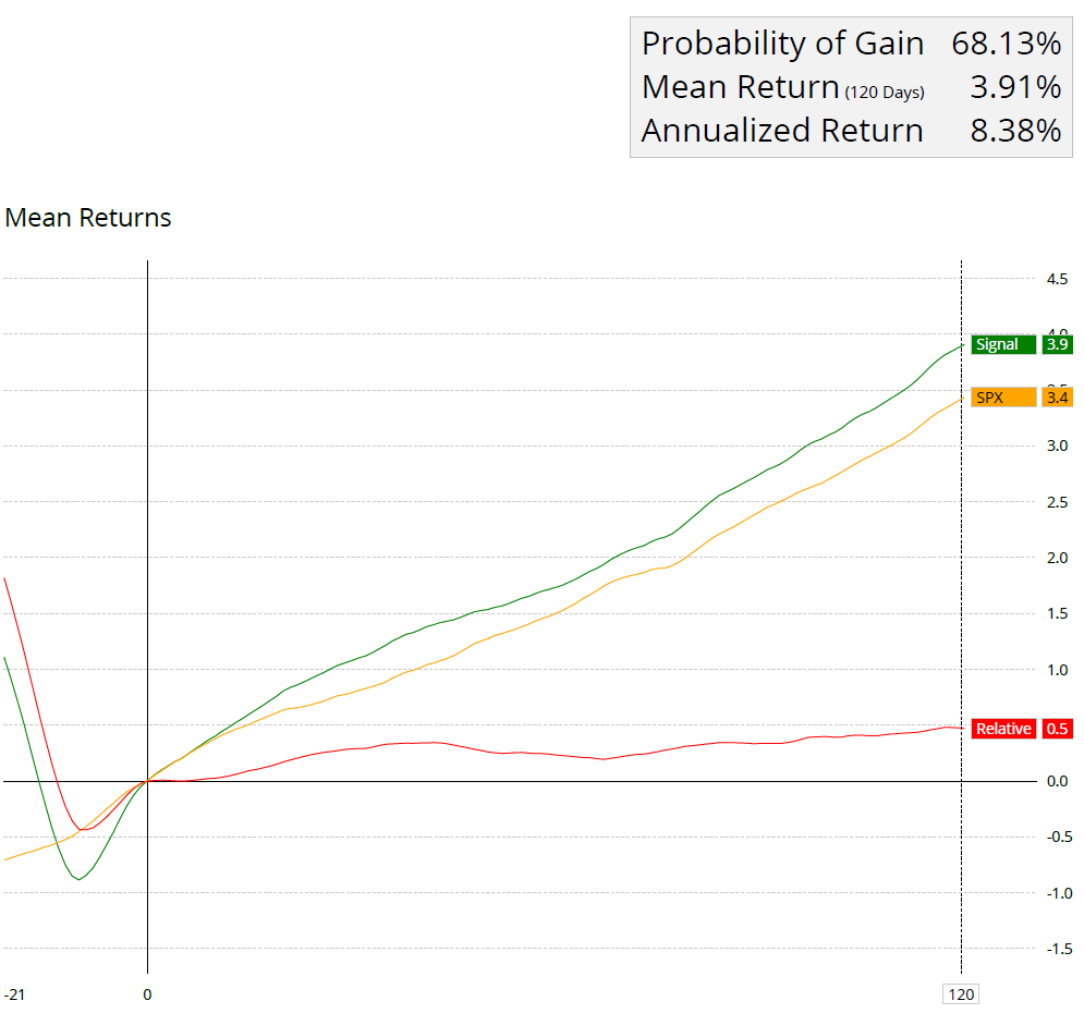
    All tests are using 1/1/2000 – 12/31/2022 as the time frame. The test examines returns 21 days before the signal to 120 days post-signal using OPTUMA’s signal tester.

    Buy sectors when they enter the ‘improving’ quadrant:

    Source: Optuma

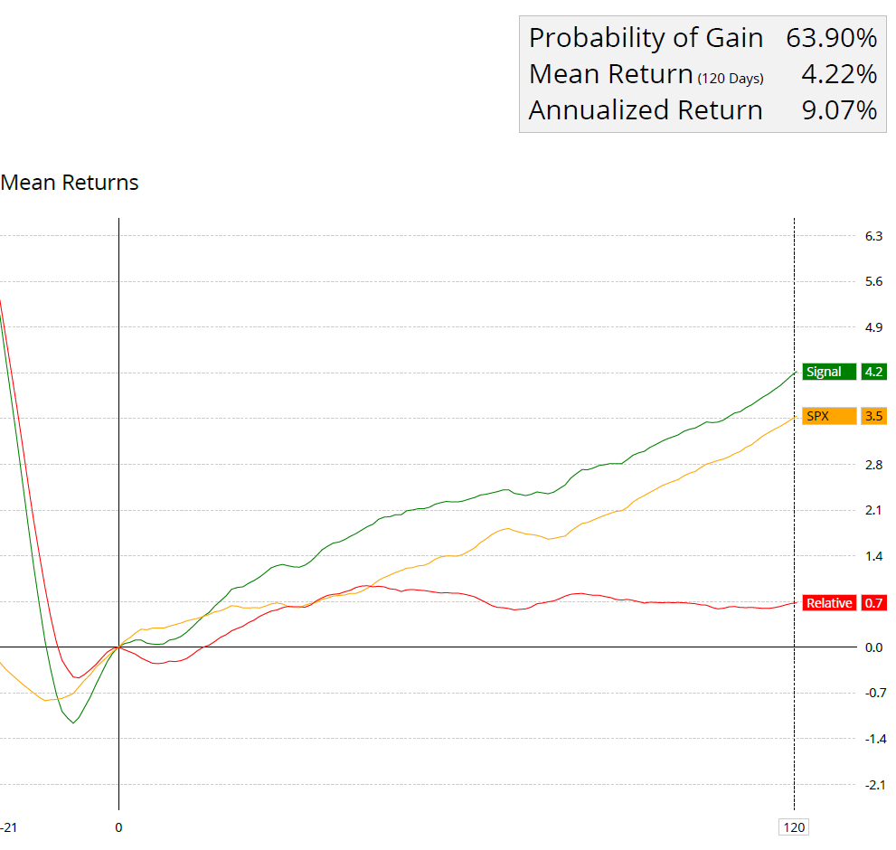
    Buy sectors when they enter the ‘improving’ quadrant and if the distance from the center point is greater than 2.

    Sectors with a larger distance value will appear further from the center of an RRG chart. One of the observations is that higher alpha comes from those that make bigger arcs, the distance measure allows us to quantify that. (OPTUMA)

    Source: Optuma

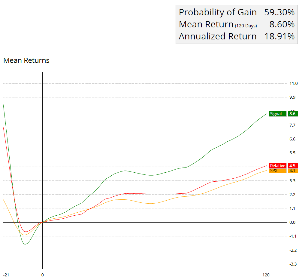
    Relative rotation graphs can also be used on individual names within the S&P 500 index (using historical index data provided by Optuma).

    Buy stock when they enter the ‘improving’ quadrant and if the distance from the center point is greater than 2.

    Source: Optuma


    Matthew Verdouw, CMT, CFTe published a thorough whitepaper on relative rotation graphs.

    (You can read it here: https://www.optuma.com/wp-content/uploads/2023/02/buying-out-performers-is-too-late.pdf)

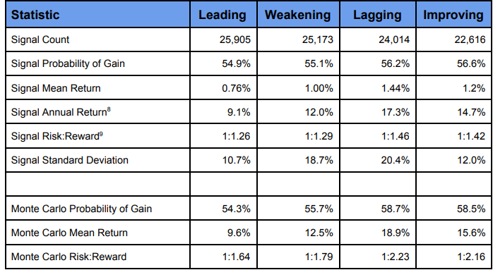
    In his whitepaper, Mr. Verdouw examined which quadrants provided the best opportunities. His research shows that the best performance comes from equities entering the lagging quadrant. 

    Immediately we can see that historically, equities entering the Lagging quadrant—where they have negative relative trend—have the highest returns.

    They also offer the largest Annual Return is measured by taking the returns over the 30 day period and extrapolating to a year.

    source: Buying Out­performers is Too Late

    Combining relative rotation graphs with other indicators (combining RRGs with volatility stops is a personal favorite), may provide investors an opportunity to enhance returns, as well as using other benchmarks – such as short-term treasuries.

    The utilization of Relative Rotation Graphs (RRGs) in investment decision-making has proven to be a valuable approach for identifying sectors with strong relative strength and positive momentum.

    Empirical studies provide compelling evidence of the performance of Relative Rotation Graphs (RRGs) in investment decision-making.

    The findings indicate the ability of RRG-based strategies to outperform traditional buy-and-hold approaches, enhance sector selection, identify trends early, and assist in risk management.


    Sources:

    1. Hsu, J., Lin, T., & Chen, S. (2017). Relative Rotation Graphs: A Systematic Approach for Sector Rotation Strategies. Journal of Applied Finance & Banking, 7(4), 129-144.
    2. Deshmukh, A., Jain, P., & Krishnamurti, C. (2019). Using Relative Rotation Graphs (RRGs) to Build Investment Portfolios. Journal of Behavioral Finance, 20(4), 424-442.
    3. Narang, S., Sirjuesingh, M., & Kapoor, K. (2020). Sector Rotation using Relative Rotation Graphs. International Journal of Business and Globalisation, 25(2), 252-266.
    4. Chen, S., Hsu, J., & Chen, Y. (2021). Relative Rotation Graphs and Risk Management in Sector Rotation Strategies. International Journal of Financial Research, 12(4), 258-272.
    5. Verdouw, Matthew (2016). Buying Outperformers is Too Late. https://www.optuma.com/research/
    6. De Kempenaer, Julius. “Sector Rotation with RRGs.” Relative Rotation Graphs, https://www.relativerotationgraphs.com/.
    7.  Minervini, Mark. “Relative Rotation Graphs (RRG) For Relative Strength Analysis.” StockCharts.com, https://stockcharts.com/articles/chartwatchers/2014/07/relative-rotation-graphs-rrg-for-relative-strength-analysis.html.
    8. Katsanos, Markos. “Relative Rotation Graphs (RRG).” Quantitative Technical Analysis, https://www.quantitativeanalysis.eu/articles/relative-rotation-graphs-rrg.

    John Rothe

    HAS BEEN FEATURED IN:

    Barrons-John-Rothe
    Reuters-John-Rothe
    US-News-John-Rothe
    Financial-Planning-John-Rothe
    Advisor-Perspectives-John-Rothe
    John Rothe CMT
    John Rothe NAAIM
    Investment Advisor
    Registered Investment Advisor

    © 2023 John Rothe

    The opinions expressed on this site are those solely of John Rothe and do not necessarily represent those of Riverbend Investment Management LLC (Riverbend). This website is made available for educational and entertainment purposes only. Mr. Rothe is an Investment Adviser Representative of Riverbend. This website is for informational purposes only and does not constitute a complete description of the investment services or performance of Riverbend. Nothing on this website should be interpreted to state or imply that past results are an indication of future performance. A copy of Riverbend’s Part II of Form ADV and privacy policy is available upon request. This website is in no way a solicitation or an offer to sell securities or investment advisory services. Mr. Rothe and Riverbend Investment Management LLC (Riverbend) disclaim responsibility for updating information. In addition, Mr. Rothe, and Riverbend disclaim responsibility for third-party content, including information accessed through hyperlinks.

    A Major, Long Term MACD Signal is Forming

    A Major, Long Term MACD Signal is Forming

    For the first time in nearly a year and a half, the US stock market is getting closer and closer to a major buy signal. This signal is based on the QQQ ETF and a changeover in the MACD monthly indicator.

    ABOUT THE MACD

    While most investors are familiar with the concept of the MACD, as it is a frequently shown indicator and included in most technical charts, it should be noted that using only one indicator can be problematic as no indicator is 100% accurate (I tend to include additional indicators, such as volatility stops).

    However, the monthly MACD signal tends to stay on the “right side of the trend” and should not be ignored.

    If you are unfamiliar, the MACD (Moving Average Convergence Divergence) is a popular technical analysis indicator and is used to identify potential buy and sell signals in the stock market (it can be used across other financial vehicles, but for this post, I will be using it for equities).

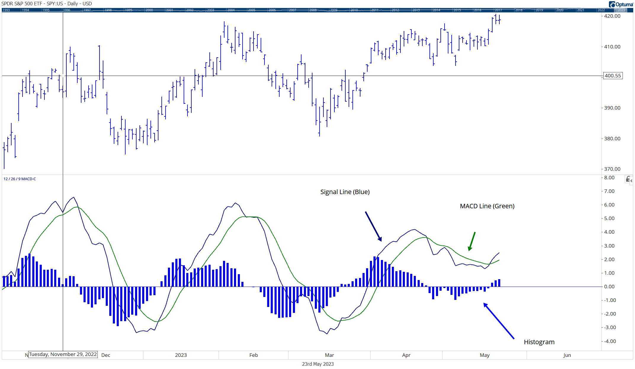
    The MACD consists of three components: the MACD line, the signal line, and the histogram.

    Chart explaining the components of the MACD indicator

    MACD Line: The MACD line is calculated by subtracting a longer-term Exponential Moving Average (EMA) from a shorter-term EMA. The most commonly used time periods for the EMAs are 12 and 26. The resulting MACD line oscillates above and below a zero line, representing the relationship between the short-term and long-term moving averages.
     
    Signal Line: The signal line is a 9-period EMA of the MACD line. It acts as a trigger line, providing potential buy and sell signals when it crosses above or below the MACD line. Crossovers between the MACD line and the signal line are considered significant indicators of market momentum.
     
    Histogram: The histogram represents the difference between the MACD line and the signal line. It helps visualize the divergence or convergence between the two lines. When the MACD line crosses above the signal line, the histogram bars turn positive, indicating bullish momentum. Conversely, when the MACD line crosses below the signal line, the histogram bars turn negative, suggesting bearish momentum.
    There are numerous ways to interpret the MACD:
     
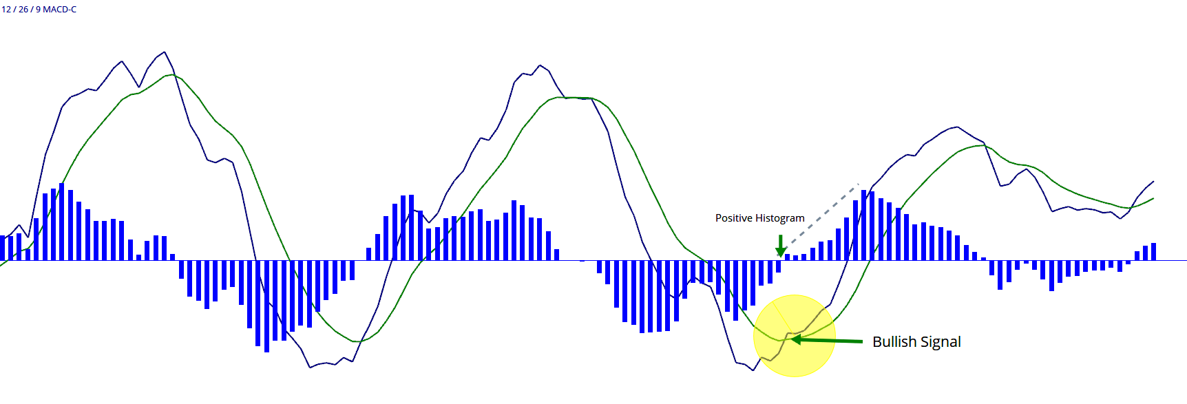
    Bullish Signal: When the MACD line crosses above the signal line and the histogram bars turn positive, it suggests a potential buying opportunity, indicating upward momentum in the market.
    MACD Bullish Crossover
     
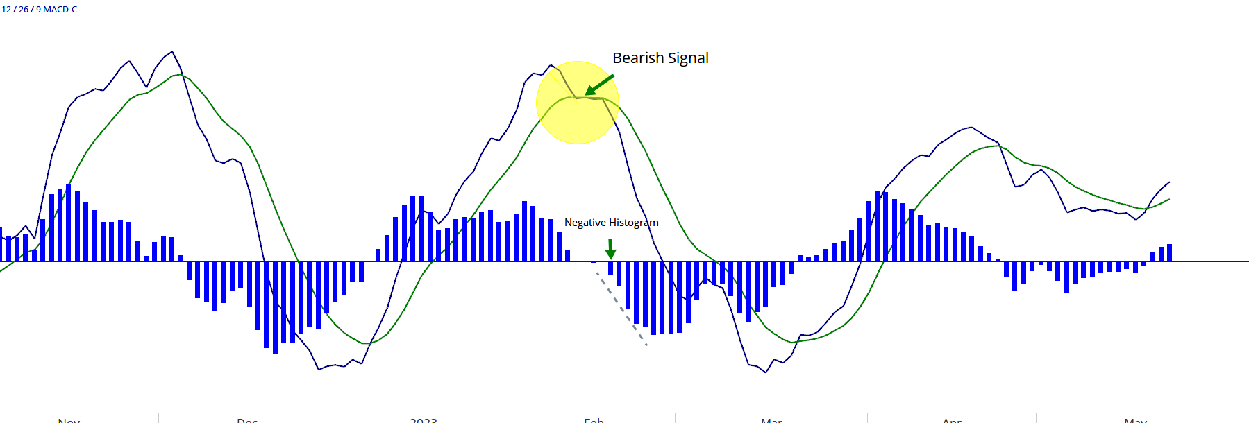
    Bearish Signal: Conversely, when the MACD line crosses below the signal line and the histogram bars turn negative, it suggests a potential selling opportunity, indicating downward momentum in the market.
    MACD Bearish Signal
     
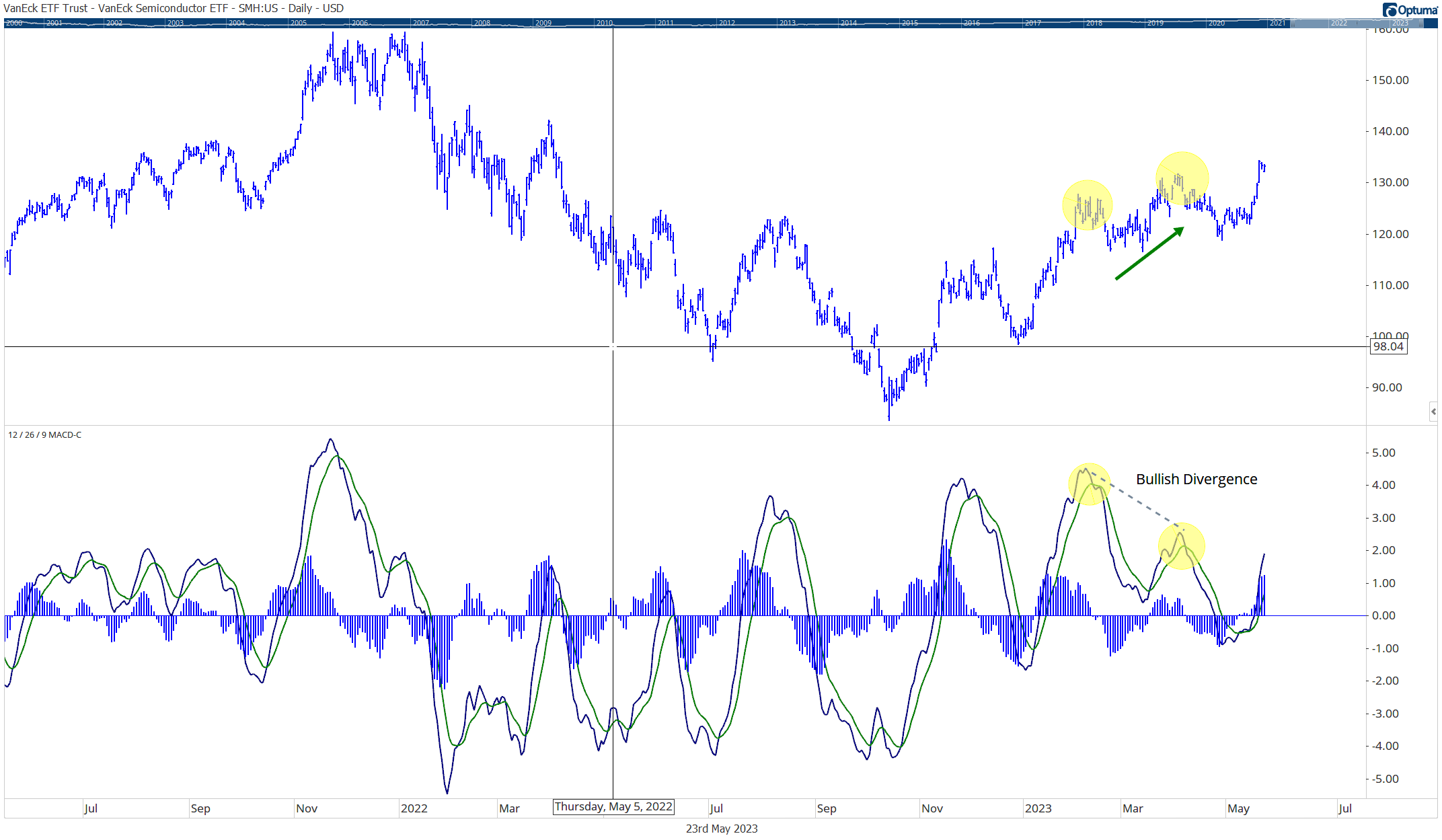
    Divergence: Divergence occurs when the MACD line and the price of the asset being analyzed move in opposite directions. Bullish divergence is observed when the price makes lower lows while the MACD line makes higher lows, indicating a potential trend reversal. Bearish divergence is observed when the price makes higher highs while the MACD line makes lower highs, suggesting a potential trend reversal.
    Example of MACD Divergence Bullish
     
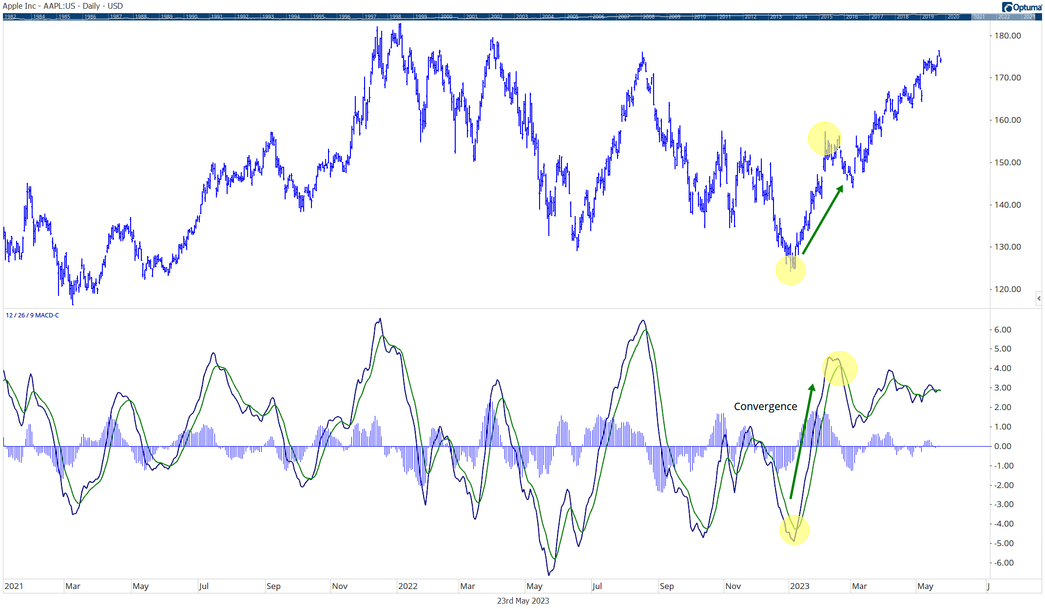
    Convergence: Convergence occurs when the MACD line and the price move in the same direction. It can confirm the strength of an ongoing trend.
    example of MACD convergence


    While traders and analysts often use the MACD indicator in conjunction with other technical analysis tools, in the analysis below, I will be using only the MACD indicator to examine the long-term signals of the ETF “QQQ”.


    WHY USE QQQ?

    I am using the QQQ ETF in this analysis due to the makeup of the S&P 500.

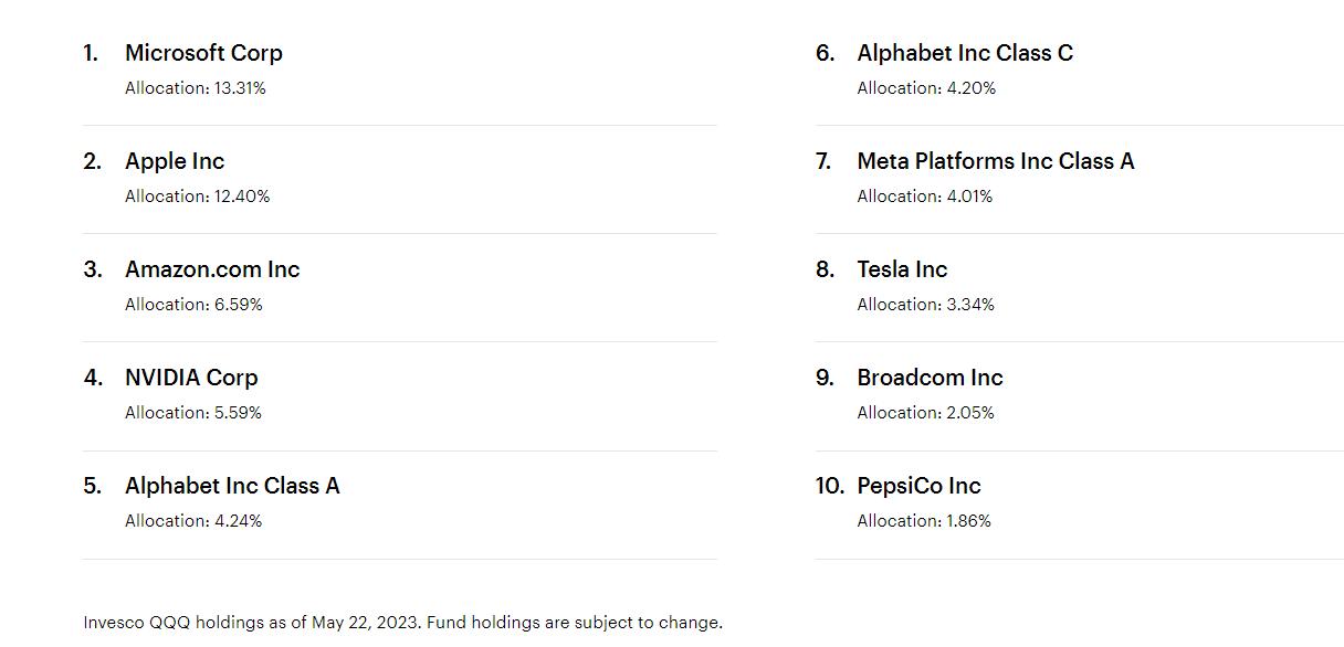
    The QQQ ETF is primarily composed of technology stocks, including heavy weightings in Microsoft, Apple, Amazon, and Google (Alphabet):

    QQQ Top Ten Holdings


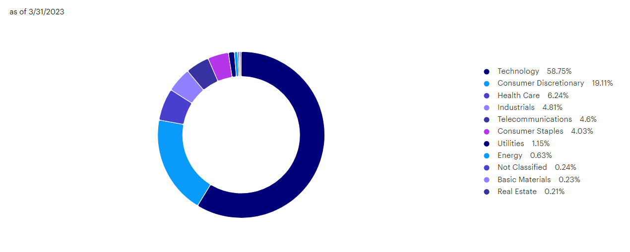
    With technology and communication companies making up over 63% of the ETF’s total weighting:QQQ ETF sector weightings

    Source: Invesco


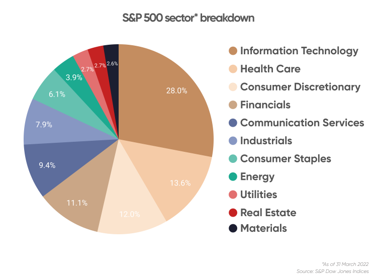
    If we compare QQQ’s weighting with that of the S&P 500, we will notice the high percentage of weighting towards technology stocks:

    S&P 500 Weightings

    Due to the overweight of technology stocks within the S&P 500, we can use the QQQ ETF as a proxy for market signals.


    CURRENT AND PAST MACD SIGNALS

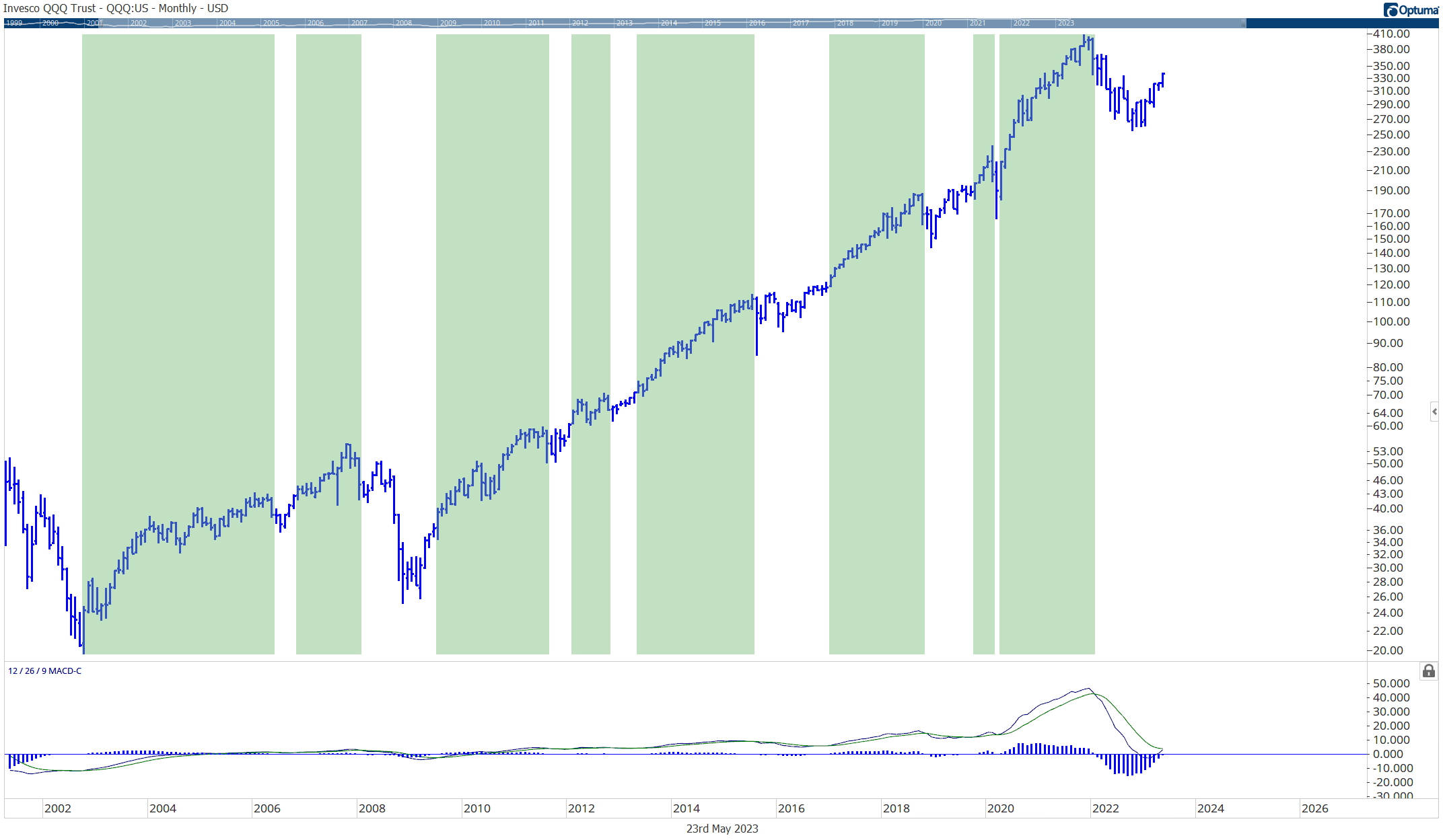
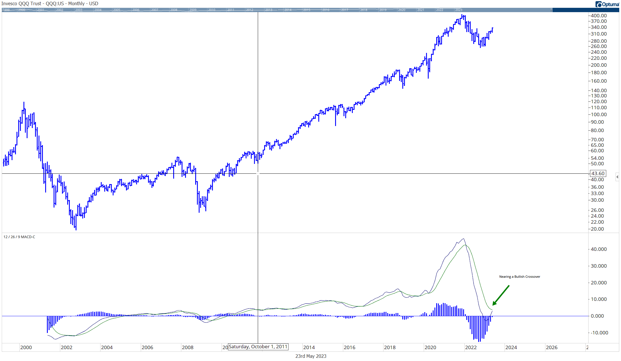
    Currently, the monthly MACD indicator is nearing a bullish crossover (a bullish signal) in the QQQ ETF:

    QQQ MACD crossover monthly chart

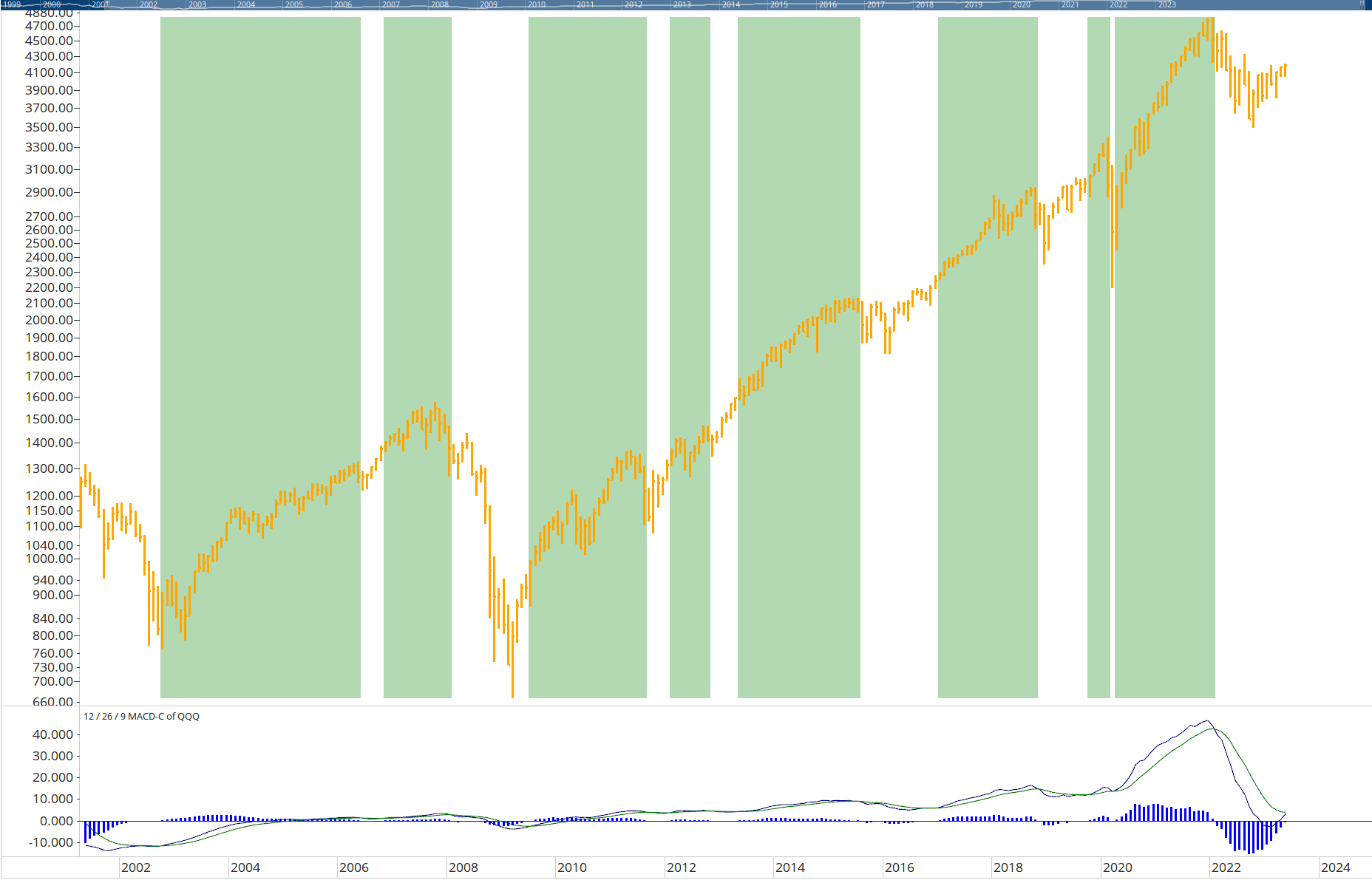
    Historically a positive, monthly MACD has been a good indication that QQQ will begin/continue an uptrend.

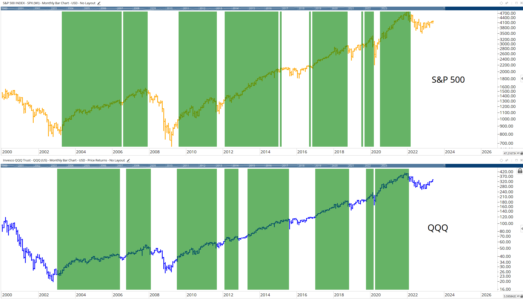
    Below I have highlighted in green all the times the MACD histogram has been positive (Monthly QQQ chart):

    QQQ etf when macd is positive

    Below is the S&P 500 when the QQQ MACD histogram has been positive:


    Why not just use a monthly MACD crossover with the S&P 500 index itself?

    The below chart compares the monthly MACD signal of the S&P 500 vs the monthly MACD signal of the QQQ ETF:


    I have found in volatile markets, using QQQ as a proxy for the S&P 500 index tends to provide signals with less whipsaw. (I plan to explore this in much more detail in a future post, as the primary purpose of this post was to highlight a potentially major shift in market sentiment.)

    For now, it may be wise to pay attention to this indicator as we approach another monthly bullish crossover.


    John Rothe

    HAS BEEN FEATURED IN:

    Barrons-John-Rothe
    Reuters-John-Rothe
    US-News-John-Rothe
    Financial-Planning-John-Rothe
    Advisor-Perspectives-John-Rothe
    John Rothe CMT
    John Rothe NAAIM
    Investment Advisor
    Registered Investment Advisor

    © 2023 John Rothe

    The opinions expressed on this site are those solely of John Rothe and do not necessarily represent those of Riverbend Investment Management LLC (Riverbend). This website is made available for educational and entertainment purposes only. Mr. Rothe is an Investment Adviser Representative of Riverbend. This website is for informational purposes only and does not constitute a complete description of the investment services or performance of Riverbend. Nothing on this website should be interpreted to state or imply that past results are an indication of future performance. A copy of Riverbend’s Part II of Form ADV and privacy policy is available upon request. This website is in no way a solicitation or an offer to sell securities or investment advisory services. Mr. Rothe and Riverbend Investment Management LLC (Riverbend) disclaim responsibility for updating information. In addition, Mr. Rothe, and Riverbend disclaim responsibility for third-party content, including information accessed through hyperlinks.

    Economic Headwinds Facing Investors

    Economic Headwinds Facing Investors

    The stock market had a strong start to 2023, with the S&P 500 finishing January with nearly a 6% gain. However, that trend began to reverse, as investors started to weigh the impact of numerous economic changes and challenges – such as mixed inflation data, bank failures, and a continued shortage of workers.

    Below is a summary of potential headwinds facing investors during the second quarter of 2023.

    U.S. Sector Performance Reverses During 1Q 2023

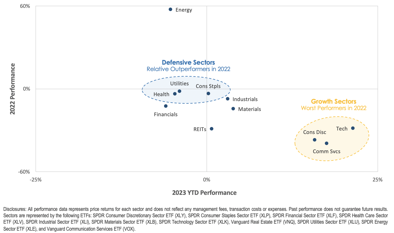
    The start of 2023 has been an intriguing one for the stock market. Generally, the sectors that performed poorly in 2022 are performing well in 2023, while the top-performing sectors in 2022 are underperforming in 2023.

    Notably, there has been a remarkable performance turnaround in Growth-style sectors, which includes Technology, Communication Services, and Consumer Discretionary.

    These sectors went from being the worst-performing sectors in 2022 to the top three-performing sectors in the first quarter of 2023. This market rotation should be noted since it could signify a shift in investor psychology, as they redirect investments toward underperforming asset classes, potentially indicating a boost in investor confidence.

    There could be various catalysts that explain this reversal of fortune. Firstly, growth sectors suffered in 2022 due to the Federal Reserve’s interest rate hikes, which weighed down expensive growth stock valuations.

    Secondly, growth stocks are usually businesses with more robust fundamentals, which could explain why investors capitalized on their oversold nature and stronger fundamentals to shift towards higher quality companies, especially after concerns about the U.S. financial system’s stability following bank failures. Market observers will be keeping a close eye on the situation.

    stock market performance Q1 2023

    Source: MarketDesk

    S&P 500’s Valuation Multiple – Overvalued or Undervalued?

    S&P 500 Current Valuation Chart

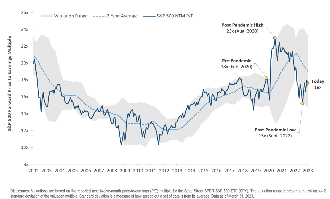
    At the start of the pandemic, the S&P 500’s earning multiple surged after the Federal Reserve cut interest rates to 0%, and for the most part of 2021, it remained stable to slightly lower as corporate earnings recovered, and the S&P 500 grew into its valuation. However, the earning multiple took a nosedive in 2022 as the Federal Reserve raised interest rates aggressively, which had an impact on expensive Growth stock valuations.

    With the constant stream of news and economic data, it’s easy to forget what you’re investing in.

    As of the end of the first quarter, the S&P 500 is trading at approximately 18x its next-12 month earnings, compared to the average of 16x since 2000.

    The data indicates that investors are paying a premium over the long-term average, but current multiples are within the range from 2015-2020.

    The upcoming earnings season, starting in mid-April will be the next test for the S&P 500 and give investors a better idea of the impact higher rates are having on earnings.

    A Simple Explanation of Recent Bank Failures

    Why did the banks fail in 2023?

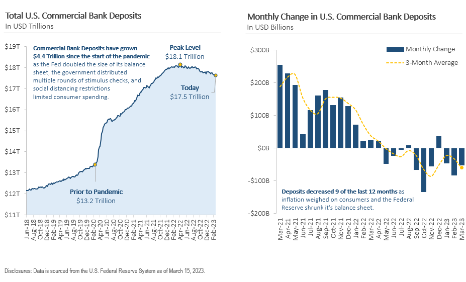
    The banking industry is currently experiencing a crisis of confidence as depositors withdraw their checking deposits in search of higher yields. Deposits at U.S. commercial banks rose significantly from $13.2 trillion at the end of 2019 to a peak of $18.1 trillion in April 2022, as individuals and businesses flocked to banks during the pandemic. However, deposits have decreased in 9 of the last 12 months, placing pressure on some banks’ balance sheets.

    Recently, three banks faced an overwhelming number of withdrawal requests in early March.

    In order to fulfill these requests, they sold portions of their bond portfolios, including government bonds and mortgage-backed securities. However, interest rates are now significantly higher than when the banks originally purchased these bonds, resulting in significant losses when they were sold.

    These losses have drained the banks’ capital cushions and left them technically insolvent. Fortunately, state banking regulators and the FDIC stepped in to take over the failed banks and protect depositors.

    While recent bank failures have raised concerns about financial stability and drawn comparisons to the 2008 financial crisis, there are significant differences between the two events.

    Regulatory changes since 2008 have strengthened the overall financial system, with higher capital requirements providing banks with a more robust financial cushion. Additionally, the cause of the recent bank failures was rapid interest rate increases by the Federal Reserve, which resulted in paper losses for banks. In the weeks following, the Federal Reserve implemented new lending programs to prevent a wider banking crisis. Markets will be closely monitored for signs of contagion in the coming months.

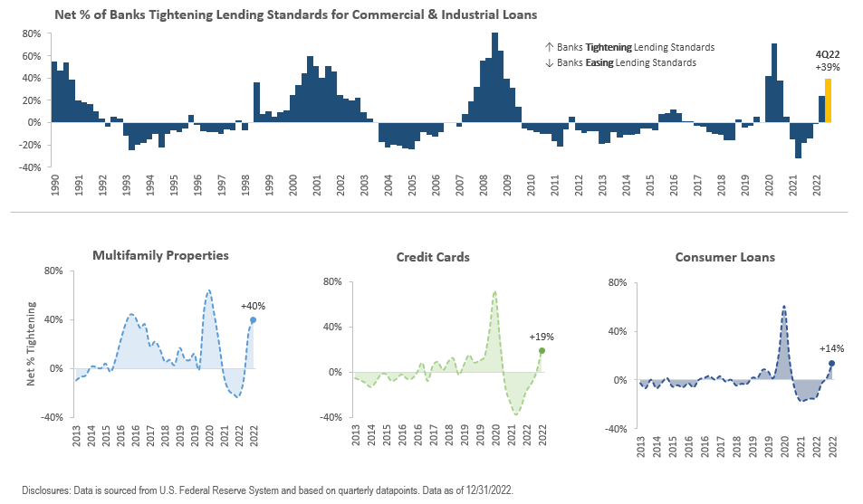
    Banks Tighten Lending Standards for Consumer & Business Loans

    banks are tightening lending

    The above chart depicts the net percentage of banks that have tightened their lending standards across different loan categories, such as consumer loans, credit cards, commercial and industrial loans, and multifamily rentals.

    The tightening of lending standards can manifest in several ways, such as increased creditworthiness requirements, higher interest rate spreads, reduced maximum loan sizes, and shorter maturities. Banks may also require more collateral, impose more restrictive loan covenants, and raise loan-to-value ratios.

    Tighter lending standards may impede economic growth by limiting credit availability and borrowers’ ability to invest and borrow. This tightening could decrease the overall credit supply, making it challenging for borrowers, particularly high-yield issuers, to refinance their maturing loans, thereby increasing the risk of default.

    To mitigate this risk, investors may consider owning bonds from high-quality companies with low refinancing risk.

    The recent bank failures and concerns about the stability of checking deposits may also tighten lending standards further. Banks may adopt a more cautious lending approach and further reduce the total amount of credit they offer due to the uncertain timing of depositor withdrawal requests.

    This could decrease credit supply and access to credit, which could eventually impact the economy and financial markets.

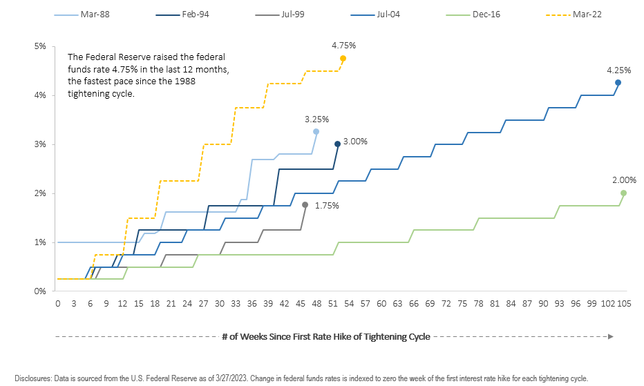
    A Look at Interest Rate Increases Across Tightening Cycles

    comparing 2023 interest rate cycle with past rate hikes

    The current tightening cycle, which began in March 2022, is significantly more aggressive when compared to the last five tightening cycles. The Federal Reserve has increased the federal funds rate by 4.75% over the past 12 months, the quickest rate of increase since the 1988 tightening cycle.

    The central bank’s next meeting is scheduled for May 2-3, but it is unclear if it will continue to raise interest rates following recent bank failures.

    The rapid interest rate hikes have already had multiple consequences.

    Bond prices declined in 2022, weighing on the fixed-income portion of portfolios. This decline also contributed to the recent bank failures, as it reduced the value of bonds on banks’ balance sheets, causing them to realize losses when depositors rushed to withdraw their checking deposits.

    However, some effects may not be immediately apparent, as tightening historically occurs with a lag. It takes time for higher interest rates to affect the economy, and there is uncertainty about how the current cycle will play out in the real world.

    The direction of central bank policy is still highly uncertain and subject to change as new information becomes available. Regardless of the path, it will have implications for investors’ portfolios.

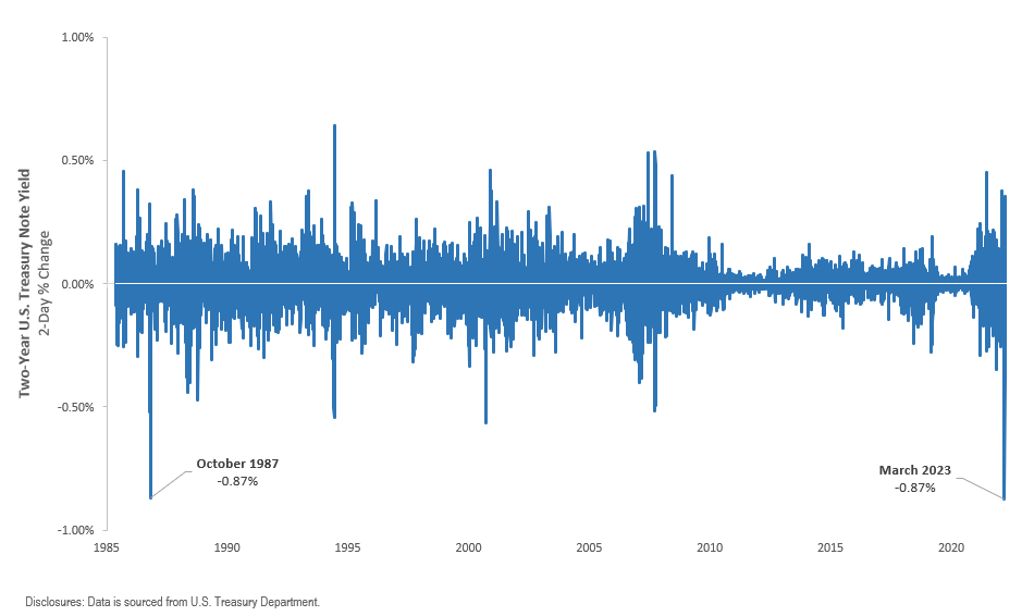
    Recent Interest Rate Volatility in the U.S. Treasury Market

    Interest Rate Volatility

    Above, we can see the fluctuations in interest rates in the U.S. Treasury market, focusing on the 2-year U.S. Treasury note’s rolling 2-day percentage change in yield since 1985. Inflation and the Federal Reserve’s aggressive interest rate hikes led to increased volatility in 2022, which continued in Q1 2023.

    The first quarter of 2023 saw a mix of factors contributing to interest rate volatility. Federal Reserve Chair Jerome Powell’s comments about the possibility of further interest rate hikes, followed by the failure of two regional banks, led to conflicting expectations among investors. The largest two-day drop in the 2-year Treasury yield since 1987 followed as investors became worried about the stability of the U.S. financial system.

    The Federal Reserve is now facing the challenging task of balancing inflation control with minimizing damage to the economy and preventing financial market instability.

    The uncertainty of how 2022’s rate hikes have affected the economy and recent bank failures are contributing to interest rate volatility. As a result, there is little consensus on the direction of Federal Reserve policy for 2023 and beyond, which may continue to impact interest rate volatility.

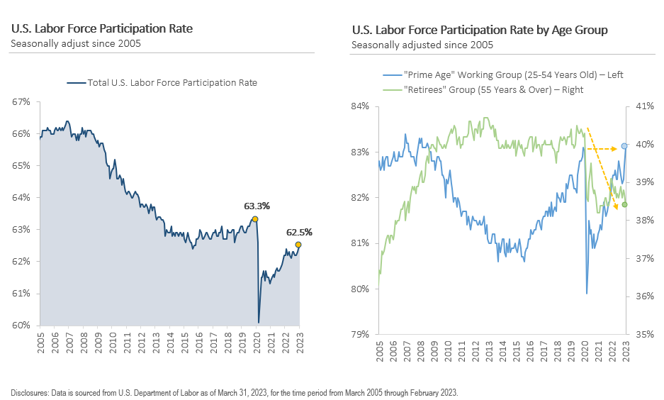
    Labor Market Participation Rebounds Despite Early Retirements

    labor participation rate

    The U.S. labor force participation rate, which measures the proportion of individuals who are employed or actively seeking employment is at 62.5% as of February 2023, which is 0.8% lower than its level in February 2020.

    Why is the participation rate still below pre-pandemic levels? The answer lies in the age-specific divergence in the participation rate.

    To better understand why the participation rate is lower now than in February 2020, we need to take a closer look at two groups: Prime Age (25-54 years old) and Retirees (55 years & over).

    During the pandemic, labor participation decreased for both groups as individuals left the labor market due to various reasons, including virus concerns, childcare responsibilities, and early retirements. However, the participation rate for the Prime Age group has surpassed its pre-pandemic level, whereas the Retiree group remains -2% lower than in February 2020 and close to its lowest level since 2007.

    The tightness of the labor market contributed to high inflation during the pandemic recovery period. As economic activity surged and labor supply dwindled, businesses struggled to find adequate employees. As a result, employers raised wages to retain current workers and attract new ones, leading to wage inflation.

    The rebound in the participation rate has helped moderate wage inflation. However, if the participation rate remains low, the labor market may continue to generate inflationary pressures in the years to come.

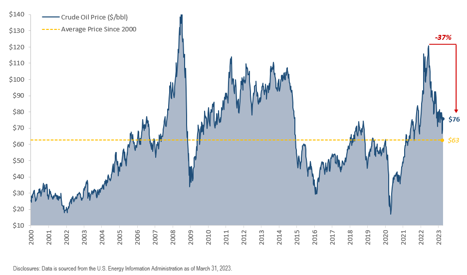
    Global Oil Prices Drop to 16-Month Low Due to Demand Concerns

    Demand for oil

    After a sharp decline early in the pandemic, crude oil prices rebounded as the economy stabilized and activity increased in 2020 and 2021.

    However, Russia’s invasion of Ukraine in early 2022 disrupted commodity markets, causing oil prices to drop back to 2008 levels. Since then, central banks’ aggressive interest rate increases have negatively impacted demand, resulting in the steepest first-quarter drop in crude oil prices since 2020.

    The decrease is attributed to concerns about a potential U.S. recession, robust Russian oil flows despite sanctions, and bank failures, which have raised concerns that tighter lending standards may slow economic activity and decrease demand for oil.

    However, Asia is showing signs of demand recovery as China reopens its economy after ending its Covid Zero policy in late 2022.

    While the steady rise in oil prices in the past has led to a surge in global inflation, recent data indicates that inflationary pressures are easing, with year-over-year inflation growth declining each month since peaking at +8.9% y/y in June 2022.

    If crude oil prices remain stable or continue to decline, it could help to alleviate inflation pressures and allow central banks to slow down their tightening pace. But if oil prices rebound, inflationary pressures could persist.

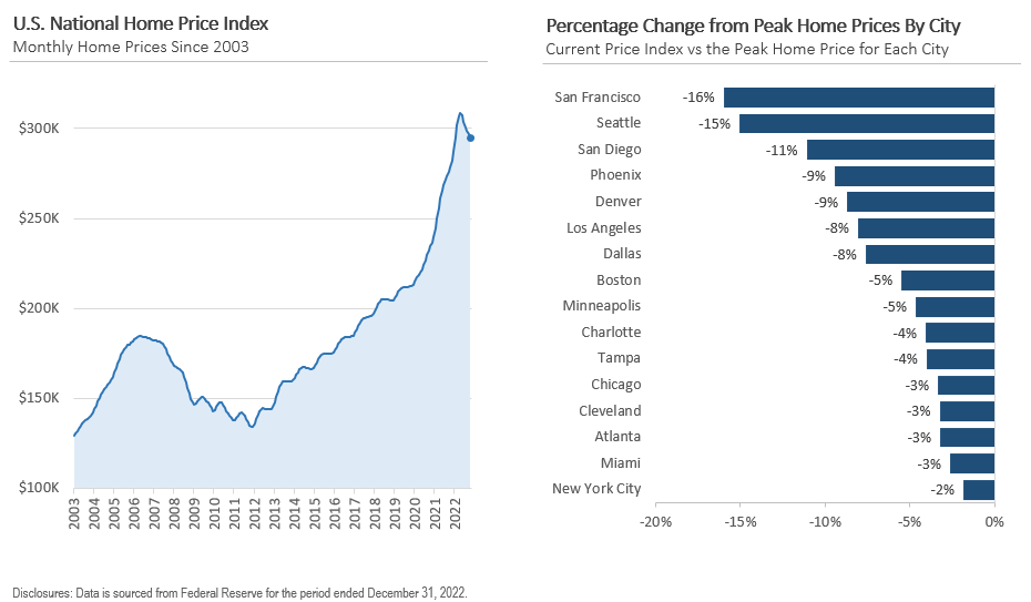
    Is the Housing Market Cooling Off? 

    Trend in home prices

    Home prices sharply increased in 2020 as a result of historically low mortgage rates and an increase in demand from remote work and migration. Consequently, some cities saw year-over-year increases of 15% or more in home prices.

    In the second half of 2022, home prices started to decline due to the Federal Reserve’s interest rate hikes. The average 30-year fixed-rate mortgage has risen to levels not seen since 2007, making monthly payments more expensive and reducing demand for homes. As a result,  home prices have fallen across most U.S. cities, and there could be further room for decline as mortgage rates remain high and lending standards tighten.

    Nevertheless, one stabilizing factor could be that homeowners who secured low-interest rates in recent years may have little incentive to sell their homes and obtain new loans at current interest rates. This limited housing supply may prevent a significant decrease in home prices.

    Corporate Profit Margins & Small Business Survey Results

    Corporate profit margins

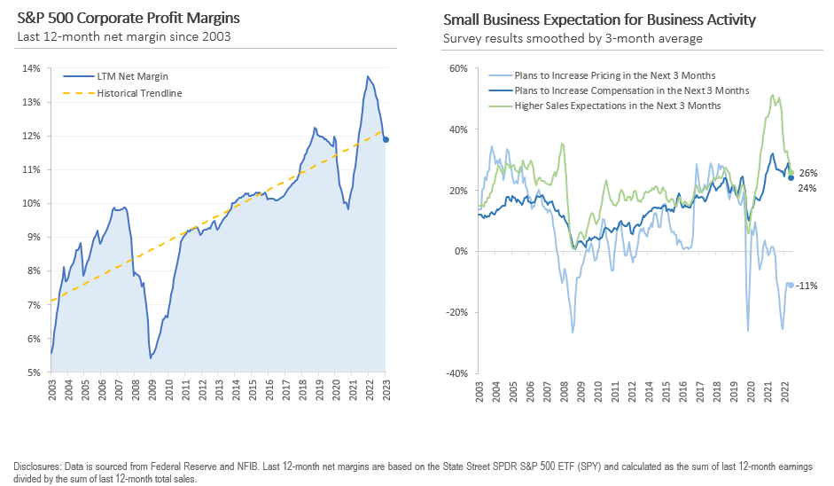
    Finally, let’s review the corporate profit margins and the latest survey of small business owners.

    On the left side, the above chart displays the S&P 500’s profit margins for the past 12 months on a quarterly basis since 2003. The two main points to highlight are that corporate profit margins increased significantly during the pandemic due to the robust economy and pricing power.

    However, profit margins usually decline when the economy contracts. Profit margins have been decreasing lately, and investors will monitor earnings closely to observe if margins will stabilize in the upcoming quarters.

    On the right side, the chart illustrates the outcomes of the National Federation of Small Business survey, which measures the sentiment and confidence of U.S. small business owners monthly. Small business owners foresee a rise in wages and prices over the next three months, but the sales outlook is predicted to be weaker, with expectations of lower sales.

    Pricing power and expense management will be critical to maintaining profit margins, especially with the possibility of demand declining.


    John Rothe

    HAS BEEN FEATURED IN:

    Barrons-John-Rothe
    Reuters-John-Rothe
    US-News-John-Rothe
    Financial-Planning-John-Rothe
    Advisor-Perspectives-John-Rothe
    John Rothe CMT
    John Rothe NAAIM
    Investment Advisor
    Registered Investment Advisor

    © 2023 John Rothe

    The opinions expressed on this site are those solely of John Rothe and do not necessarily represent those of Riverbend Investment Management LLC (Riverbend). This website is made available for educational and entertainment purposes only. Mr. Rothe is an Investment Adviser Representative of Riverbend. This website is for informational purposes only and does not constitute a complete description of the investment services or performance of Riverbend. Nothing on this website should be interpreted to state or imply that past results are an indication of future performance. A copy of Riverbend’s Part II of Form ADV and privacy policy is available upon request. This website is in no way a solicitation or an offer to sell securities or investment advisory services. Mr. Rothe and Riverbend Investment Management LLC (Riverbend) disclaim responsibility for updating information. In addition, Mr. Rothe, and Riverbend disclaim responsibility for third-party content, including information accessed through hyperlinks.

    White Paper: Using Volatility to Add Alpha and Control Portfolio Risk

    White Paper: Using Volatility to Add Alpha and Control Portfolio Risk

    Volatility is a well-known and widely-studied aspect of financial markets, and has been the focus of numerous academic and industry research efforts over the years.

    It is widely recognized that volatility can have a significant impact on investment portfolios, and as such, controlling risk has become a key priority for many investors.

    One approach to managing portfolio risk is to use volatility as a tool to control the exposure of a portfolio to risk. This paper aims to explore the use of volatility as a risk management tool and alpha generator, with a focus on the practical application of this approach in the management of investment portfolios.

    The paper will begin by reviewing the concept of volatility and its impact on financial markets, before examining the various methods that are used to measure volatility.
    It will then move on to discuss the use of volatility-based risk management strategies, including the use of volatility-based stop loss orders and the impact of these strategies on portfolio risk and return.

    The paper will conclude by summarizing the key findings and offering insights into the use of volatility as a risk management tool and alpha generator.

    Read: Using Volatility to Add Alpha and Control Portfolio Risk

    Value vs Growth: Is A Decade of Value Leadership Coming?

    Value vs Growth: Is A Decade of Value Leadership Coming?

    After the tumultuous stock market swings of this year, many investors are starting to re-evaluate their portfolios and are wondering Value vs Growth, which will outperform going forward?

    Since the Great Financial Crisis of 2008-2009, growth stocks have significantly outperformed their value counterparts.

    However, the tides may be turning after rising interest rates and a strong US dollar have had a significantly negative impact on some of the leading names within the technology sector.

    FANNG Stocks

    As interest rates rose during 2022, the so-called darlings of the technology sector, often referred to as FANNG stocks, saw large price declines since their January 2022 peak.

    A list of FANNG index members

    Investopedia / Ryan Oakley

    The NYSE FANG + Index is an index that tracks the performance of 10 highly-traded growth stocks of technology and tech-enabled companies in the technology, media & communications, and consumer discretionary sectors.

    The index includes FANNG stocks (Meta/Facebook, Amazon, Netflix, and Alphabet/Google), and is unique in that it also includes some of the other Wall Street darlings. such as Tesla (TSLA) and NVIDA (NVDA).

    From its peak in January 2022 to its low in November 2022, the NYSE FANG+ Index declined nearly 50%.

    Chart showing the decline in the NYSE FANG Index

    Some FANNG stocks saw even larger declines than the index itself.

    META (formerly Facebook)

    Meta saw approximately a 77% decline in price:

    stock chart of META (formerly Facebook)

    Amazon (AMZN)

    Amazon saw approximately a 57% decline in price:

    Netflix (NFLX)

    Netflix saw approximately a 76% decline in price:

    stock chart of NFLX

    Growth Leadership Pre-2022

    From March 2009 to January 2022, the S&P 500 Growth Index (using the ETF “SPYG” as a proxy), had a total return of approximately 913%.

    S&P 500 Growth Index Returns from March 2009 to January 20222

    Meanwhile, during the same period, Value (using the ETF “SPYV” as a proxy) returned approximately 388%.

    Total return of the S&P value index from March 2009 to January 2022

    During this time we saw the Technology sector balloon up to 25% of the S&P 500 index. 38% if we include the Communications Sector. No wonder investors were quick to exit the tech sector.

    Pie chart showing S&P 500 index weightings at the end of 2021

    Data source: State Street

    Value vs Growth Leadership?

    However, this outperformance of growth stocks may be ending — and potentially starting a decade of outperformance from their value counterparts.

    Since the November lows, the relationship between Growth and Value names has traded place.

    If we take a look at the relative strength comparison between S&P 500 Value and S&P 500 Growth, we can see that after the Tech Collapse in 2000-2001, Value stocks outperformed Growth stocks on a relative basis up until the Great Financial Crisis.

    After 2009, Value underperformed Growth — until the stock market lows in November 2022.

    Chart showing the relative strength between growth and value stocks

    Will Value Stocks Continue to Outperform Growth?

    Simply looking at the trend comparison between Growth and Value, it can be easy to say “yes”.

    But, let’s take a deeper look.

    Value companies, which tend to generate profits in the short term, may be less affected by fluctuations in interest rates and inflation than growth companies, which focus on long-term profits.

    Changes in interest rates have also created opportunities for active investors to find undervalued stocks with strong fundamentals, which may see an increase in value as investors recognize their potential.

    “During higher inflation environments, investors tend to rotate away from growth into value as present income and strong cash flows become more important,” Sherifa Issifu, associate, index investment strategy at S&P Dow Jones Indices.”

    growth vs value PE

    Source: S&P 500 Global Market Intelligence

    To further the impact of rising interest rates on growth stocks, a lot of investors and research analysts rely on the Net Present Value (NPV) model.

    The NPV model discounts projected cash flows to the present using a discount rate, which is typically the 10-year Treasury yield.

    So, as interest rates rise, the companies with greater cash flows may look more attractive to investors.

    chart showing the performance of value stocks cash flow

    For now, investors should keep an eye on the relative relationship between Growth and Value stocks to help them get a better understanding of where the broader market’s inflows and outflows are.


     -John Rothe, CMT