Momentum Investing Research:  Harnessing the Power of Market Trends

Momentum Investing Research: Harnessing the Power of Market Trends

Momentum investing research has proven time and time again that strategies involving the purchasing of stocks or other securities demonstrating high returns over the past three to twelve months have added alpha over traditional buy-and-hold investment strategies.

This tactic has been leveraged by both professional investors and individual traders for many years, helping many to consistently outperform the stock market.

In this article, we will delve into the world of momentum investing research, exploring what it is, how it operates, and why it has been so successful.

chart on momentum investing reseach

What is Momentum Investing?

Momentum investing is a systematic investment approach that capitalizes on the continuance of existing market trends. This method entails buying securities that have exhibited an upward price trend and selling those with a downward trend. It operates on the assumption that securities that have performed well in the past will continue to excel, and those that have underperformed will continue to do poorly.

The concept of momentum investing is deeply rooted in behavioral finance, attributing its effectiveness to cognitive biases among investors. Investors can be slow to react to new information, leading to trends persisting for longer than traditional financial models might suggest. Likewise, investor sentiment and herd behavior can further perpetuate these trends.

Momentum investing necessitates active monitoring and reevaluation of market trends. Investors must frequently rebalance their portfolios, often on a monthly or quarterly basis, to maintain exposure to securities currently demonstrating strong momentum.

In contrast to ‘buy and hold’ strategies, momentum investing adopts a more dynamic approach, continually adjusting to the ebb and flow of market trends. This strategy can be applied to individual stocks, industry sectors, or even entire markets, and it can be utilized across various asset classes, including stocks, bonds, commodities, and even cryptocurrencies.

Why Has Momentum Investing Outperformed The Stock Market?

Historical data and academic research demonstrate the effectiveness of momentum investing. For instance, a comprehensive study by Jegadeesh and Titman (1993) found that strategies that bought stocks that had performed well in the past and sold stocks that had performed poorly generated significant positive returns over 3- to 12-month holding periods.

Furthermore, a research paper by Moskowitz, Ooi, and Pedersen (2012) analyzed momentum returns across different asset classes and found consistent momentum premiums.

These researchers also discovered that momentum strategies implemented across various asset classes provided significant diversification benefits.

Table: Momentum Premiums Across Asset Classes (Moskowitz, Ooi, and Pedersen, 2012)

Asset Class Annualized Momentum Premium
Equities 7.6%
Bonds 7.0%
Commodities 9.8%
Currencies 8.1%

As evidenced by the table, the momentum premium – the additional return obtained from a momentum strategy compared to a benchmark – is significant across different asset classes.

In the academic world, the pioneering research on momentum was a 1993 study published in the Journal of Finance by Narasimhan Jegadeesh and Sheridan Titman, both at UCLA Anderson at the time. They documented how strategies of buying recent stock winners and selling recent losers generated significantly higher near-term returns than the U.S. market overall from 1965 to 1989.

The authors established the basic time frame for momentum-investing success as a three-to-12-month window on either side. In other words, a stock’s relative performance over the previous three to 12 months typically predicted its relative performance for the following three to 12 months.

They measured various time combinations of prior returns and future returns within those windows and found trading them to be “on average quite profitable” strategies.

For example, a portfolio that selected stocks based on their previous six-month returns, and then held them for six months, generated an extra return of about 1 percent per month above what would have been expected.

Data Analysis & Examples Of Momentum Investing RESEARCH

There’s a good reason for academics to want to nail down the key factor behind momentum’s success: As an investment strategy, it’s a thumb in the eye of the “efficient market hypothesis” (EMH), one of the central tenets of modern finance.

EMH, developed by the economist Eugene Fama in the 1960s, holds that a stock’s price at any moment reflects all of the relevant information about the company. So it’s impossible to ferret out a bargain because investors are rational beings and share prices are always exactly what they “should” be, given what investors collectively know.

That, of course, is the argument that has made index (or “passive”) stock investing so incredibly popular over the last 20 years: You can’t outsmart the market, so just own the whole thing.

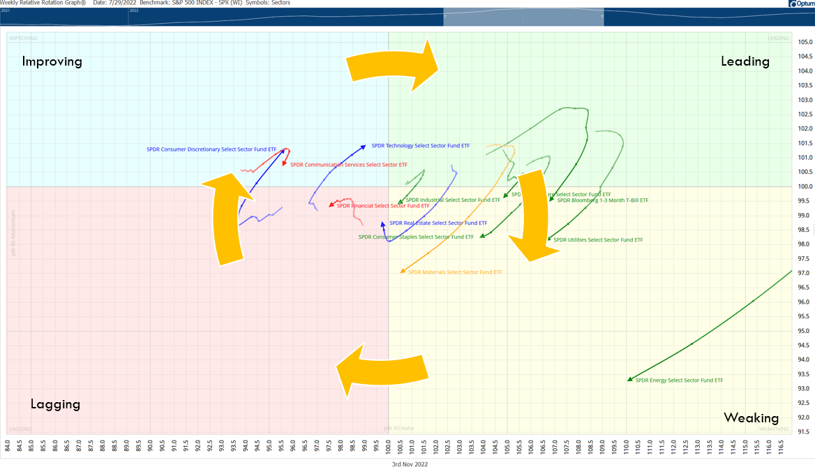
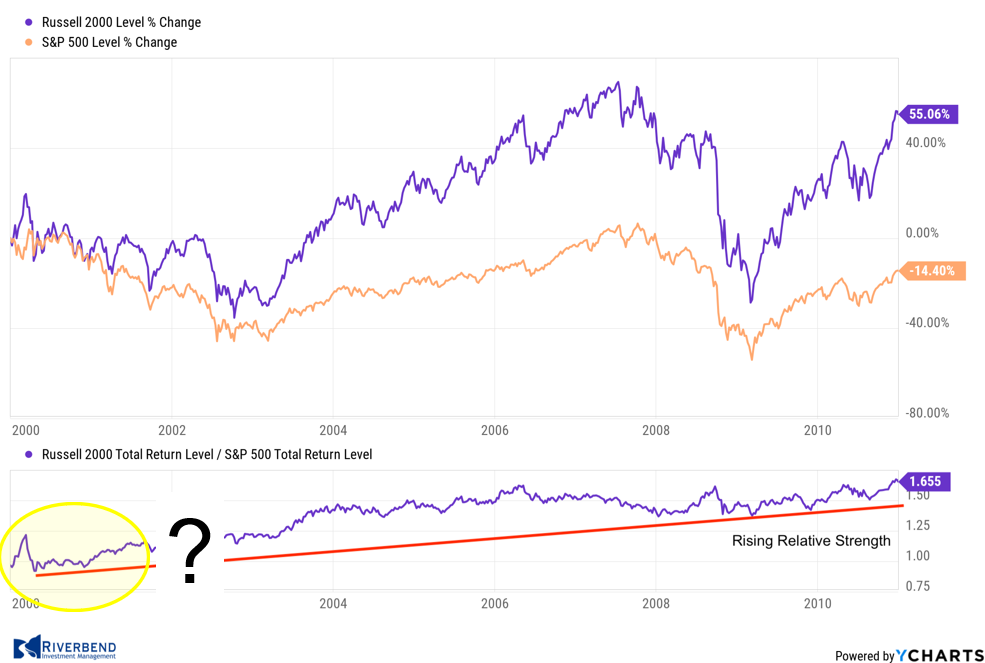
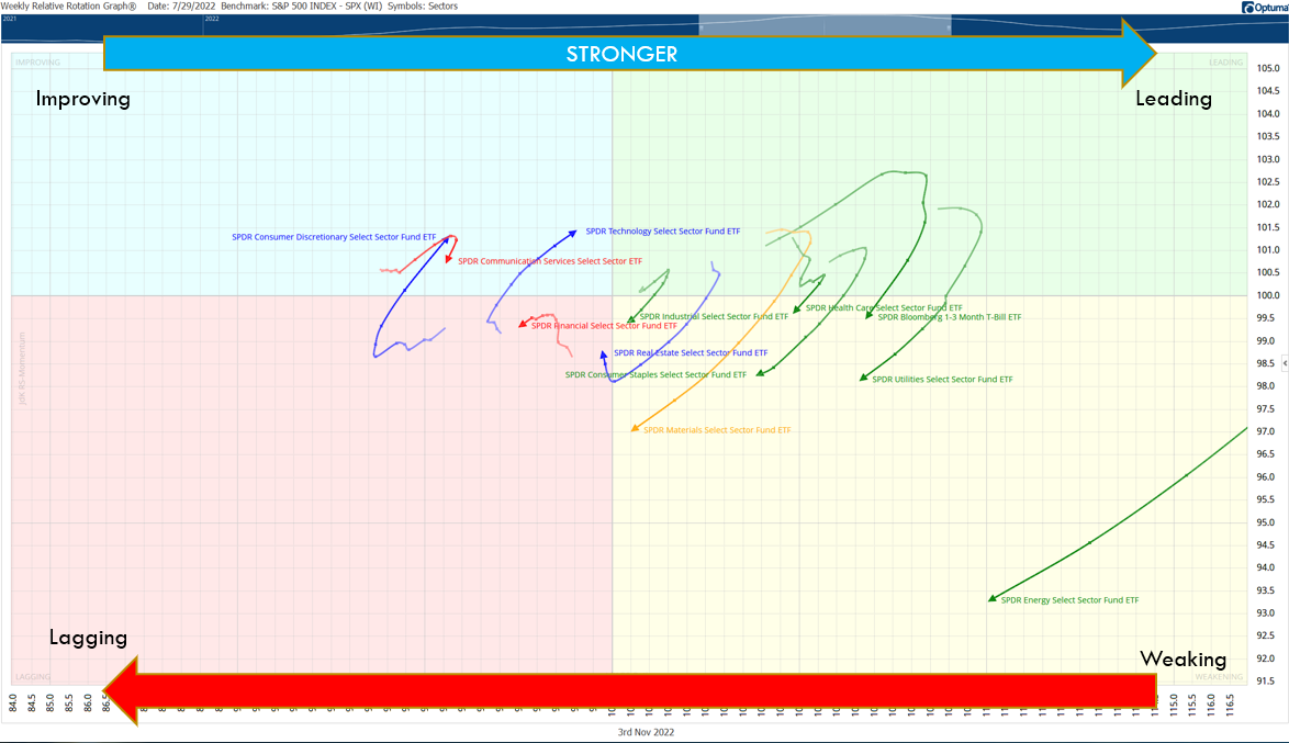
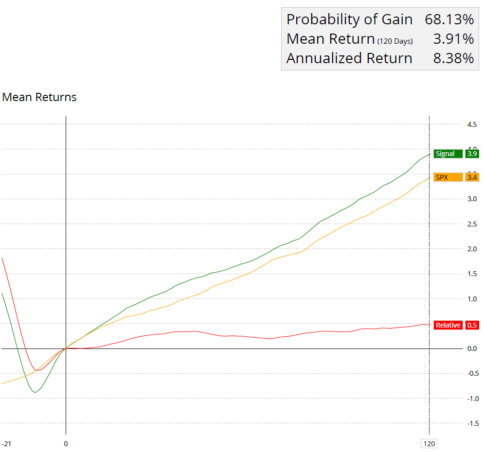
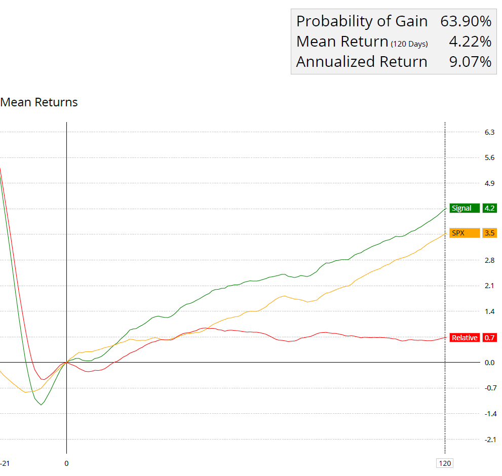
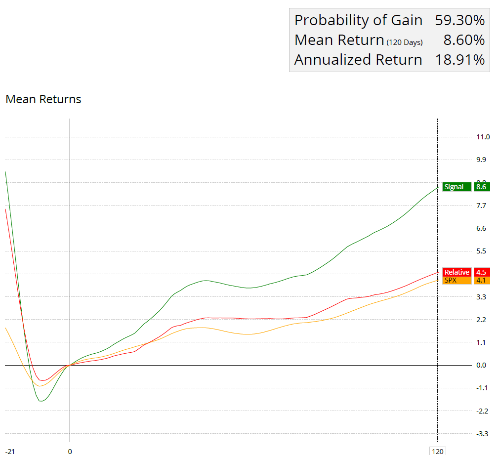
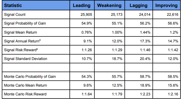
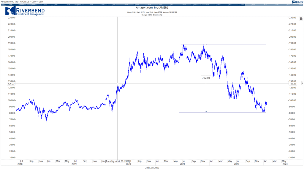
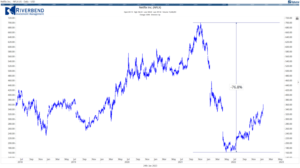
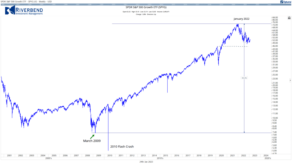
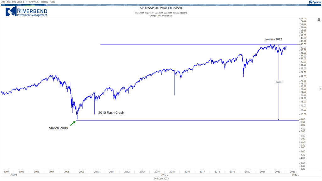
To illustrate how effective momentum investing can be compared with traditional long-term strategies, let’s examine some data analysis examples below:

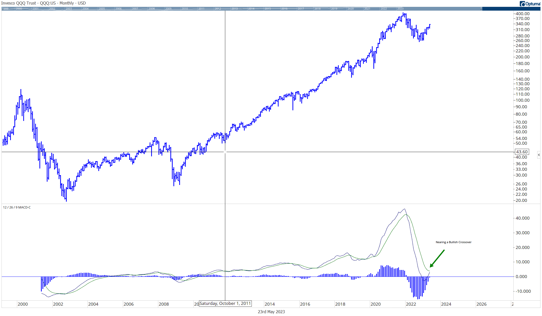
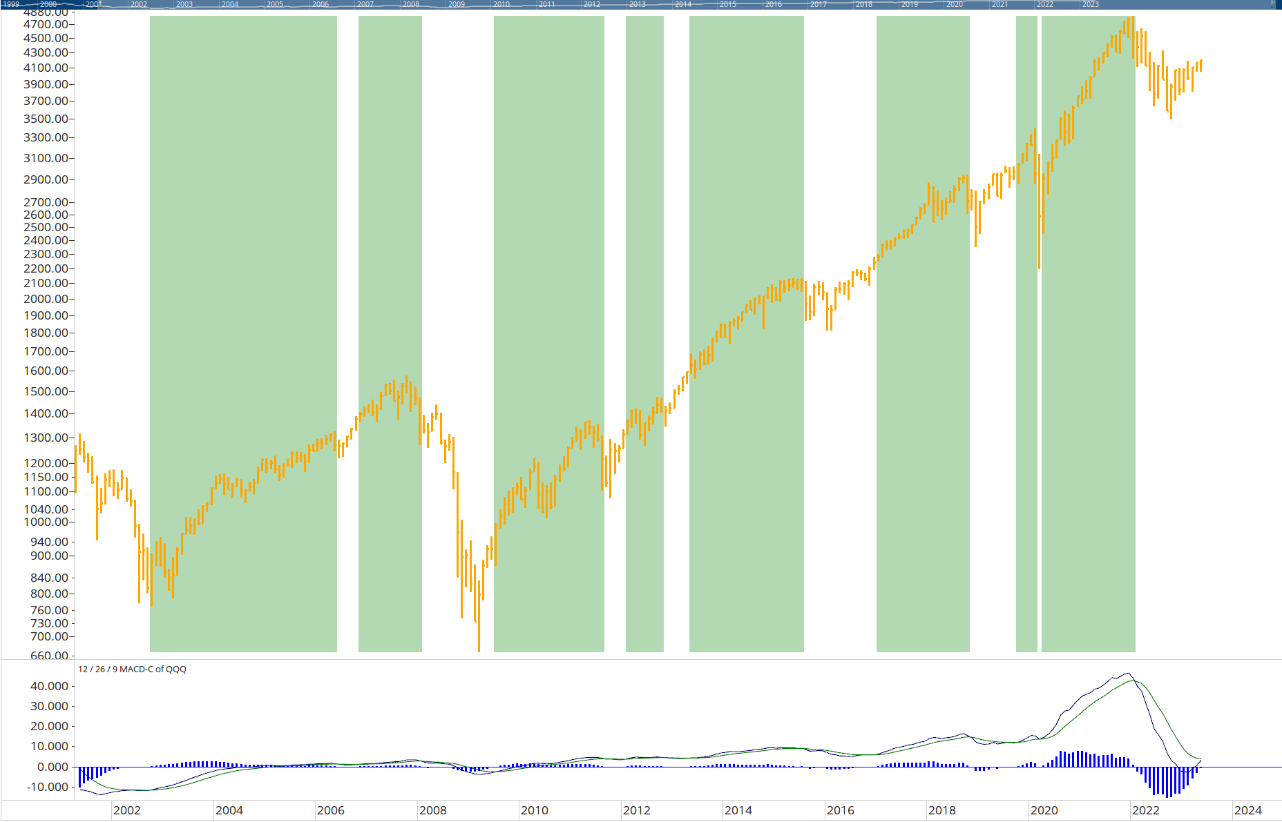
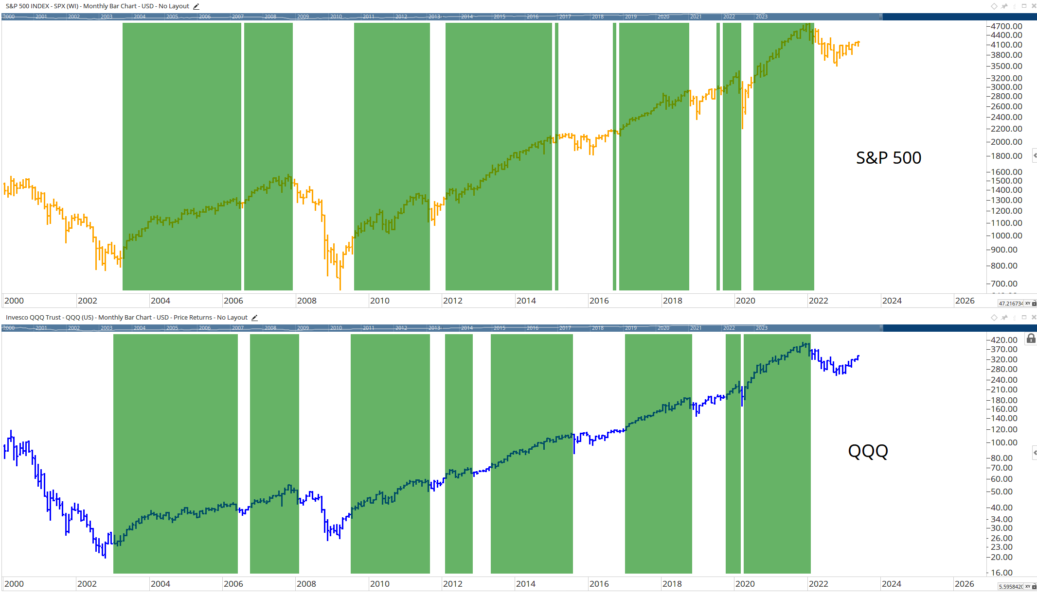
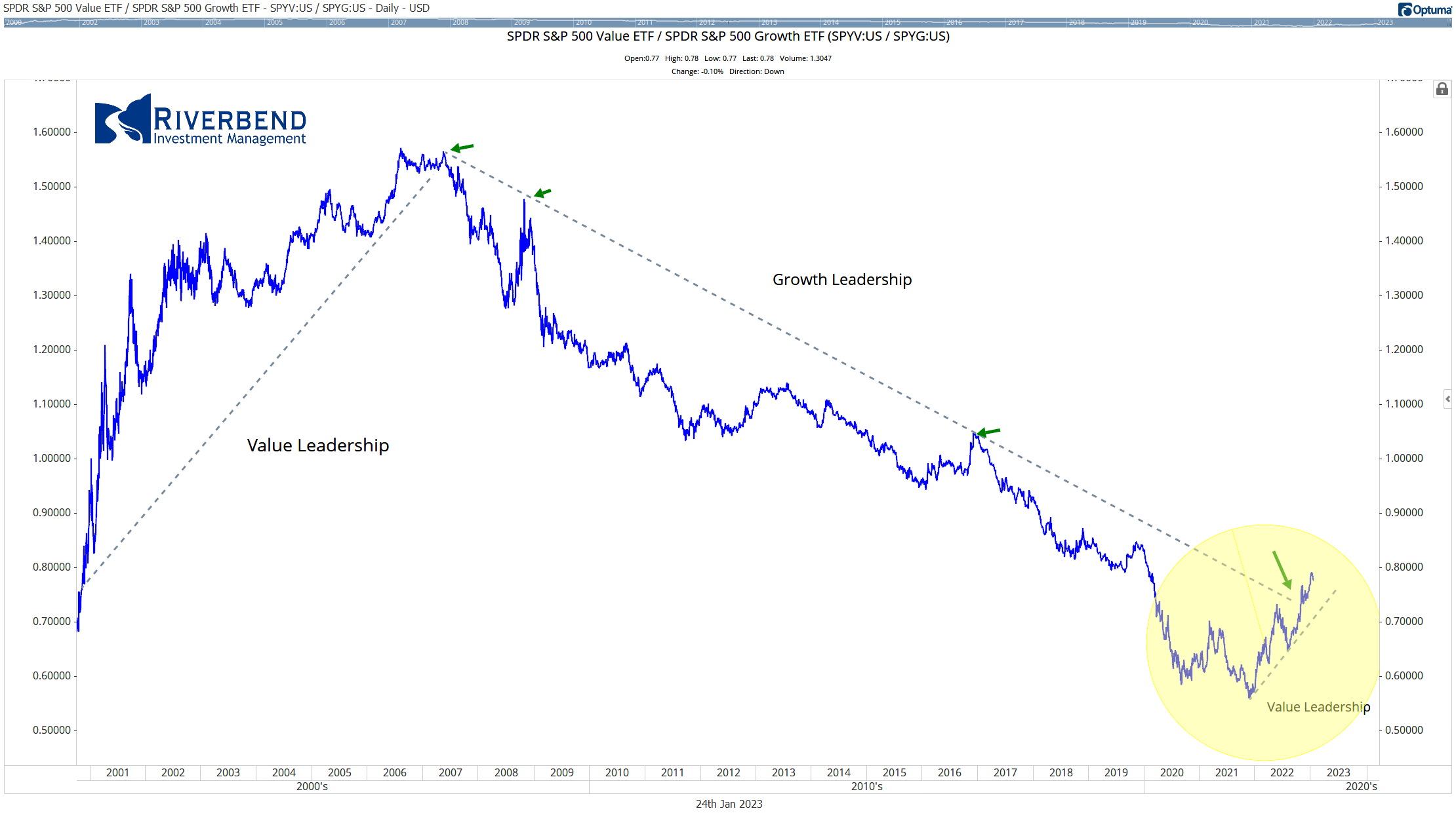
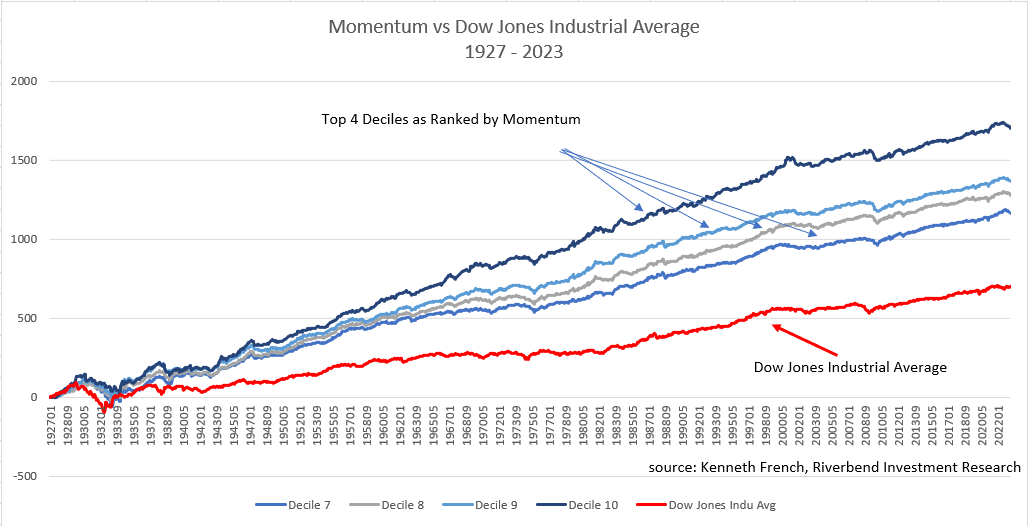
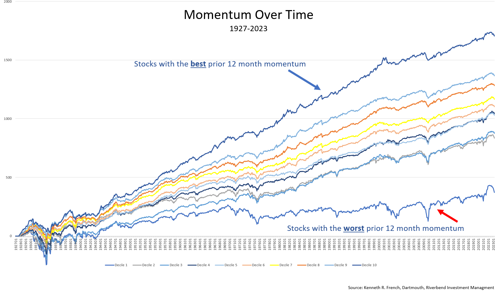
The above graph shows the difference in returns from January 1927 to January 2023 between the top 4 momentum ranked deciles compared to the Dow Jones Industrial Average.

This simple chart demonstrates that momentum investing historically has outperformed traditional buy & hold strategies over time.

We can also look at further examples of how momentum investing has outperformed traditional strategies over time: one example comes from research conducted by Anderson Review which found that “stocks where past returns accumulate gradually exhibit more momentum than stocks where returns are accumulated in a lumpy fashion” – meaning that gradual increases in prices tend to lead to further gains while sudden spikes tend not lead anywhere significant in terms of profitability over time; another example comes from research conducted by Quantpedia which found that “momentum factor effect” was present across all asset classes studied – meaning that even when markets were volatile overall, there were still opportunities for making profits through careful selection of stocks based on their recent performance; finally, research conducted by Research Affiliates which showed “simulated portfolios based on momentum add remarkable value” even during periods when markets were down overall – showing us how powerful this strategy can be even during difficult times for markets overall.

Study after study has shown that momentum investing typically is a market-beating strategy. So how has that translated into real-world results?

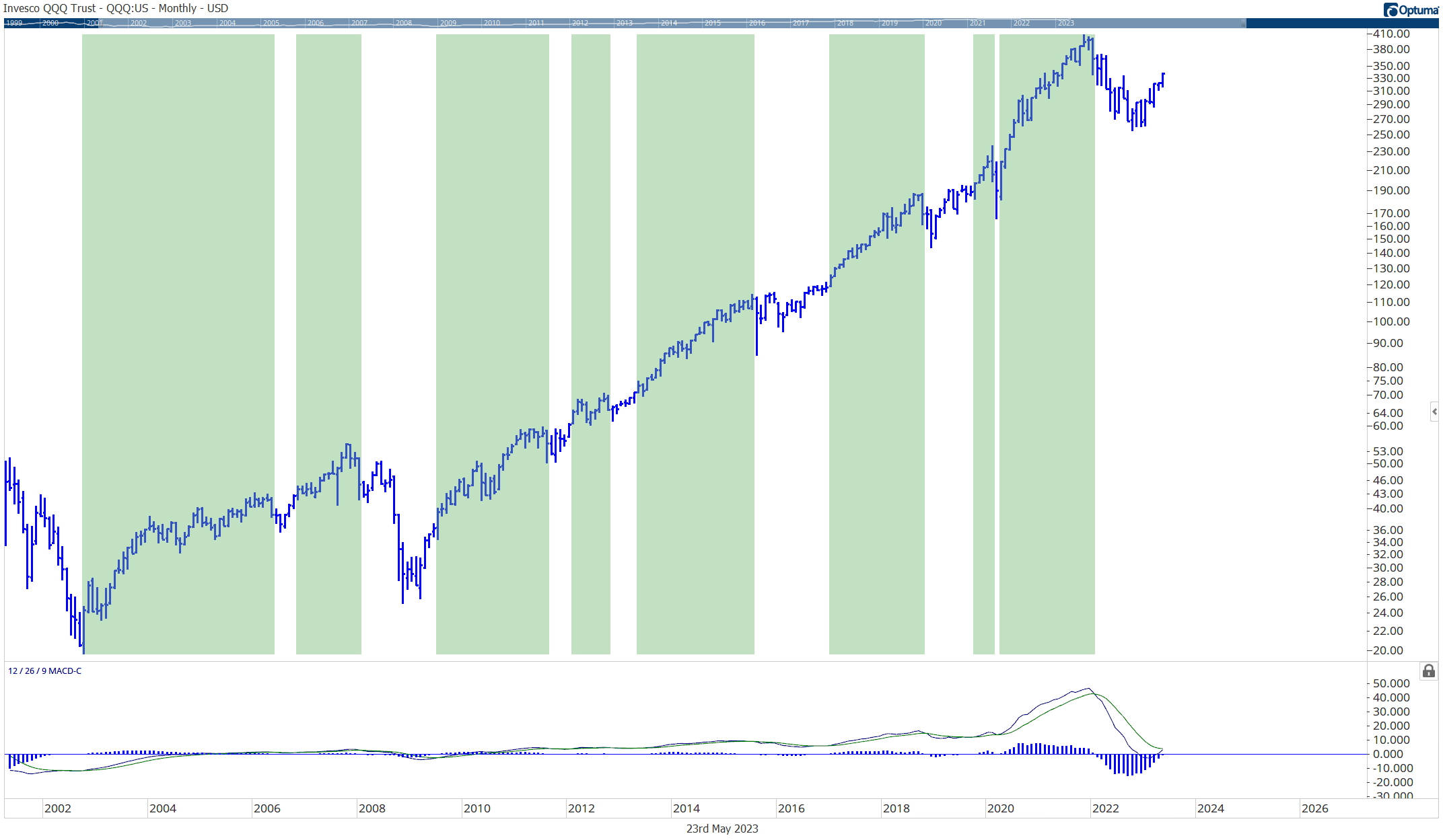
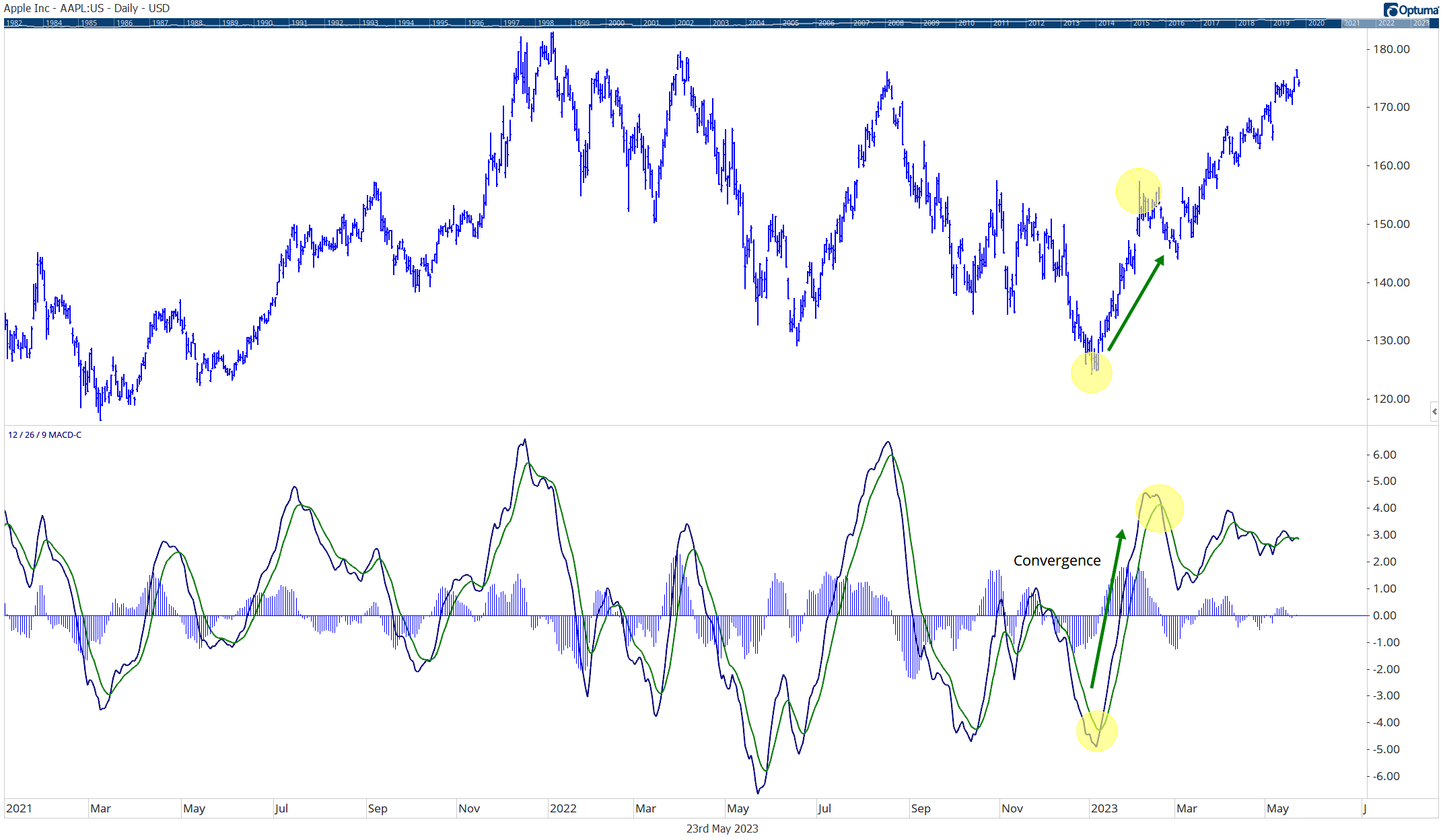
Consider the iShares Edge MSCI USA Momentum Factor exchange-traded fund (ticker symbol: MTUM). Launched in 2013, the fund has grown to $10 billion in assets by outperforming the benchmark Standard & Poor’s 500 index.
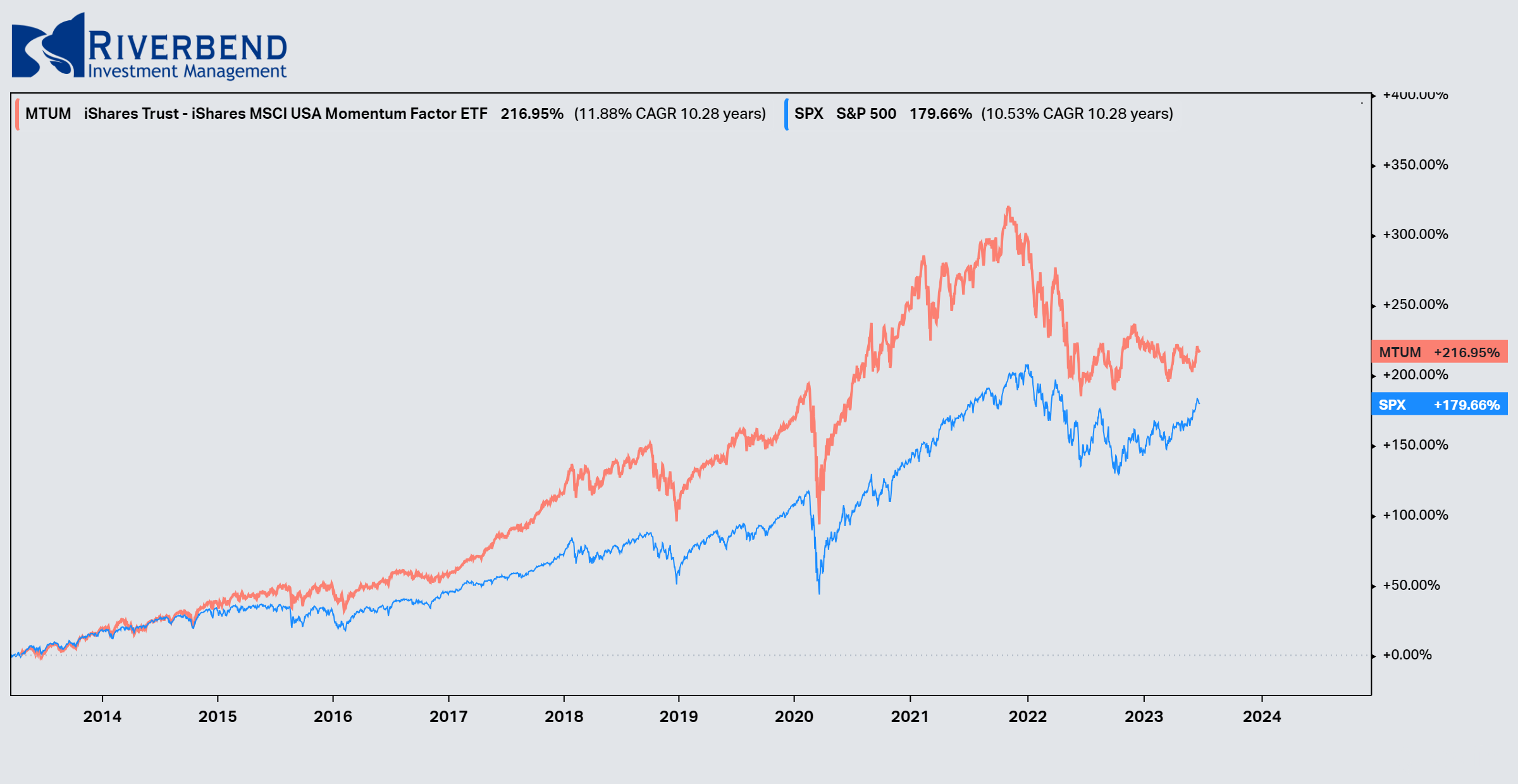
source: Koyfin

The fund is designed to track the MSCI USA Momentum Index, which comprises the recent best-performing U.S. large- and mid-capitalization stocks.

The fundamentals of the companies don’t matter; the stocks just have to be market leaders to get into the index (and the fund).

To identify the leaders, each of the 675 stocks in the broad MSCI USA market index is given a “momentum value” based on performance over the recent six months and the recent 12 months. The momentum values then are risk-adjusted to give each stock a momentum score. The 120 or so highest-scoring stocks then make up the index. Twice a year the index — and the fund — are reconstituted to pick up new market leaders and sell those that have slumped out.

Conclusion

In conclusion, momentum investing research has revealed why this approach has become so popular among both professional investors and individual traders alike: it takes advantage of market trends to generate consistent profits while reducing risk compared with traditional buy & hold strategies.

Furthermore, we can see from our data analysis examples above just how effective this strategy has been historically compared with traditional approaches, leading us to believe it will continue to outperform going forward.

Combined with other tools, such as risk management, momentum investing can be a powerful addition to an investor’s tool kit.

John Rothe, CMT

June 2023


References:

  1. Jegadeesh, N., & Titman, S. (1993). Returns to buying winners and selling losers: Implications for stock market efficiency. The Journal of Finance, 48(1), 65-91.
  2. Moskowitz, T. J., Ooi, Y. H., & Pedersen, L. H. (2012). Time series momentum. Journal of Financial Economics, 104(2), 228-250.
  3. https://alphaarchitect.com/category/architect-academic-insights/factor-investing/momentum-investing/
  4. https://anderson-review.ucla
  5. Kenneth R. French http://mba.tuck.dartmouth.edu/pages/faculty/ken.french/index.html
  6. https://www.iShares.com
  7. https://www.Koyfin.com


John Rothe

HAS BEEN FEATURED IN:

Barrons-John-Rothe
Reuters-John-Rothe
US-News-John-Rothe
Financial-Planning-John-Rothe
Advisor-Perspectives-John-Rothe
John Rothe CMT
John Rothe NAAIM
Investment Advisor
Registered Investment Advisor

© 2023 John Rothe

The opinions expressed on this site are those solely of John Rothe and do not necessarily represent those of Riverbend Investment Management LLC (Riverbend). This website is made available for educational and entertainment purposes only. Mr. Rothe is an Investment Adviser Representative of Riverbend. This website is for informational purposes only and does not constitute a complete description of the investment services or performance of Riverbend. Nothing on this website should be interpreted to state or imply that past results are an indication of future performance. A copy of Riverbend’s Part II of Form ADV and privacy policy is available upon request. This website is in no way a solicitation or an offer to sell securities or investment advisory services. Mr. Rothe and Riverbend Investment Management LLC (Riverbend) disclaim responsibility for updating information. In addition, Mr. Rothe, and Riverbend disclaim responsibility for third-party content, including information accessed through hyperlinks.

How to Use Relative Rotation Graphs for Selecting the Best Sectors

How to Use Relative Rotation Graphs for Selecting the Best Sectors

Investing in the right sector can be a key determinant of success in the financial markets. However, with numerous sectors and subsectors (let’s not forget about international markets) to choose from, selecting which sectors to allocate in a portfolio can be a bit overwhelming.

Traditional approaches such as fundamental analysis and technical indicators provide valuable insights, but they may not capture the dynamic nature of sector rotation, and if they do it is sometimes well into an already established trend.

During the period between 2000-2010, small-caps outperformed their large-cap counterparts. Looking at a relative strength chart, like the one below, it becomes obvious which area to favor.

However, the problem arises when we try to decide in real-time (instead of hindsight) when the trend begins.

chart showing relative strength


I have found relative rotation graphs (RRG) to be a great tool to help understand sector rotation within a specific market, for example comparing the sectors that make up the S&P 500 index.

RRG charts can provide early insight into which sectors are outperforming a particular index, which sectors are strengthening, and which may become leadership areas to focus on.

This helps to eliminate the problem of deciding when the “trend” begins.

What are Relative Rotation Graphs?

Relative Rotation Graphs (RRGs) are powerful tools that depict the relative strength and momentum of different sectors or asset classes.

Developed by Julius de Kempenaer, RRGs provide a visual representation of how sectors are rotating over time, allowing investors to assess their performance relative to a benchmark index.

Typically sectors will rotate in a clockwise fashion around an index, such as the S&P 500:

clockwise rotation of rrg chart


The x-axis of an RRG represents the relative strength of a sector, while the y-axis signifies its momentum.

Each sector is represented by a point on the graph, and the direction and curvature of the lines connecting these points indicate the rotation of sectors over time.

How to Use Relative Rotation Graphs (RRG) to Identify Strong Sectors

By analyzing RRGs, investors can determine the most favorable sectors for investment.

image of relative rotation graph

Here’s how RRGs can assist in this process:

  1. Visual Representation: RRGs offer a visually intuitive representation of sector rotation. They provide a clear depiction of which sectors are leading, lagging, improving, or weakening over time. This visual representation helps investors identify emerging trends and potential investment opportunities.
  2. Relative Strength Analysis: The x-axis of an RRG measures relative strength, which compares a sector’s performance against a benchmark index. Sectors with a positive slope on the x-axis are outperforming the benchmark, while those with a negative slope are underperforming. Investors can focus on sectors with a positive slope to identify potential investment opportunities.
  3. Momentum Analysis: The y-axis of an RRG measures momentum, which determines the speed and direction of a sector’s price movement. Sectors with a positive slope on the y-axis are exhibiting positive momentum, indicating potential upward price movement.
  4. Rotation Analysis: The direction and curvature of lines connecting the sectors’ points on an RRG indicate their rotation patterns. Sectors moving from the “Weakening” quadrant to the “Leading” quadrant are displaying improving strength and momentum.


    Improving Portfolio Performance Using RRGs

    In the quest to add alpha, investors are constantly seeking innovative strategies to gain a competitive edge. Relative Rotation Graphs (RRGs) have emerged as a popular tool for analyzing sector rotation dynamics and identifying potential investment opportunities among traders and investors.

    So, is there evidence available to show us if RRGs may provide an opportunity to add alpha to a portfolio?

    Numerous studies have shown the benefits of using RRGs in portfolio selection:

    1. Enhanced Sector Selection:

    One of the primary advantages of utilizing RRGs for investment decisions is the ability to identify sectors with strong relative strength and positive momentum.

    By focusing on sectors in the “Leading” quadrant of an RRG, investors can select areas of the market that exhibit robust performance compared to the broader benchmark.

    This approach has the potential to improve investment returns by targeting sectors that are on an upward trajectory.

    A study conducted by Hsu et al. (2017) examined the effectiveness of RRGs in sector rotation strategies. The research found that RRG-based strategies consistently outperformed buy-and-hold strategies, providing evidence of the enhanced sector selection capabilities of RRGs.

    1. Dynamic Portfolio Management:

    RRGs enable investors to adapt their portfolios dynamically based on changing market conditions. By monitoring the rotation of sectors on an RRG, investors can identify when sectors are losing strength or momentum, potentially indicating the need for portfolio adjustments.

    This flexibility allows investors to capitalize on emerging opportunities while minimizing exposure to underperforming sectors, enhancing overall portfolio performance.

    A research paper by Deshmukh et al. (2019) explored the efficacy of RRGs in managing portfolios. The study demonstrated that RRG-based strategies achieved superior risk-adjusted returns compared to traditional buy-and-hold strategies.

    The dynamic nature of RRGs allows for more efficient portfolio management by taking advantage of sector rotation dynamics.

    1. Early Identification of Trends:

    RRGs provide a unique advantage by visually displaying the rotation patterns of sectors. By observing sectors transitioning from the “Weakening” quadrant to the “Leading” quadrant, investors can identify sectors that are beginning to exhibit improved strength and momentum.

    This early identification of emerging trends allows investors to enter positions at an opportune time, potentially capturing substantial gains as the sector gains momentum.

    In a research study by Narang et al. (2020), the authors investigated the performance of RRG-based strategies in capturing trend reversals.

    The study found that RRG-based strategies outperformed traditional momentum strategies, demonstrating the effectiveness of RRGs in identifying trends early.

    1. Risk Mitigation:

    While RRGs excel in identifying sectors with strong performance, they can also act as risk management tools. By monitoring sectors in the “Lagging” or “Weakening” quadrants, investors can identify areas of the market that are underperforming or losing momentum.

    This information can prompt investors to reduce exposure to such sectors, potentially mitigating losses during market downturns or periods of sector-specific weakness.

    A study by Chen et al. (2021) investigated the risk management capabilities of RRG-based strategies. The research concluded that incorporating RRG-based signals into portfolio management resulted in improved risk-adjusted returns and reduced downside risk.


    Testing Relative Rotation Graphs (RRG)

    To further test the results of using an RRG strategy, I compared the sectors of the S&P 500 vs the index itself to see if there are any alpha-generating benefits. (I am only showing a few tests, as a much more in-depth paper will be published in the future).

    All tests are using 1/1/2000 – 12/31/2022 as the time frame. The test examines returns 21 days before the signal to 120 days post-signal using OPTUMA’s signal tester.

    Buy sectors when they enter the ‘improving’ quadrant:

    Source: Optuma

    Buy sectors when they enter the ‘improving’ quadrant and if the distance from the center point is greater than 2.

    Sectors with a larger distance value will appear further from the center of an RRG chart. One of the observations is that higher alpha comes from those that make bigger arcs, the distance measure allows us to quantify that. (OPTUMA)

    Source: Optuma

    Relative rotation graphs can also be used on individual names within the S&P 500 index (using historical index data provided by Optuma).

    Buy stock when they enter the ‘improving’ quadrant and if the distance from the center point is greater than 2.

    Source: Optuma


    Matthew Verdouw, CMT, CFTe published a thorough whitepaper on relative rotation graphs.

    (You can read it here: https://www.optuma.com/wp-content/uploads/2023/02/buying-out-performers-is-too-late.pdf)

    In his whitepaper, Mr. Verdouw examined which quadrants provided the best opportunities. His research shows that the best performance comes from equities entering the lagging quadrant. 

    Immediately we can see that historically, equities entering the Lagging quadrant—where they have negative relative trend—have the highest returns.

    They also offer the largest Annual Return is measured by taking the returns over the 30 day period and extrapolating to a year.

    source: Buying Out­performers is Too Late

    Combining relative rotation graphs with other indicators (combining RRGs with volatility stops is a personal favorite), may provide investors an opportunity to enhance returns, as well as using other benchmarks – such as short-term treasuries.

    The utilization of Relative Rotation Graphs (RRGs) in investment decision-making has proven to be a valuable approach for identifying sectors with strong relative strength and positive momentum.

    Empirical studies provide compelling evidence of the performance of Relative Rotation Graphs (RRGs) in investment decision-making.

    The findings indicate the ability of RRG-based strategies to outperform traditional buy-and-hold approaches, enhance sector selection, identify trends early, and assist in risk management.


    Sources:

    1. Hsu, J., Lin, T., & Chen, S. (2017). Relative Rotation Graphs: A Systematic Approach for Sector Rotation Strategies. Journal of Applied Finance & Banking, 7(4), 129-144.
    2. Deshmukh, A., Jain, P., & Krishnamurti, C. (2019). Using Relative Rotation Graphs (RRGs) to Build Investment Portfolios. Journal of Behavioral Finance, 20(4), 424-442.
    3. Narang, S., Sirjuesingh, M., & Kapoor, K. (2020). Sector Rotation using Relative Rotation Graphs. International Journal of Business and Globalisation, 25(2), 252-266.
    4. Chen, S., Hsu, J., & Chen, Y. (2021). Relative Rotation Graphs and Risk Management in Sector Rotation Strategies. International Journal of Financial Research, 12(4), 258-272.
    5. Verdouw, Matthew (2016). Buying Outperformers is Too Late. https://www.optuma.com/research/
    6. De Kempenaer, Julius. “Sector Rotation with RRGs.” Relative Rotation Graphs, https://www.relativerotationgraphs.com/.
    7.  Minervini, Mark. “Relative Rotation Graphs (RRG) For Relative Strength Analysis.” StockCharts.com, https://stockcharts.com/articles/chartwatchers/2014/07/relative-rotation-graphs-rrg-for-relative-strength-analysis.html.
    8. Katsanos, Markos. “Relative Rotation Graphs (RRG).” Quantitative Technical Analysis, https://www.quantitativeanalysis.eu/articles/relative-rotation-graphs-rrg.

    John Rothe

    HAS BEEN FEATURED IN:

    Barrons-John-Rothe
    Reuters-John-Rothe
    US-News-John-Rothe
    Financial-Planning-John-Rothe
    Advisor-Perspectives-John-Rothe
    John Rothe CMT
    John Rothe NAAIM
    Investment Advisor
    Registered Investment Advisor

    © 2023 John Rothe

    The opinions expressed on this site are those solely of John Rothe and do not necessarily represent those of Riverbend Investment Management LLC (Riverbend). This website is made available for educational and entertainment purposes only. Mr. Rothe is an Investment Adviser Representative of Riverbend. This website is for informational purposes only and does not constitute a complete description of the investment services or performance of Riverbend. Nothing on this website should be interpreted to state or imply that past results are an indication of future performance. A copy of Riverbend’s Part II of Form ADV and privacy policy is available upon request. This website is in no way a solicitation or an offer to sell securities or investment advisory services. Mr. Rothe and Riverbend Investment Management LLC (Riverbend) disclaim responsibility for updating information. In addition, Mr. Rothe, and Riverbend disclaim responsibility for third-party content, including information accessed through hyperlinks.

    A Major, Long Term MACD Signal is Forming

    A Major, Long Term MACD Signal is Forming

    For the first time in nearly a year and a half, the US stock market is getting closer and closer to a major buy signal. This signal is based on the QQQ ETF and a changeover in the MACD monthly indicator.

    ABOUT THE MACD

    While most investors are familiar with the concept of the MACD, as it is a frequently shown indicator and included in most technical charts, it should be noted that using only one indicator can be problematic as no indicator is 100% accurate (I tend to include additional indicators, such as volatility stops).

    However, the monthly MACD signal tends to stay on the “right side of the trend” and should not be ignored.

    If you are unfamiliar, the MACD (Moving Average Convergence Divergence) is a popular technical analysis indicator and is used to identify potential buy and sell signals in the stock market (it can be used across other financial vehicles, but for this post, I will be using it for equities).

    The MACD consists of three components: the MACD line, the signal line, and the histogram.

    Chart explaining the components of the MACD indicator

    MACD Line: The MACD line is calculated by subtracting a longer-term Exponential Moving Average (EMA) from a shorter-term EMA. The most commonly used time periods for the EMAs are 12 and 26. The resulting MACD line oscillates above and below a zero line, representing the relationship between the short-term and long-term moving averages.
     
    Signal Line: The signal line is a 9-period EMA of the MACD line. It acts as a trigger line, providing potential buy and sell signals when it crosses above or below the MACD line. Crossovers between the MACD line and the signal line are considered significant indicators of market momentum.
     
    Histogram: The histogram represents the difference between the MACD line and the signal line. It helps visualize the divergence or convergence between the two lines. When the MACD line crosses above the signal line, the histogram bars turn positive, indicating bullish momentum. Conversely, when the MACD line crosses below the signal line, the histogram bars turn negative, suggesting bearish momentum.
    There are numerous ways to interpret the MACD:
     
    Bullish Signal: When the MACD line crosses above the signal line and the histogram bars turn positive, it suggests a potential buying opportunity, indicating upward momentum in the market.
    MACD Bullish Crossover
     
    Bearish Signal: Conversely, when the MACD line crosses below the signal line and the histogram bars turn negative, it suggests a potential selling opportunity, indicating downward momentum in the market.
    MACD Bearish Signal
     
    Divergence: Divergence occurs when the MACD line and the price of the asset being analyzed move in opposite directions. Bullish divergence is observed when the price makes lower lows while the MACD line makes higher lows, indicating a potential trend reversal. Bearish divergence is observed when the price makes higher highs while the MACD line makes lower highs, suggesting a potential trend reversal.
    Example of MACD Divergence Bullish
     
    Convergence: Convergence occurs when the MACD line and the price move in the same direction. It can confirm the strength of an ongoing trend.
    example of MACD convergence


    While traders and analysts often use the MACD indicator in conjunction with other technical analysis tools, in the analysis below, I will be using only the MACD indicator to examine the long-term signals of the ETF “QQQ”.


    WHY USE QQQ?

    I am using the QQQ ETF in this analysis due to the makeup of the S&P 500.

    The QQQ ETF is primarily composed of technology stocks, including heavy weightings in Microsoft, Apple, Amazon, and Google (Alphabet):

    QQQ Top Ten Holdings


    With technology and communication companies making up over 63% of the ETF’s total weighting:QQQ ETF sector weightings

    Source: Invesco


    If we compare QQQ’s weighting with that of the S&P 500, we will notice the high percentage of weighting towards technology stocks:

    S&P 500 Weightings

    Due to the overweight of technology stocks within the S&P 500, we can use the QQQ ETF as a proxy for market signals.


    CURRENT AND PAST MACD SIGNALS

    Currently, the monthly MACD indicator is nearing a bullish crossover (a bullish signal) in the QQQ ETF:

    QQQ MACD crossover monthly chart

    Historically a positive, monthly MACD has been a good indication that QQQ will begin/continue an uptrend.

    Below I have highlighted in green all the times the MACD histogram has been positive (Monthly QQQ chart):

    QQQ etf when macd is positive

    Below is the S&P 500 when the QQQ MACD histogram has been positive:


    Why not just use a monthly MACD crossover with the S&P 500 index itself?

    The below chart compares the monthly MACD signal of the S&P 500 vs the monthly MACD signal of the QQQ ETF:


    I have found in volatile markets, using QQQ as a proxy for the S&P 500 index tends to provide signals with less whipsaw. (I plan to explore this in much more detail in a future post, as the primary purpose of this post was to highlight a potentially major shift in market sentiment.)

    For now, it may be wise to pay attention to this indicator as we approach another monthly bullish crossover.


    John Rothe

    HAS BEEN FEATURED IN:

    Barrons-John-Rothe
    Reuters-John-Rothe
    US-News-John-Rothe
    Financial-Planning-John-Rothe
    Advisor-Perspectives-John-Rothe
    John Rothe CMT
    John Rothe NAAIM
    Investment Advisor
    Registered Investment Advisor

    © 2023 John Rothe

    The opinions expressed on this site are those solely of John Rothe and do not necessarily represent those of Riverbend Investment Management LLC (Riverbend). This website is made available for educational and entertainment purposes only. Mr. Rothe is an Investment Adviser Representative of Riverbend. This website is for informational purposes only and does not constitute a complete description of the investment services or performance of Riverbend. Nothing on this website should be interpreted to state or imply that past results are an indication of future performance. A copy of Riverbend’s Part II of Form ADV and privacy policy is available upon request. This website is in no way a solicitation or an offer to sell securities or investment advisory services. Mr. Rothe and Riverbend Investment Management LLC (Riverbend) disclaim responsibility for updating information. In addition, Mr. Rothe, and Riverbend disclaim responsibility for third-party content, including information accessed through hyperlinks.

    White Paper: Using Volatility to Add Alpha and Control Portfolio Risk

    White Paper: Using Volatility to Add Alpha and Control Portfolio Risk

    Volatility is a well-known and widely-studied aspect of financial markets, and has been the focus of numerous academic and industry research efforts over the years.

    It is widely recognized that volatility can have a significant impact on investment portfolios, and as such, controlling risk has become a key priority for many investors.

    One approach to managing portfolio risk is to use volatility as a tool to control the exposure of a portfolio to risk. This paper aims to explore the use of volatility as a risk management tool and alpha generator, with a focus on the practical application of this approach in the management of investment portfolios.

    The paper will begin by reviewing the concept of volatility and its impact on financial markets, before examining the various methods that are used to measure volatility.
    It will then move on to discuss the use of volatility-based risk management strategies, including the use of volatility-based stop loss orders and the impact of these strategies on portfolio risk and return.

    The paper will conclude by summarizing the key findings and offering insights into the use of volatility as a risk management tool and alpha generator.

    Read: Using Volatility to Add Alpha and Control Portfolio Risk

    Value vs Growth: Is A Decade of Value Leadership Coming?

    Value vs Growth: Is A Decade of Value Leadership Coming?

    After the tumultuous stock market swings of this year, many investors are starting to re-evaluate their portfolios and are wondering Value vs Growth, which will outperform going forward?

    Since the Great Financial Crisis of 2008-2009, growth stocks have significantly outperformed their value counterparts.

    However, the tides may be turning after rising interest rates and a strong US dollar have had a significantly negative impact on some of the leading names within the technology sector.

    FANNG Stocks

    As interest rates rose during 2022, the so-called darlings of the technology sector, often referred to as FANNG stocks, saw large price declines since their January 2022 peak.

    A list of FANNG index members

    Investopedia / Ryan Oakley

    The NYSE FANG + Index is an index that tracks the performance of 10 highly-traded growth stocks of technology and tech-enabled companies in the technology, media & communications, and consumer discretionary sectors.

    The index includes FANNG stocks (Meta/Facebook, Amazon, Netflix, and Alphabet/Google), and is unique in that it also includes some of the other Wall Street darlings. such as Tesla (TSLA) and NVIDA (NVDA).

    From its peak in January 2022 to its low in November 2022, the NYSE FANG+ Index declined nearly 50%.

    Chart showing the decline in the NYSE FANG Index

    Some FANNG stocks saw even larger declines than the index itself.

    META (formerly Facebook)

    Meta saw approximately a 77% decline in price:

    stock chart of META (formerly Facebook)

    Amazon (AMZN)

    Amazon saw approximately a 57% decline in price:

    Netflix (NFLX)

    Netflix saw approximately a 76% decline in price:

    stock chart of NFLX

    Growth Leadership Pre-2022

    From March 2009 to January 2022, the S&P 500 Growth Index (using the ETF “SPYG” as a proxy), had a total return of approximately 913%.

    S&P 500 Growth Index Returns from March 2009 to January 20222

    Meanwhile, during the same period, Value (using the ETF “SPYV” as a proxy) returned approximately 388%.

    Total return of the S&P value index from March 2009 to January 2022

    During this time we saw the Technology sector balloon up to 25% of the S&P 500 index. 38% if we include the Communications Sector. No wonder investors were quick to exit the tech sector.

    Pie chart showing S&P 500 index weightings at the end of 2021

    Data source: State Street

    Value vs Growth Leadership?

    However, this outperformance of growth stocks may be ending — and potentially starting a decade of outperformance from their value counterparts.

    Since the November lows, the relationship between Growth and Value names has traded place.

    If we take a look at the relative strength comparison between S&P 500 Value and S&P 500 Growth, we can see that after the Tech Collapse in 2000-2001, Value stocks outperformed Growth stocks on a relative basis up until the Great Financial Crisis.

    After 2009, Value underperformed Growth — until the stock market lows in November 2022.

    Chart showing the relative strength between growth and value stocks

    Will Value Stocks Continue to Outperform Growth?

    Simply looking at the trend comparison between Growth and Value, it can be easy to say “yes”.

    But, let’s take a deeper look.

    Value companies, which tend to generate profits in the short term, may be less affected by fluctuations in interest rates and inflation than growth companies, which focus on long-term profits.

    Changes in interest rates have also created opportunities for active investors to find undervalued stocks with strong fundamentals, which may see an increase in value as investors recognize their potential.

    “During higher inflation environments, investors tend to rotate away from growth into value as present income and strong cash flows become more important,” Sherifa Issifu, associate, index investment strategy at S&P Dow Jones Indices.”

    growth vs value PE

    Source: S&P 500 Global Market Intelligence

    To further the impact of rising interest rates on growth stocks, a lot of investors and research analysts rely on the Net Present Value (NPV) model.

    The NPV model discounts projected cash flows to the present using a discount rate, which is typically the 10-year Treasury yield.

    So, as interest rates rise, the companies with greater cash flows may look more attractive to investors.

    chart showing the performance of value stocks cash flow

    For now, investors should keep an eye on the relative relationship between Growth and Value stocks to help them get a better understanding of where the broader market’s inflows and outflows are.


     -John Rothe, CMT


    Is International Finally Ready to Shine?

    Is International Finally Ready to Shine?

    Over the past decade, U.S. investors benefitted significantly by investing at home rather than abroad, as U.S. stocks significantly outperformed their international counterparts. As illustrated in Figure 1, an initial investment of $1,000 in the S&P 500 at the end of 2012 grew to $2,613, excluding dividends, by the end of 2022.

    For comparison, the same $1,000 investment in the MSCI Developed Market Index returned only $1,142, while a $1,000 investment in the MSCI Emerging Market Index posted a loss and returned $842.

    Looking back at the last decade, investment analysts attribute the outperformance of U.S. stocks to several factors. One major contributing factor is the composition of the S&P 500 Index, which is heavily weighted towards technology and other growth-oriented stocks such as Apple, Amazon, Microsoft, Google, and Tesla.

    Image for global valuations John-Rothe


    This high concentration of technology stocks is not found anywhere else around the world, and as the group outperformed, so did the broader U.S. stock market. Additionally, the U.S. dollar strengthened by approximately 30% over the last decade, which decreased the value of foreign investments when translated back into U.S. dollars.

    These two catalysts benefitted U.S. stocks while acting as a headwind for international stocks.

    Today international stocks currently trade at more attractive valuations than U.S. stocks after a decade of underperformance. As illustrated in Figure 2, U.S. stocks trade at a higher next 12-month price-to-earnings multiple than international stocks. In addition, U.S. stocks trade more expensive against their historical valuation range, as evidenced by the 10th to 90th percentile range of historical price-to-earnings multiples.

    Given the current valuation backdrop, growth stocks’ underperformance in 2022, and recent U.S. dollar weakness, international stocks may become more of a focus for investors in 2023.