For investors looking to invest in strength understanding the different types of momentum indicators is crucial to develop a resilient investment strategy.
Both seasoned traders and investors rely on an array of tools to shape their decision-making process. Among the arsenal of tools, one stands out – the momentum indicator.
This powerful technical analysis tool offers valuable insights into the velocity of a security’s price movements. By delving into various types of momentum indicators, this article equips you with the knowledge needed to make well-informed trading decisions.
What Are Momentum Indicators?
While traders like to mention momentum tools as a singular indicator, there are actually numerous types of momentum indicators that can help investors study the momentum within the market.
Sometimes referred to as momentum oscillators, these indicators are indispensable tools for technical analysis used by traders and investors to assess the strength or speed of a price movement in a security within a specified time frame.
They are rooted in the core principle of momentum, which, in financial terms, is the tendency of a security’s price to sustain its direction. These indicators provide a means to measure the rate of price change, offering valuable insights into market volatility, trend strength, and potential reversals.
The different types of momentum indicators are typically presented as line graphs that oscillate above and below a central line or predefined boundaries, revealing overbought or oversold conditions.
Overbought conditions may imply an upcoming price decrease, while oversold conditions could suggest a price increase.
These indicators hold particular value in trending markets as they help identify the strength and potential waning of a trend.
By incorporating these indicators into their strategies, traders can identify potential entry and exit points and optimize their trading endeavors.
Types of Momentum Indicators
There are several momentum indicators available, each providing unique insights into the behavior of the stock market. Below are four of the most widely used momentum indicators that everyone should know:
Relative Strength Index (RSI)

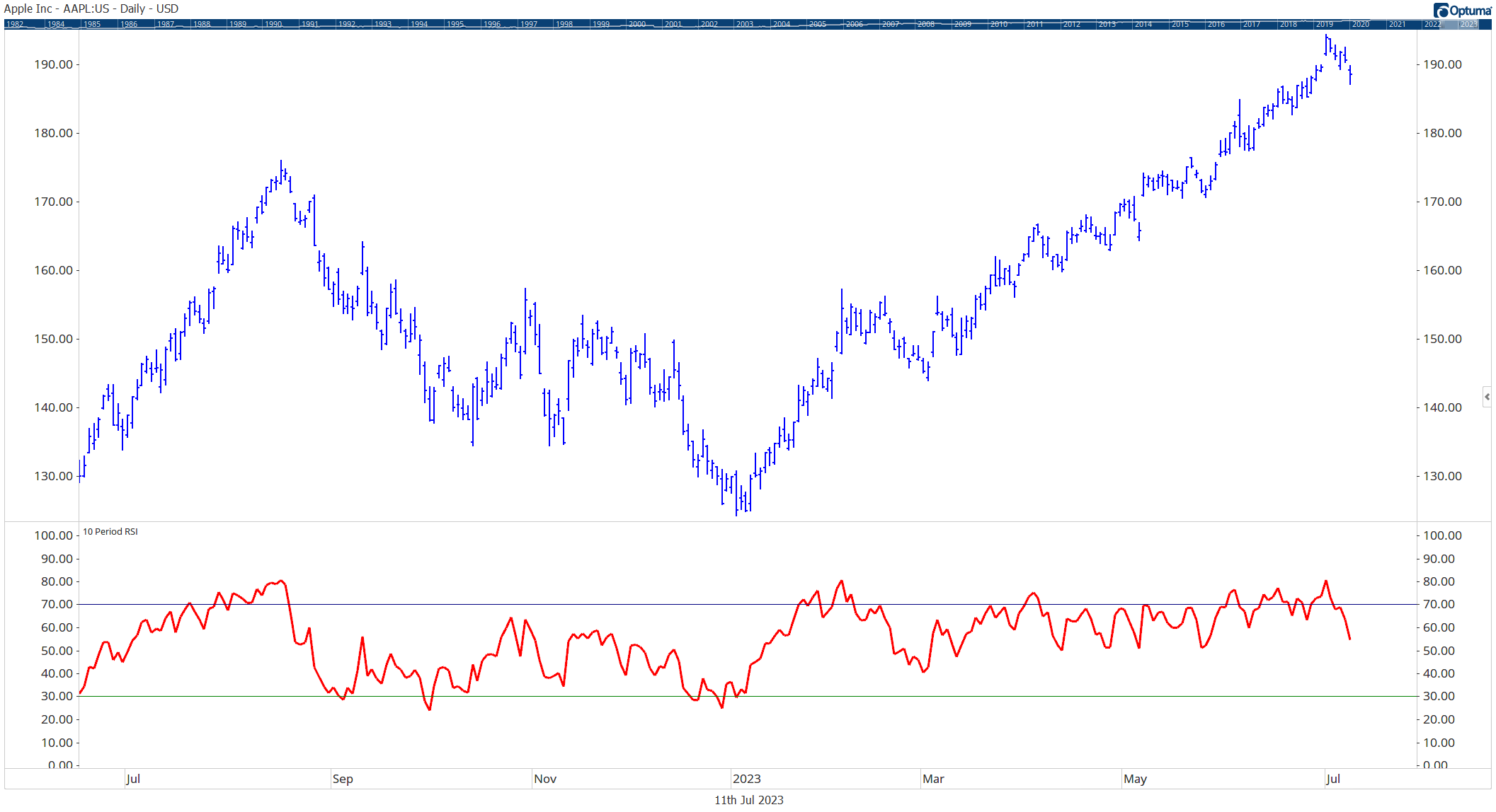
A 10-period RSI Chart (Red)
RSI is a go-to indicator for many traders. It helps determine overbought and oversold conditions by comparing recent gains to losses over a specified period. RSI values range from 0 to 100.
A value above 70 typically indicates an overbought condition, while a value below 30 suggests an oversold condition. However, it’s important to note that RSI can stay overbought or oversold in persistent trends, so it’s best to use it in combination with other indicators.
Moving Average Convergence Divergence (MACD)

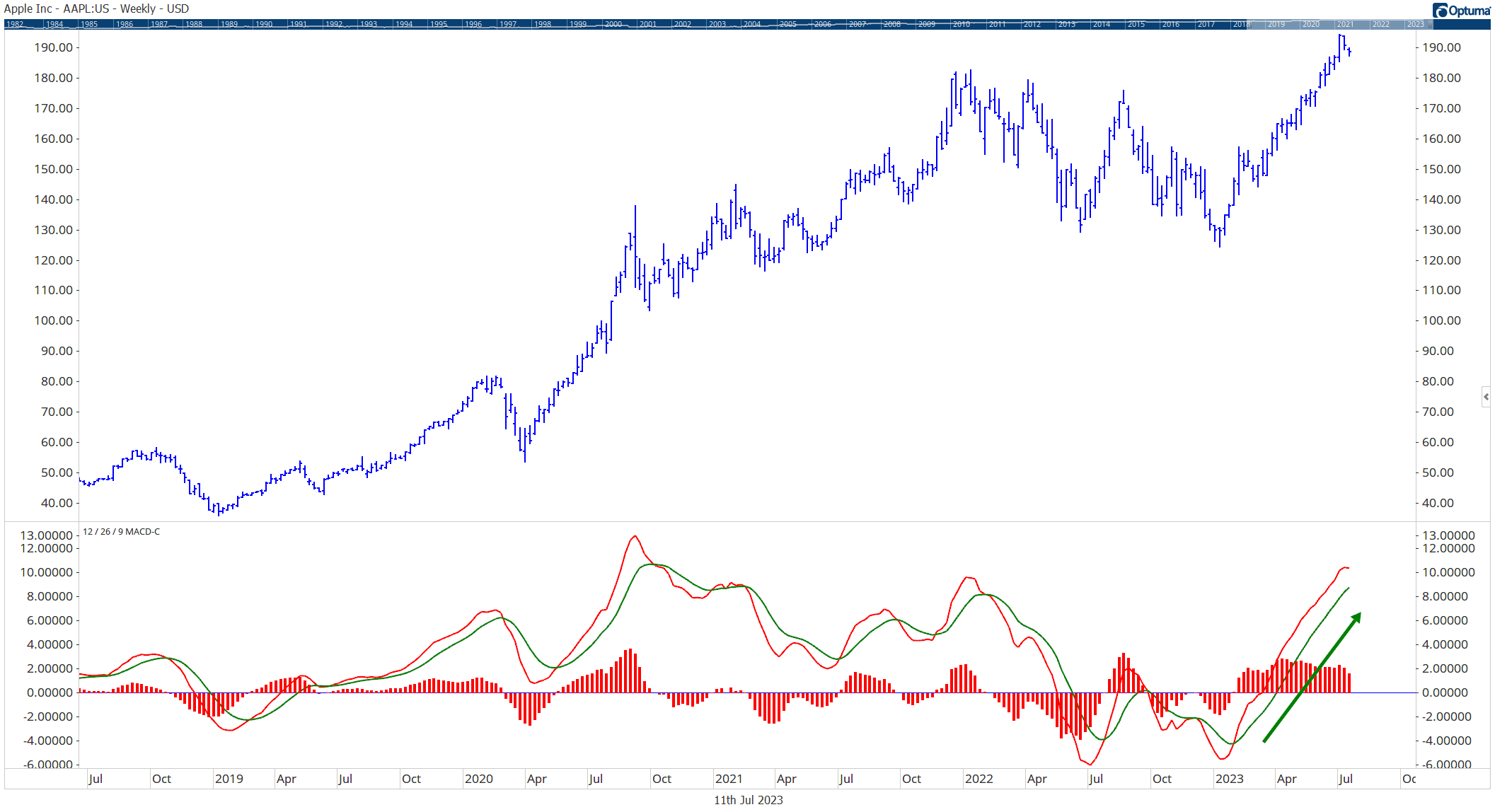
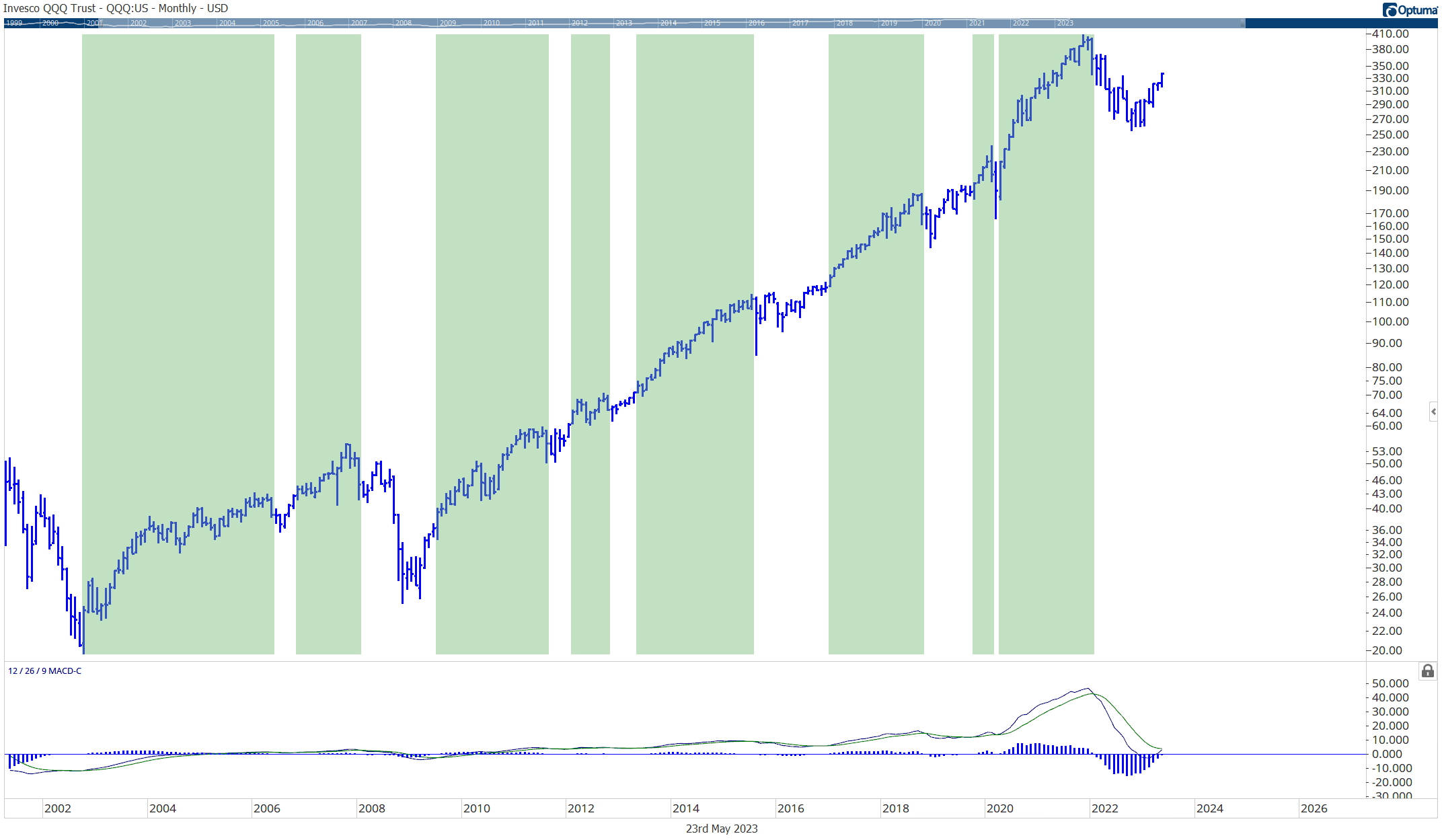
MACD indicator showing positive momentum
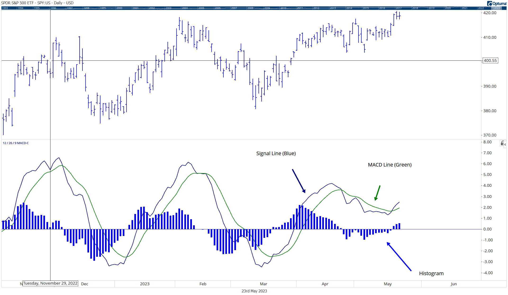
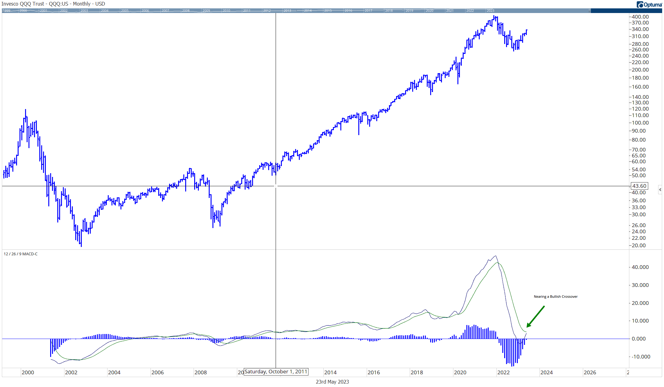
MACD uses two moving averages, usually the 12-day and 26-day, to identify potential buying or selling opportunities.
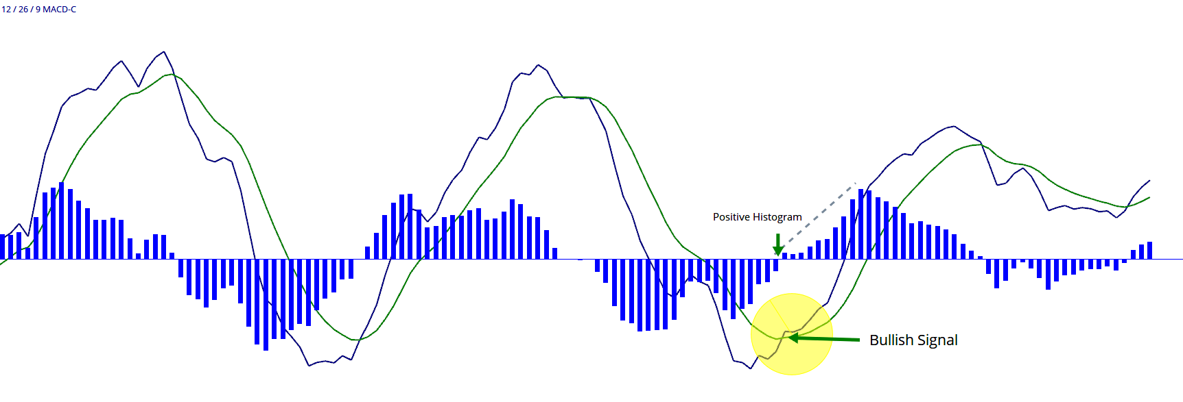
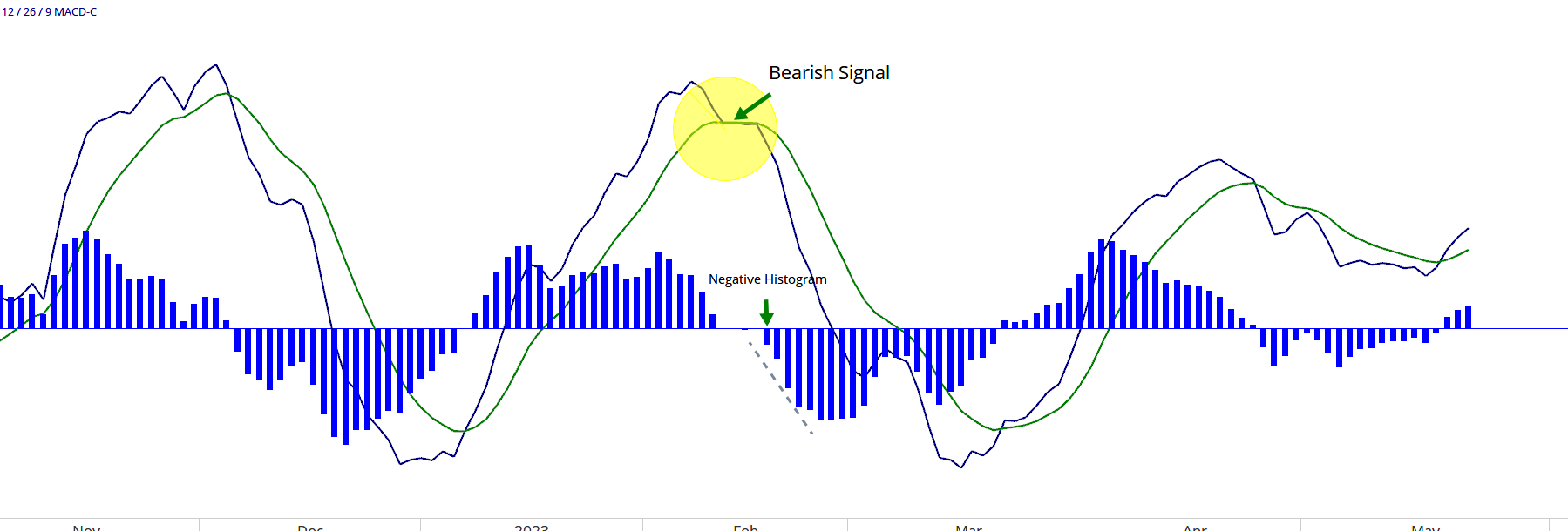
A bullish signal is generated when the 12-day moving average crosses above the 26-day moving average, while a bearish signal is generated when the 12-day crosses below the 26-day.
The MACD also includes a ‘signal line’ (a 9-day exponential moving average of the MACD) which can trigger additional buy or sell signals.
Stochastic Oscillator

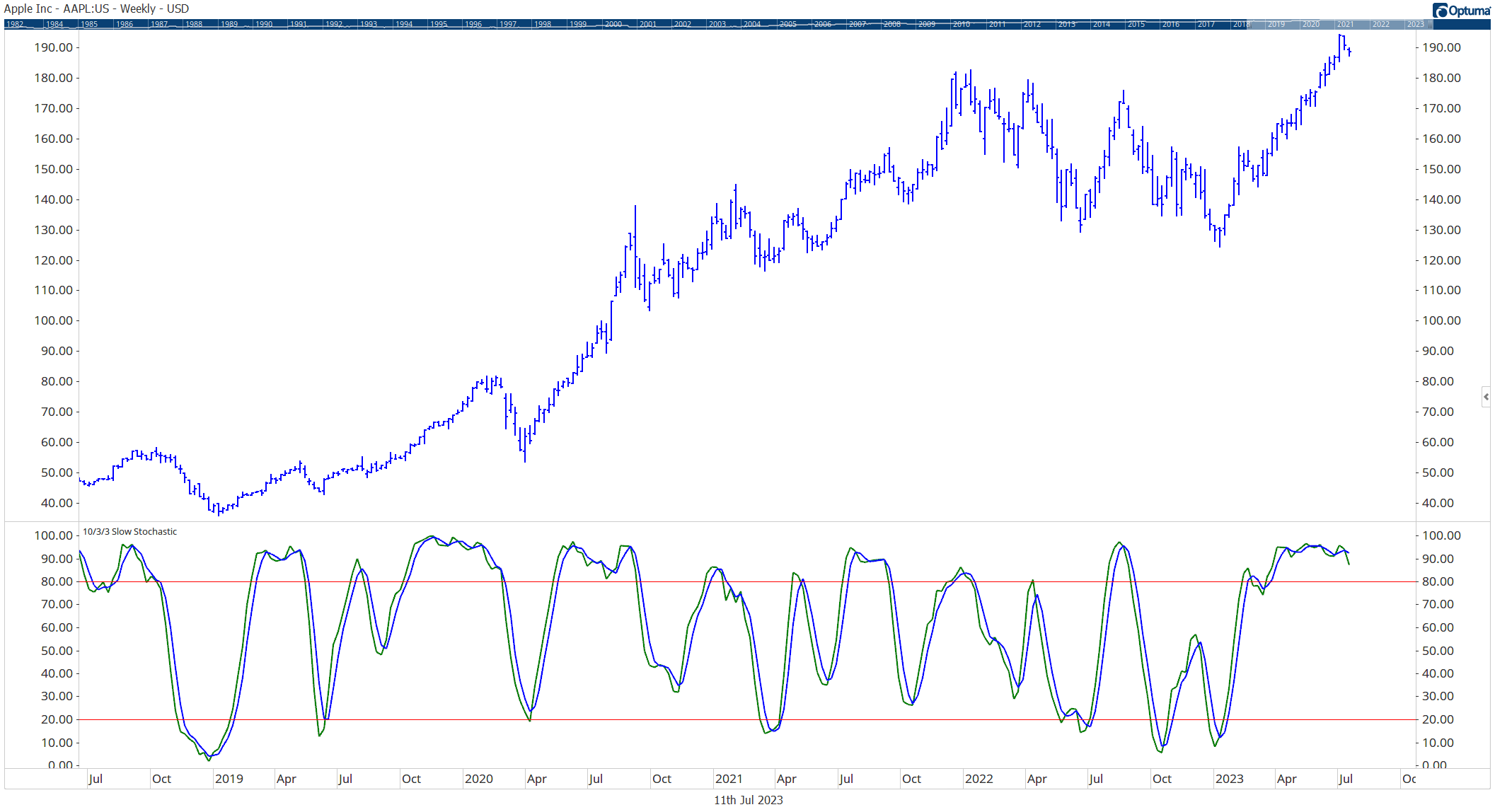
Stochastic indicator showing overbought levels
This momentum indicator compares a security’s closing price to a range of prices over a specific period. The stochastic oscillator fluctuates between 0 and 100.
Similar to RSI, readings above 80 are considered overbought, and readings below 20 are considered oversold. The stochastic oscillator also includes a ‘signal line’, and crossovers between the oscillator and this line can indicate potential trading opportunities.
On-Balance Volume (OBV)

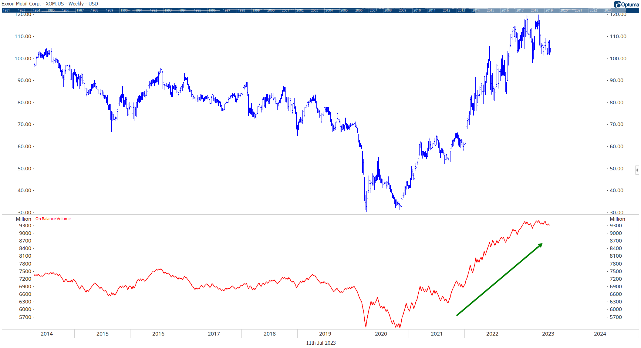
Rising On Balance Volume (OBV)
Unlike other types of momentum indicators that primarily focus on price, OBV takes volume into consideration. It is a cumulative indicator that adds volume on up days and subtracts volume on down days.
Rising OBV indicates positive volume pressure that may lead to higher prices, while falling OBV suggests negative volume pressure that may precede lower prices.
By understanding and utilizing the different types of momentum indicators, you can gain valuable insights to make informed decisions in the stock market.
How to Use Momentum Indicators
While momentum indicators can offer valuable insights, it’s important to recognize their limitations. Here are some useful tips to maximize their effectiveness:
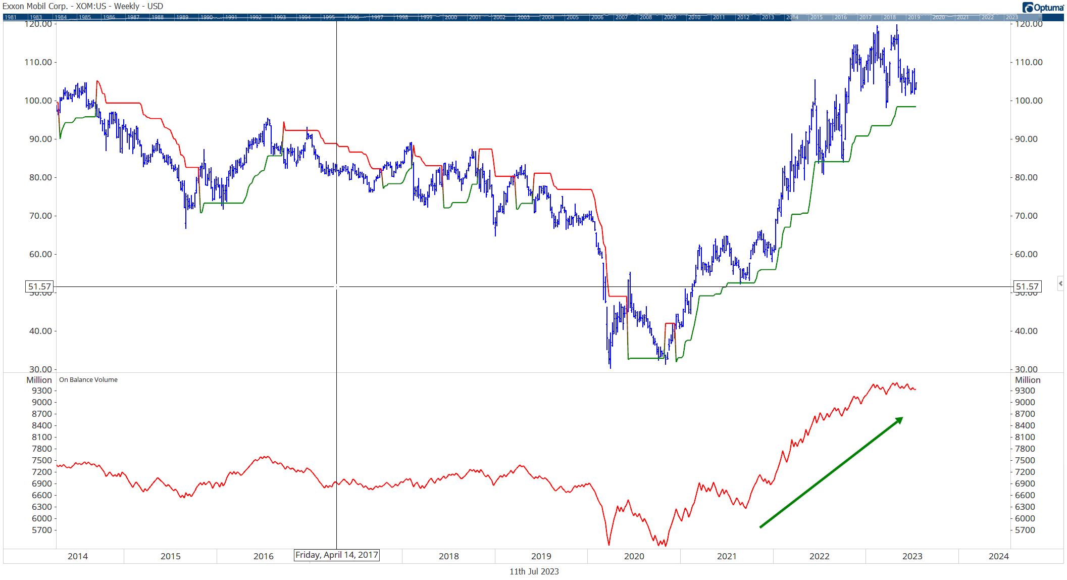
Confirmation is key: To make the most informed decisions, it’s best to combine momentum indicators with other technical analysis tools. When one indicator affirms another’s signal, it reduces the risk of false signals and increases the probability of successful trades.

Rising On Balance Volume (Bottom) confirming Supertrend Indicator (Above, Red/Green Line)
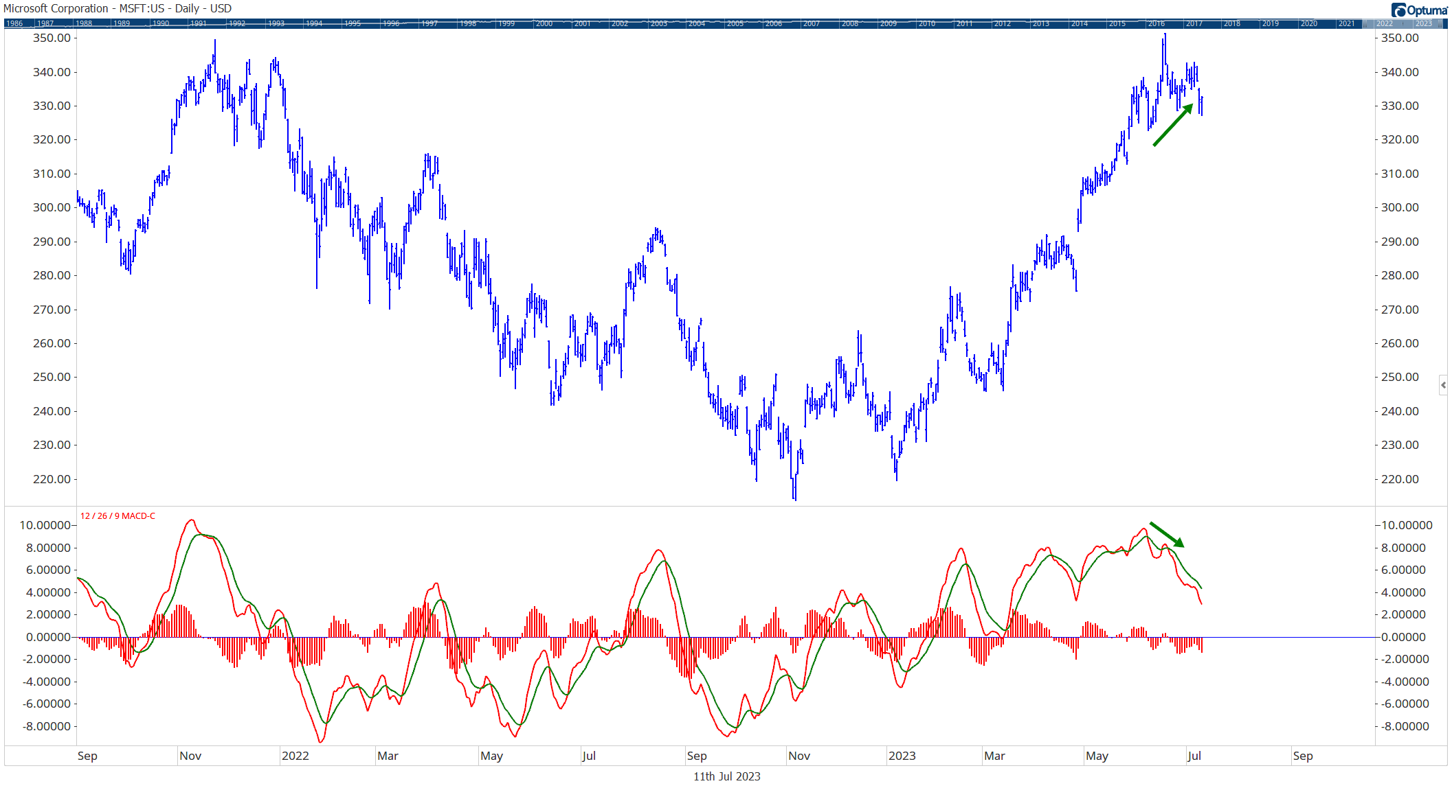
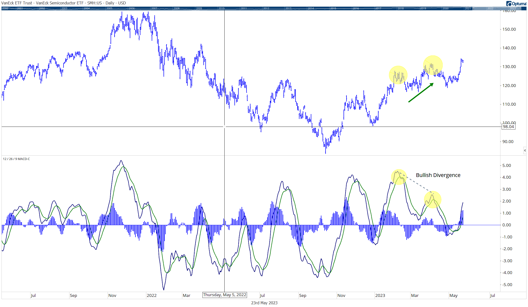
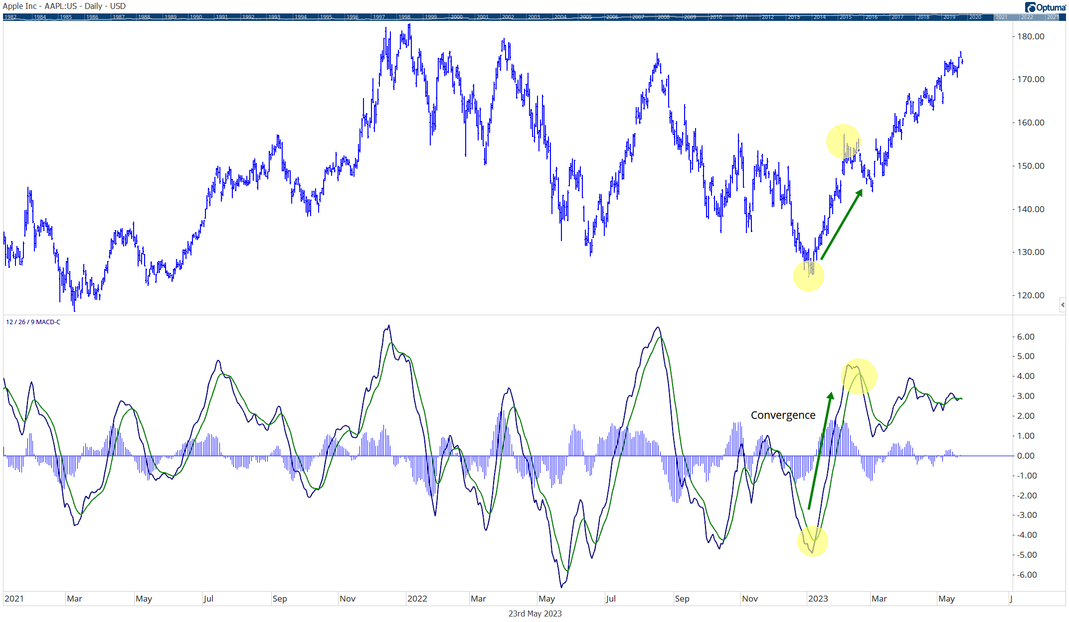
Don’t overlook divergence: Keep an eye out for divergence, which arises when a security’s price moves in the opposite direction of a momentum indicator. This discrepancy often serves as a warning sign of a possible price reversal.

Bearish Divergence: MSFT stock price is rising, while the MACD indicator is falling
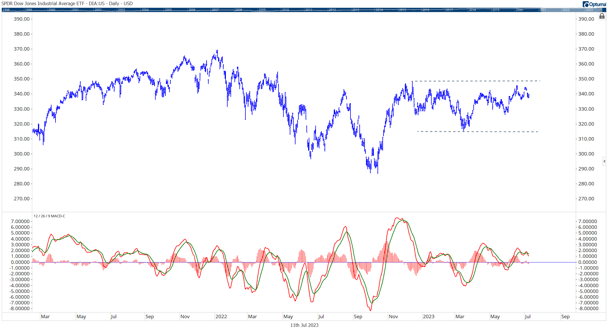
Consider market conditions: Remember that momentum indicators excel in trending markets, whether bullish or bearish. In range-bound or sideways markets, they may generate numerous false signals.

The MACD indicator during a sideways trading range can cause whipsaw in a portfolio
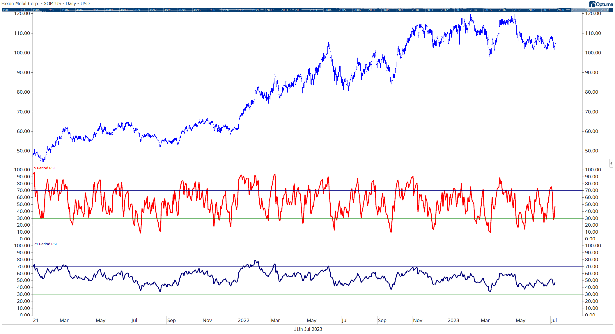
Customize your settings: Depending on your preferred trading style, adjusting the period lengths used in your indicators’ calculations can be beneficial. Shorter periods offer more sensitive readings, suited for short-term trading, while longer periods may better align with long-term investing goals.

5 Day RSI vs 21 Day RSI
Best Practices for Interpreting Momentum Indicators
When it comes to interpreting the different types of momentum indicators, there are several best practices that investors can follow to maximize their utility and accuracy.
One key practice is the utilization of multiple momentum indicators in conjunction.
By combining different indicators, one can validate and confirm signals more effectively as each indicator has its own strengths and weaknesses.
Some helpful reminders:
1) Relative Strength Index (RSI) can help identify overbought or oversold conditions, the Moving Average Convergence Divergence (MACD) is great for spotting potential bullish or bearish crossovers.
2) Cross-verifying signals across various indicators help reduce the chances of false signals and can enhance the effectiveness of trading strategies.
3) Another important aspect to pay attention to are divergences between the price and momentum indicators. These divergences often signal potential trend reversals, giving valuable insights for adjusting trading positions accordingly.
If the price is increasing while the momentum indicator is decreasing, that’s a bearish divergence indicating a forthcoming downtrend.
Conversely, if the price is decreasing while the momentum indicator is increasing, it is a bullish divergence suggesting a potential uptrend. Identifying these divergences early can help investors seize valuable opportunities and make necessary adjustments.
4) Lastly, investors can customize the settings of their momentum indicators to align with their trading style to help improve their relevance and effectiveness.
For example, a short-term trader may prefer smaller period settings that offer more sensitivity and quicker signals.
On the other hand, long-term traders might find larger period settings more suitable as they filter out market “noise” and focus on more significant trends.
Understanding the nature of the security that is being traded and individual trading style plays a crucial role in making these adjustments effectively.
Summing Up the Different Types of Momentum Indicators
To sum up, momentum indicators are an indispensable tool for traders like to assess market trends’ strength, speed, and potential reversals.
From the Relative Strength Index (RSI) to the Moving Average Convergence Divergence (MACD), these indicators offer various insights into the market’s behavior. They not only help spot overbought and oversold conditions but also detect divergences that often signal trend reversals.
However, it’s vital to interpret and utilize the different types of momentum indicators correctly. By using multiple indicators, focusing on divergences, and customizing settings to match trading styles, investors can optimize their effectiveness. Combined with a solid understanding of market conditions and continuous learning, this approach can help investors with their decision-making process and boosts the chances of successful trades.
References
- Technical Analysis of the Financial Markets by John J. Murphy – This book is a comprehensive guide to trading that covers various aspects of technical analysis including the different types of momentum indicators.
- “Technical Analysis Explained” by Martin J. Pring – Another valuable resource that delves into various technical analysis tools including momentum indicators.
- Investopedia’s pages on various momentum indicators such as RSI, MACD, Stochastic Oscillator, and OBV – These are excellent online resources that offer a deep-dive into each of the different types of momentum indicators.

