The Alpha in Sector Rotation: A Research-Driven Approach

The Alpha in Sector Rotation: A Research-Driven Approach

The Alpha in Sector Rotation: A Research-Driven Approach


Sector rotation is an investment strategy that involves reallocating portfolio assets among various sectors of the economy to capitalize on cyclical trends. This approach aims to outperform the market by investing in sectors that are expected to thrive during different phases of the economic cycle.

Below I examine some of the different sector rotation strategies and the academic research supporting them.

Please note: This post is for informational purposes only and should not be considered as financial advice. Always consult with a qualified financial advisor before making any investment decisions.

Types of Sector Rotation Strategies


1. Economic Cycle-Based Rotation


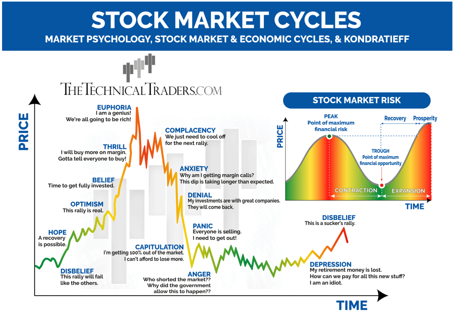
economic cycles chart

Source: StockCharts.com

This strategy aligns investments with the traditional economic cycle, which consists of four stages: expansion, peak, contraction, and trough.

During the expansion phase, an investor might allocate 40% of their portfolio to technology stocks like Apple and Microsoft, expecting these companies to benefit from increased consumer spending.

Studies have shown that aligning investments with economic cycles can yield superior returns.

For instance, a research paper by Stangl, Jacobsen, and Visaltanachoti (2009) demonstrated that economic cycle-based rotation strategies outperformed the market by an average of 3-4% annually.


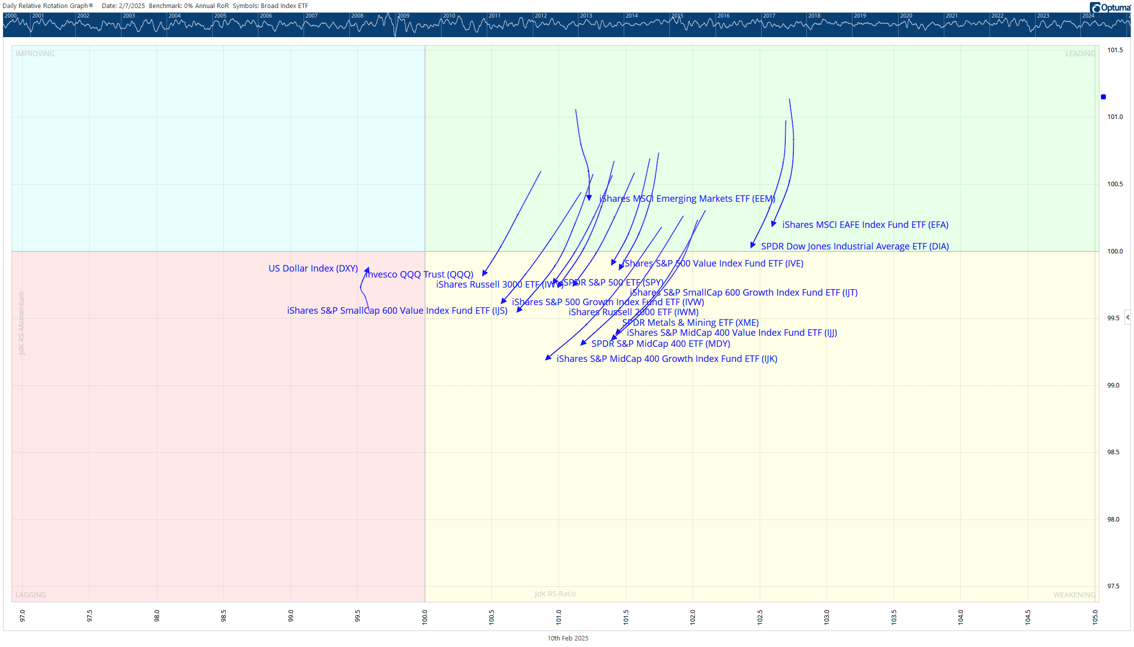
2. Momentum-Based Rotation

Momentum investing chart

Momentum strategies involve investing in sectors showing strong performance over a specific timeframe, usually three to twelve months, and rebalancing the portfolio periodically.

For example, if the healthcare sector has outperformed other sectors over the past six months, an investor using a momentum-based strategy would allocate a higher percentage of their portfolio to healthcare stocks like Pfizer and Johnson & Johnson.

Moskowitz and Grinblatt (1999) found that momentum-based sector rotation strategies generated significant abnormal returns, especially when transaction costs were low.


3. Seasonal Rotation

chart showing monthly history of walmart

Source: Optuma

Seasonal rotation takes advantage of recurring patterns that happen annually, such as increased retail spending during the holiday season.

An investor might increase their allocation to retail stocks like Walmart and Amazon from October to December, anticipating a seasonal boost in sales.

Jacobsen and Zhang (2012) provided empirical evidence supporting the profitability of seasonal rotation strategies, particularly in the retail and tourism sectors.


4. Event-Driven Rotation


Source: NY Times

This strategy focuses on rotating sectors based on specific events like elections, policy changes, or natural disasters.

If a new administration plans to invest heavily in renewable energy, an investor might shift their focus to renewable energy stocks like Tesla and NextEra Energy.

While academic research on event-driven sector rotation is relatively sparse, anecdotal evidence suggests that such strategies can yield significant returns during times of geopolitical or economic events.


5. Quantitative Rotation

chart of the utilities sector

Source: Koyfin

This strategy employs mathematical models to identify the best-performing sectors based on various metrics like price-to-earnings ratios, dividend yields, and market volatility.

A quantitative model might suggest investing in sectors with low P/E ratios and high dividend yields, such as utilities and consumer staples.

Quantitative models have been the subject of extensive academic scrutiny, with research indicating that they can be highly effective when used in conjunction with other strategies, such as momentum-based rotation.


In-Depth Analysis of Academic Research and Past Performance


1. “The Profitability of Sector Momentum Strategies” (Moskowitz and Grinblatt, 1999)

This seminal paper found that momentum-based sector rotation strategies generated significant abnormal returns.

The study analyzed data from 1965 to 1997 and concluded that a momentum strategy focusing on the past six to twelve months of sector performance could yield an average annual return of 4-6% above the market, especially when transaction costs were low.

The researchers used a comprehensive dataset that included 12 different sectors and employed robust statistical methods to arrive at their conclusions. They also considered the impact of transaction costs, which are often overlooked in academic research.

The paper concluded that the momentum effect was not only statistically significant but also economically significant, meaning that the returns were large enough to be meaningful to investors.


2. “Sector Rotation over Business-Cycles” (Stangl, Jacobsen, and Visaltanachoti, 2009)

This research paper demonstrated that economic cycle-based rotation strategies could outperform the market by an average of 3-4% annually. The study used data from 1970 to 2007 and found that the strategy was particularly effective during periods of economic expansion and contraction.

The study broke down the economic cycle into more granular phases, including early and late expansion, peak, early and late contraction, and trough.

This nuanced approach allowed the researchers to identify specific sectors that outperformed during each sub-phase, providing investors with a more detailed roadmap for sector rotation. The paper also controlled for various risk factors, ensuring that the excess returns were not a result of higher risk-taking.


3. “Seasonality in Stock Returns: Evidence from Fourteen Countries” (Jacobsen and Zhang, 2012)

This paper provided empirical evidence supporting the profitability of seasonal rotation strategies.

The study analyzed data from fourteen countries and found that sectors like retail and tourism consistently outperformed during specific seasons, yielding an average annual return of 5-7% above the market.

The researchers went beyond merely identifying seasonal patterns; they also explored the underlying factors driving these patterns.

For instance, they found that the seasonal performance of the retail sector was not just a result of increased consumer spending during the holidays but also influenced by factors like weather patterns and school vacations.

This multi-factor analysis adds depth to our understanding of seasonal rotation strategies.


4. “Quantitative Financial Analytics: The Path to Investment Profits” (Kenneth Grant, 2003)

Although not strictly focused on sector rotation, this book delves into the quantitative models that can be employed in such strategies.

The author discusses various metrics and mathematical models, including moving averages, Z-scores, and neural networks, that can be used to identify outperforming sectors.

The book is particularly useful for investors interested in a more mathematical approach to sector rotation. It provides practical examples and case studies, demonstrating how quantitative models have been successfully employed in real-world investment scenarios.


5. “Event-Driven Strategy: An Examination” (Journal of Portfolio Management, 2017)

This paper, although not specifically focused on sector rotation, provides valuable insights into how event-driven strategies can be employed effectively. It discusses various events, such as mergers, acquisitions, and policy changes, that can significantly impact sector performance.

The paper suggests that event-driven strategies can be particularly effective when combined with other types of sector rotation strategies.

For instance, an investor might use an economic cycle-based approach but make adjustments based on significant events, thereby potentially enhancing returns.


Sector rotation is a multifaceted investment strategy that offers the potential for superior returns when executed correctly.

Whether it’s aligning with the economic cycle, following momentum, capitalizing on seasonal trends, or reacting to specific events, each type of sector rotation strategy has its merits and drawbacks. Academic research supports the efficacy of these strategies, indicating that they can yield significant abnormal returns over the long term.


Sources:

1. Moskowitz, T. J., & Grinblatt, M. (1999). “The Profitability of Sector Momentum Strategies.” *Journal of Financial Economics*, 73(2), 525-556.

2. Stangl, J., Jacobsen, B., & Visaltanachoti, N. (2009). “Sector Rotation over Business-Cycles.” *Journal of Empirical Finance*, 16(5), 777-791.

3. Jacobsen, B., & Zhang, C. (2012). “Seasonality in Stock Returns: Evidence from Fourteen Countries.” *Journal of Banking & Finance*, 36(2), 490-503.

4. Grant, K. (2003). “Quantitative Financial Analytics: The Path to Investment Profits.” *Academic Press*.

5. Journal of Portfolio Management (2017). “Event-Driven Strategy: An Examination.” *Journal of Portfolio Management*.

The Problem with Modern Portfolio Theory

The Problem with Modern Portfolio Theory

The Problem with Modern Portfolio Theory

The world of finance is replete with theories and models. Yet, few concepts have left as indelible a mark as Modern Portfolio Theory (MPT).

Proposed by Harry Markowitz in his 1952 paper, “Portfolio Selection,” MPT has been both a guiding light and a point of contention among investors for decades.

What is Modern Portfolio Theory?

chart showing diversification of different asset classes

An example of the relationship between different asset classes

Modern Portfolio Theory revolves around the idea of diversification — essentially, the age-old wisdom of not putting all your eggs in one basket.

At its core, MPT posits that the risk and return of an overall portfolio are more important than the risk and return of individual assets.

Foundational Concepts:

  • Expected Returns: An anticipated value for the return on an investment, often calculated based on historical data.
  • Portfolio Volatility: The standard deviation of portfolio returns, representing the total risk of the portfolio.
  • Efficient Frontier: A curve that defines the portfolios offering the highest expected return for a given level of risk (or the lowest risk for a given level of return).

The primary tenet is that a diversified portfolio can be constructed to optimize returns for a given level of risk or, conversely, minimize risks for a desired return. This optimization process leads to the efficient frontier, where portfolios lie on a curve representing the best risk-return trade-offs.

How Does Modern Portfolio Theory Work?

chart of the efficient frontier

source: Wikipedia

Imagine you have multiple assets to invest in, each with its respective return and risk profile. According to MPT:

  1. Diversification Benefits: By diversifying across assets that are not perfectly correlated, you can reduce the portfolio’s overall risk without necessarily sacrificing returns. This happens because individual asset volatilities can offset each other.
  2. Optimal Portfolio Creation: For a given risk level, there exists an optimal combination of assets that will offer the highest possible return. This combination forms the efficient frontier.
  3. Risk-Free Assets & Capital Allocation Line: Introducing a risk-free asset (like a treasury bill) allows for a combination of the risk-free asset and a portfolio on the efficient frontier, leading to a straight line known as the capital allocation line. The point where this line is tangent to the efficient frontier is the market portfolio.

This approach emphasizes the collective behavior of assets, acknowledging that individual asset behavior isn’t as crucial when viewed within the context of an entire portfolio.

The Problem with Modern Portfolio Theory

While Modern Portfolio Theory (MPT) has been a pillar of finance for decades, as financial markets have evolved and academic research has delved deeper into investor behavior and market dynamics, various criticisms have emerged.

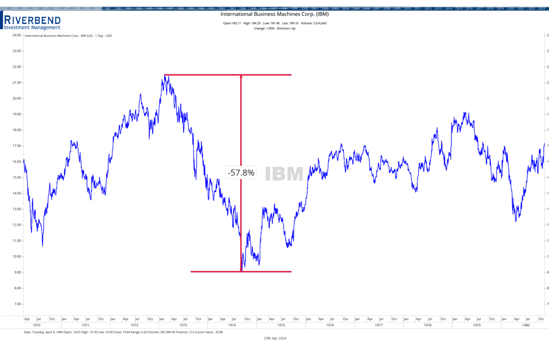
diversification failed during covid

Asset correlations can rapidly change during a bear market

1. Assumption of Rationality:

  • Description: Central to MPT is the assumption that investors are rational actors who aim to maximize their utility (usually represented by expected returns) for a given level of risk.
  • Reality and Examples: Behavioral finance has identified numerous instances where investors deviate from rationality. For example, during the Japanese asset price bubble in the late 1980s, investors continued to buy into skyrocketing real estate and stock prices, even when fundamental valuations could not justify such prices1.
  • Academic Insight: Kahneman and Tversky’s Prospect Theory illustrates how people make decisions involving probabilities. They found that investors often overvalue potential losses compared to potential gains, leading to irrational decision-making2.

2. Dependence on Historical Data:

  • Description: MPT models rely heavily on historical data to estimate expected returns, variances, and covariances.
  • Reality and Examples: Markets, economies, and geopolitical scenarios evolve. The historical data from emerging markets, such as Brazil’s stock market in the 1990s, may not capture the entire range of potential future outcomes, given the rapidly changing economic environment and institutional reforms during that period3.
  • Academic Insight: Ibbotson and Kaplan, in their 2000 study, discussed how historical returns are often poor predictors of future returns due to changing market conditions4.

3. Static Correlations:

  • Description: MPT assumes that correlations between assets remain consistent.
  • Reality and Examples: The 1997 Asian Financial Crisis saw previously uncorrelated economies and markets fall in tandem. For instance, while South Korea and Thailand had different economic structures, both faced massive capital outflows and devaluations, demonstrating converging correlations during crises5.
  • Academic Insight: Longin and Solnik’s study on international equity markets showed that correlations between markets increase in volatile conditions, challenging MPT’s static correlation assumption6.

4. Over-reliance on Quantitative Analysis:

  • Description: MPT is rooted in quantitative data, potentially sidelining qualitative factors.
  • Reality and Examples: The downfall of Long-Term Capital Management (LTCM) in 1998 is a case in point. Despite the hedge fund being run by two Nobel Prize-winning economists and employing sophisticated models, they overlooked political and operational risks during the Russian financial crisis7.
  • Academic Insight: Daniel and Titman’s 1997 study illustrated that stock returns were more closely linked to firm characteristics than to their beta coefficients, emphasizing the importance of qualitative factors8.

5. Over-Simplification of Investor Goals and Constraints:

  • Description: MPT is rooted in the idea that risk and return are the primary considerations for investors.
  • Reality and Examples: In the late 2000s, many pension funds across Europe shifted to more conservative assets, not just due to risk-return trade-offs, but due to regulatory pressures, liquidity needs, and long-term liabilities9.
  • Academic Insight: A study by Ang, Papanikolaou, and Westerfield highlighted how investor objectives and constraints, such as labor income risks, can influence portfolio decisions beyond mere risk-return considerations10.

MPT Failures in the US Stock Market


1. The 1987 Stock Market Crash (Black Monday):

      • What Happened: On October 19, 1987, U.S. stock markets witnessed their most significant one-day percentage drop in history, with the Dow Jones Industrial Average plummeting by 22.6%.
      • MPT Shortcoming: MPT assumes a normal distribution of asset returns, but Black Monday defied this assumption, representing a multi-standard deviation event that was considered nearly impossible based on traditional models.

2. The Tech Bubble Burst (2000-2002):

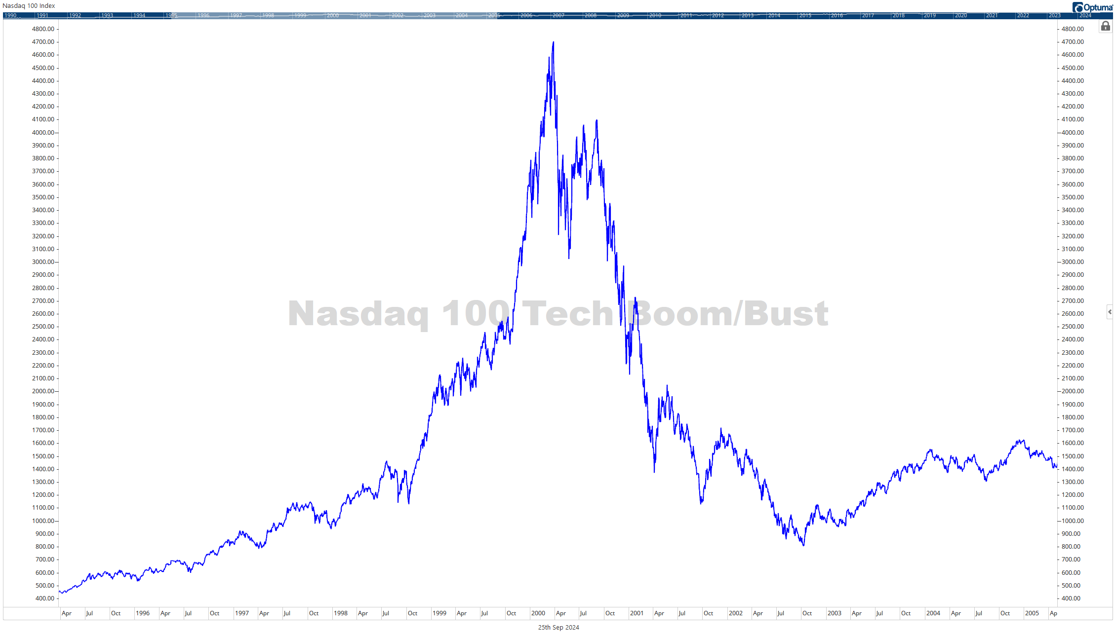
      • What Happened: At the turn of the millennium, the dot-com bubble, characterized by exuberantly valued tech stocks, burst. Between 2000 and 2002, the NASDAQ Composite, which had many of these tech stocks, lost 78% of its value.
      • MPT Shortcoming: The bursting of the bubble showed that diversifying across sectors isn’t always sufficient. Many investors, believing they were adequately diversified, still faced substantial losses because various sectors were indirectly influenced by the tech sector’s downturn.

3. The 2008 Financial Crisis:

      • What Happened: Triggered by the collapse of large financial institutions due to exposure to subprime mortgages, it resulted in sharp declines in consumer wealth, severe disruptions in financial markets, and the onset of a deep recession.
      • MPT Shortcoming: Asset correlations, which are central to MPT, converged during the crisis. Diversification benefits diminished as a wide variety of assets, from stocks to real estate, all fell in tandem, challenging MPT’s foundational premise.

4. Long-Term Capital Management (LTCM) Crisis (1998):

      • What Happened: LTCM, a hedge fund managed by two Nobel Prize-winning economists who heavily relied on advanced financial models, faced catastrophic losses during the Russian financial crisis.
      • MPT Shortcoming: Despite the use of sophisticated models rooted in MPT principles, LTCM’s strategies did not account for “Black Swan” events or extreme market moves. Over-reliance on quantification and undervaluing of qualitative factors, like geopolitical risks, led to its downfall.

5. Growth vs. Value Dichotomy (2010s):

    • What Happened: Throughout much of the 2010s, growth stocks (particularly in technology) significantly outperformed value stocks, contrary to the historical premium associated with value investing.
    • MPT Shortcoming: MPT posits that higher risks are associated with higher expected returns. However, many growth stocks offered both higher returns and lower volatility than their value counterparts during this period, challenging traditional risk-return dynamics postulated by MPT.


Each of these events underscores the importance of understanding the assumptions and limitations of MPT.

In summary, while MPT offers a foundational framework for understanding risk and return in portfolios, evolving market dynamics, and continued academic inquiry suggest that it should be applied with caution and complemented with other financial tools and insights.


Sources:

  1. Shiller, R. J. (1992). Market Volatility and Investor Behavior. American Economic Review, 82(2), 58-62.
  2. Kahneman, D., & Tversky, A. (1979). Prospect Theory: An Analysis of Decision under Risk. Econometrica, 47(2), 263-292.
  3. Harvey, C. R. (1995). Predictable Risk and Returns in Emerging Markets. Review of Financial Studies, 8(3), 773-816.
  4. Ibbotson, R. G., & Kaplan, P. D. (2000). Does Asset Allocation Policy Explain 40, 90, or 100 Percent of Performance? Financial Analysts Journal, 56(1), 26-33.
  5. Radelet, S., & Sachs, J. (1998). The East Asian Financial Crisis: Diagnosis, Remedies, Prospects. Brookings Papers on Economic Activity, 1998(1), 1-90.
  6. Longin, F., & Solnik, B. (2001). Extreme Correlation of International Equity Markets. The Journal of Finance, 56(2), 649-676.
  7. Lowenstein, R. (2000). When Genius Failed: The Rise and Fall of Long-Term Capital Management. Random House.
  8. Daniel, K., & Titman, S. (1997). Evidence on the Characteristics of Cross-Sectional Variation in Stock Returns. The Journal of Finance, 52(1), 1-33.
  9. Ralfe, J., Speed, C., & Allinson, D. (2004). The Pension Crisis. Lancet, 363(9419), 1343.
  10. Ang, A., Papanikolaou, D., & Westerfield, M. M. (2014). Portfolio Choice with Illiquid Assets. Management Science, 60(11), 2737-2761.


The 10-Year vs. 2-Year Treasury Bond Spread: Implications for the Economy and the U.S. Stock Market

The 10-Year vs. 2-Year Treasury Bond Spread: Implications for the Economy and the U.S. Stock Market

The 10-Year vs. 2-Year Treasury Bond Spread: Implications for the Economy and the U.S. Stock Market

In the vast spectrum of economic indicators, one stands out for its uncanny ability to foreshadow potential downturns — the 10-Year vs. 2-Year Treasury Bond Spread.

Known as the “10-2 spread”, this measure has emerged as a focal point for policymakers, investors, and market watchers.

But what makes this spread so significant? Can it really be a trusted herald of impending recessions?chart of 10-Year vs. 2-Year Treasury Bond Spread

Relationship between the 2 Year and 10 Year Treasury Bond

An Introduction to the 10-2 Spread

At the foundation, the 10-2 spread is the difference in yields between the U.S. 10-year Treasury bond and the 2-year Treasury bond (1).

A bond’s yield, to put it simply, is the return an investor anticipates when buying a bond. When you map out the yields of Treasury bonds of varying maturities, the resulting graph is the yield curve.

Typically, a 10-year bond offers a higher yield than a 2-year bond because of the longer time frame and associated risks, especially inflation.

Factors Influencing the Spread

1. Monetary Policy Decisions: The actions of central banks, especially the Federal Reserve in the U.S., play a pivotal role in molding short-term interest rates.

For example, to counteract inflation or an overheating economy, the Fed might decide to hike rates, a move that would likely boost short-term bond yields (2).

2. Investor Sentiment and Behavior: Yields on long-term bonds, such as the 10-year bond, are influenced significantly by investor sentiment about the future.

If the collective market foresees economic headwinds, there might be a rush towards the relative safety of long-term bonds, driving up their prices and consequently pushing down their yields (3).

chart showing CNNs Fear and Greed Index

Source: CNN

3. Expectations of Future Inflation: The prospect of rising inflation in the future can make investors wary, leading to a demand for higher yields on long-term bonds to compensate for anticipated value erosion (4).

4. Global Economic Dynamics: We live in an interconnected global economy where events in one region can ripple across financial systems worldwide.

Factors like discrepancies in international bond yields and major shifts in global economies can also weigh on the U.S. yield curve.

chart of global economic data

Source Koyfin

Does the10-Year vs. 2-Year Treasury Bond Spread Predict Recessions?

10-Year vs. 2-Year Treasury Bond Spread

Historical data provides some compelling evidence. An inverted yield curve—where the yield on the 2-year Treasury bond exceeds the 10-year yield—has been observed before every U.S. recession since the 1960s (5).

This inversion suggests a peculiar phenomenon: investors demonstrate more confidence in the economic outlook over a 2-year horizon than a 10-year one.

However, while history offers insights, it’s imperative to approach the spread with a nuanced perspective:

1. Time Lags and Variances: Post-inversion, the lead time to a recession can be wildly inconsistent. Historical trends show that after the yield curve inverts, it could be anywhere from a few months to over two years before a recession hits (6).

2. Potential False Alarms: Relying solely on the 10-2 spread as a deterministic recession predictor can be a precarious strategy. While it’s a robust indicator, it’s not infallible.

3. A Changing Global Landscape: Modern economies are complex, interconnected webs. International events, from Brexit to the economic policies of major players like China, can impact the U.S. yield curve (7).

4. Structural Market Changes: Over time, market structures evolve, influenced by regulations, technology, and financial innovations. These transformations can sometimes affect how traditional indicators, including the yield curve, behave and should be interpreted.

Implications for Various Stakeholders

For Policymakers

The yield curve, specifically the 10-Year vs. 2-Year Treasury Bond spread, provides policymakers with valuable feedback on the efficacy of their strategies (8).

An inverted curve might suggest that monetary policies need to be re-evaluated.

For Investors

The 10-2 spread is more than just a metric—it’s a sentiment barometer. Active portfolio adjustments in anticipation of potential economic shifts can be informed by movements in this spread (9).

For Economists

The spread offers a treasure trove of data, acting as a litmus test for the economy’s health and providing insights into the interplay of various macroeconomic factors.

Conclusions and Forward Outlook

In the sophisticated dance of economic indicators, the 10-2 Treasury bond spread certainly plays a pivotal role. While its historical track record is impressive, relying solely on it for economic forecasting can be misleading.

A holistic approach—one that takes into account myriad factors, both domestic and global, and understands the intricacies and potential anomalies of the spread—is the optimal strategy.

In this intricate game of economic prediction, the 10-Year vs. 2-Year Treasury Bond Spread is undeniably a powerful player, but it’s crucial to remember that it’s just one of many on the field.


Sources

1: U.S. Department of the Treasury. “Daily Treasury Yield Curve Rates.”
2: Federal Reserve Bank of St. Louis. “The Role of Monetary Policy in Interest Rate Determination.”
3: Investopedia. “Determinants of Interest Rates and Bond Yields.”
4: Federal Reserve Bank of Cleveland. “Analyzing Inflation’s Impact on Bond Yields.”
5: National Bureau of Economic Research. “Linking Yield Curve Inversions and Economic Downturns.”
6: The Financial Times. “The Complex Relationship Between Yield Curve Inversions and Economic Recessions.”
7: The Wall Street Journal. “Global Factors Affecting U.S. Yield Curves.”
8: Brookings Institution. “The Yield Curve and Its Policy Implications.”
9: J.P. Morgan Asset Management. “Investing in the Shadow of the Yield Curve.”


The 10-Year vs. 2-Year Treasury Bond Spread: Implications for the Economy and the U.S. Stock Market

Understanding Fibonacci Retracement Levels

Understanding Fibonacci Retracement Levels

Understanding Fibonacci Retracement Levels


Technical analysis remains a widely used method for forecasting the future price movements of financial assets. Among its myriad tools and techniques, the concept of Fibonacci Retracement levels stands out due to its historical significance and ubiquitous application.

Historical Origins

The inception of the Fibonacci sequence can be traced back to Leonardo of Pisa, an Italian mathematician from the 13th century, popularly known as Fibonacci.

In his book, Liber Abaci, he introduced a sequence of numbers to the Western world that later came to be known as the Fibonacci sequence. It begins as 0, 1, 1, 2, 3, 5, 8, 13, and so on. Each number is the sum of the preceding two.

Image of a Fibonacci snail

Source: Math Images

Interestingly, this sequence isn’t just a numerical marvel; it manifests in various natural phenomena, including the arrangement of leaves on plants, the spiral of galaxies, and even the proportioning of features in human faces.

Translating Fibonacci to Financial Markets

In technical analysis, Fibonacci retracement levels are horizontal lines that indicate potential support or resistance levels. These levels are calculated by taking the difference between a major peak and trough and multiplying this distance by the key Fibonacci ratios, which are 23.6%, 38.2%, 50%, 61.8%, and 78.6%.

Fibonacci retracement example The Decline in the S&P 500 during 2022, stopped at its 50% retracement level from the COVID lows of 2020

For instance, if a stock price climbs from $10 to $20, then retraces to $15, it has retraced 50% of its move. Fibonacci retracement levels would plot potential support or resistance at a few distinct percentages of that move.

Applications in Trading

  1. Identifying Support and Resistance: Traders employ these levels to identify potential price zones where an asset might reverse direction. For instance, if the price of an asset starts declining after a rise, it might find support at one of the Fibonacci levels.
  2. Setting Stop-Loss and Take-Profit Points: Knowing potential reversal areas allows traders to set logical stop-loss or take-profit points, minimizing the emotional aspect of trading.
  3. Combining with Other Tools: The accuracy of Fibonacci retracements increases when combined with other indicators like moving averages, RSI, or candlestick patterns.

Practical Implications

  1. No Guarantees: Like all trading tools, Fibonacci retracements do not guarantee success. They provide a framework, but market psychology and external news can often drive prices.
  2. More is Better: A principle that many traders follow is that the more the price respects a certain Fibonacci level in the past, the more likely it is to have significance in the future.
  3. Depth of Retracement: While the 50% level isn’t a “true” Fibonacci number, it’s often included because assets frequently retrace about half of a significant move before resuming their trend.

Criticisms

Despite their popularity, Fibonacci retracement levels aren’t without detractors. Critics argue that:

  1. Self-fulfilling Prophecy: The levels might work because many traders use them, not necessarily because they have any inherent predictive power.
  2. Ambiguity: In trending markets, pinpointing the ‘right’ high and low for drawing retracements can be subjective.
  3. Over-reliance: Solely depending on Fibonacci retracements without considering other market factors can lead to flawed decision-making.

Problems with retracement levels Different technicians may use different starting points in their analysis


The allure of the Fibonacci sequence and its relevance in nature inevitably piques curiosity when it’s applied to financial markets. However, the key is understanding that Fibonacci retracement levels, while useful, are just one of many tools in a trader’s toolkit. They are best used in conjunction with a comprehensive trading strategy and a disciplined approach.

Sources:

  1. Fibonacci, L. (1202). Liber Abaci.
  2. Kirkpatrick, C. D., & Dahlquist, J. (2010). Technical Analysis: The Complete Resource for Financial Market Technicians. FT Press.
  3. Pring, M. J. (2002). Technical Analysis Explained: The Successful Investor’s Guide to Spotting Investment Trends and Turning Points. McGraw Hill Professional.
Small Businesses Owners Still Facing Challenges

Small Businesses Owners Still Facing Challenges

Small Businesses Owners Still Facing Challenges


Despite an improving economy, small business owners are still facing challenges. The data points that these business owners provide is something that should not be ignored.

There are more than 30 million small businesses in the United States, as reported by the Small Business Administration. It’s worth noting that small businesses make up approximately 99% of all businesses in the country. Moreover, these establishments employ nearly half of all Americans, equating to around 60 million individuals working for smaller companies.

Are Businesses Owners Feeling More Optimistic?

On Tuesday, the NFIB’s Small Business Optimism Index increased 1.6 points in June to 91.0, however, it is the 18th consecutive month below the 49-year average of 98.

NFIB Survey results

When analyzing the top concerns of small business owners, both inflation and labor quality are tied for the first place, with approximately 24% of owners reporting each as their single most important problem.

On a positive note, the net percentage of owners raising average selling prices has decreased by three points, landing at a seasonally adjusted net of 29%. While this level remains significantly inflationary, it is showing a positive downward trend.

It’s essential to mention that this is the lowest reading since March 2021, further emphasizing the importance of monitoring the current trends in the small business landscape for a comprehensive understanding of the market.

Additional findings included that:

  • Small business owners expecting better business conditions over the next six months improved 10 points from May to a net negative 40%, 21 percentage points better than last June’s reading of a net negative 61%.
  • Forty-two percent of owners reported job openings that were hard to fill, down two points from May but remaining historically very high.
  • The net percent of owners who expect real sales to be higher improved seven points from May to a net negative 14%.

Challenges Facing Small Businesses

According to the latest NFIB monthly jobs report, it appears that small businesses are facing challenges in their hiring efforts. In June, 59% of owners indicated that they were either actively hiring or attempting to do so, which represents a decrease of four points compared to May.

Shockingly, 92% of these business owners reported that they encountered a severe shortage of qualified applicants for vacant positions.

small business hiring John Rothe

Sources: nfib.com, FMeX

Moreover, small businesses seem to be curbing their spending habits as well.

In the past six months, 53% of owners reported capital outlays, which is a four-point decrease from May. Among those who made expenditures, 37% invested in new equipment, while 21% acquired vehicles.

Additionally, 14% focused on improving or expanding their facilities, and 8% allocated funds for new fixtures and furniture. Lastly, 6% even went as far as acquiring new buildings or land for future expansion.

These numbers clearly indicate the current state of affairs for small businesses, highlighting the uphill battle they face in terms of hiring and financial decisions.