Is Gold a Good Hedge Against Inflation?
Is Gold a Good Hedge Against Inflation?
Gold has historically been viewed as a reliable store of value and a hedge against inflation. Throughout time, investors have turned to gold during economic upheavals, political unrest, and times of inflation. But how accurate is this belief? Is gold genuinely a good inflation hedge?
Understanding Inflation
Before discussing gold’s relationship with inflation, it’s essential to have a clear understanding of what inflation is.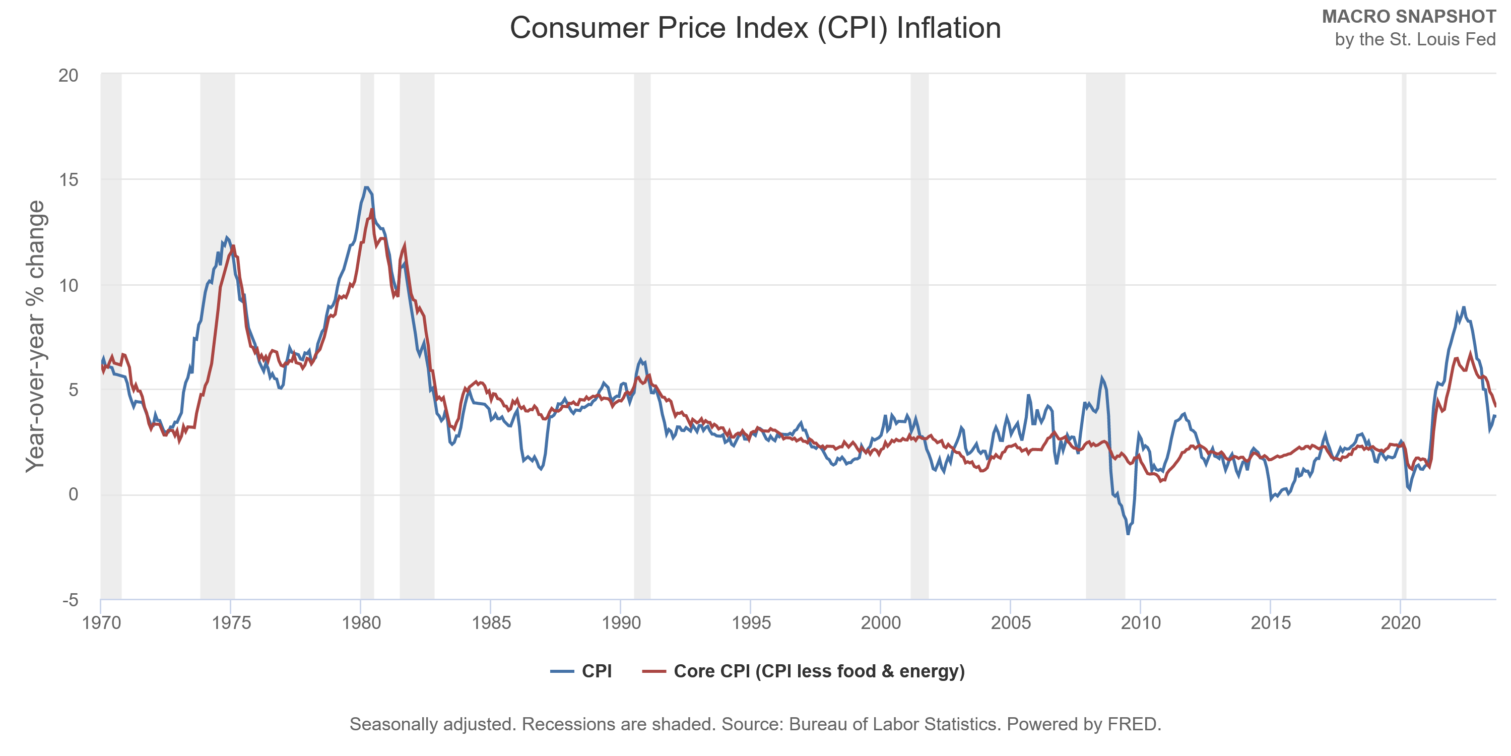
At its core, inflation refers to the rate at which the general level of prices for goods and services rises, subsequently eroding purchasing power. Central banks, such as the Federal Reserve, aim to maintain inflation at a stable rate, believing it’s crucial for economic growth.
The Theoretical Case for Gold as an Inflation Hedge
Proponents argue that gold serves as a hedge against inflation due to:
Limited Supply: Unlike fiat currencies, which central banks can print in unlimited quantities, the supply of gold is relatively fixed. This inherent scarcity can provide protection against currency devaluation.
Historical Precedent: Gold has been a form of currency for centuries, suggesting it retains its value over long periods.
Tangible Asset: Unlike stocks or bonds, gold is a tangible asset. Physical gold doesn’t rely on a third party’s performance or promises, potentially offering security during uncertain economic times.
Is Gold a Good Hedge Against Inflation?
Let’s examine some specific periods when inflation spiked to see how gold performed:
1970s U.S. Inflation Crisis
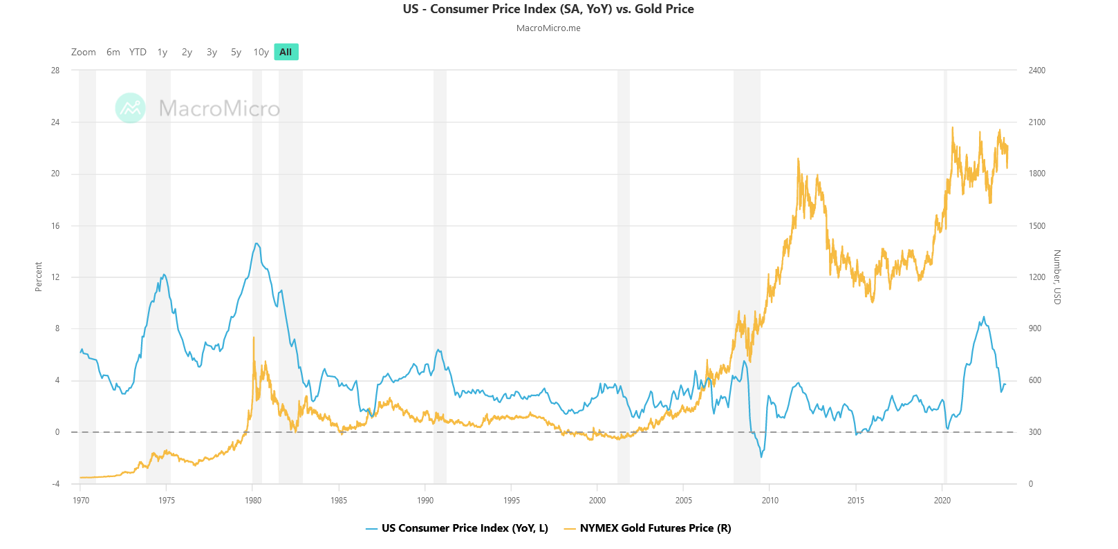
The 1970s in the U.S. witnessed an alarming rate of inflation, peaking at over 13% in 1979 (Bureau of Labor Statistics, 2020).
During this decade, the price of gold skyrocketed from $35 per ounce in 1971 to $850 in 1980, not adjusted for inflation (World Gold Council, 2021). This represents a remarkable increase and provides a strong case for gold as an inflation hedge.
2008 Financial Crisis
Contrastingly, the 2008 financial crisis, although not strictly an inflationary period, was marked by expansive monetary policies and quantitative easing, leading to anticipated inflationary pressures. Gold, sensing these undercurrents, appreciated significantly, reinforcing its safe-haven status.
Hyperinflation in History
Hyperinflation periods provide extreme cases to assess gold’s protection. In the Weimar Republic’s hyperinflation in the 1920s, gold retained its value, while the German mark became worthless (Fergusson, A. 1975. When Money Dies). More recently, during Zimbabwe’s hyperinflation crisis in the late 2000s, gold also proved its worth as local currencies collapsed.
Academic Research on Gold and Inflation
Several academic studies have delved into the relationship between gold and inflation:
1) The World Gold Council (2011) found a positive correlation between gold and U.S. inflation, particularly during extreme inflationary environments. This correlation was stronger in the short term (less than a year) but weakened over longer periods (World Gold Council, 2011).
2) Baur and Lucey (2010) in their study titled “Is Gold a Hedge or a Safe Haven? An Analysis of Stocks, Bonds, and Gold,” found that gold can act as both an inflation hedge and a safe haven in extreme market conditions, but its efficacy can vary depending on the time frame and geographical region (Baur, D.G., & Lucey, B.M., 2010).
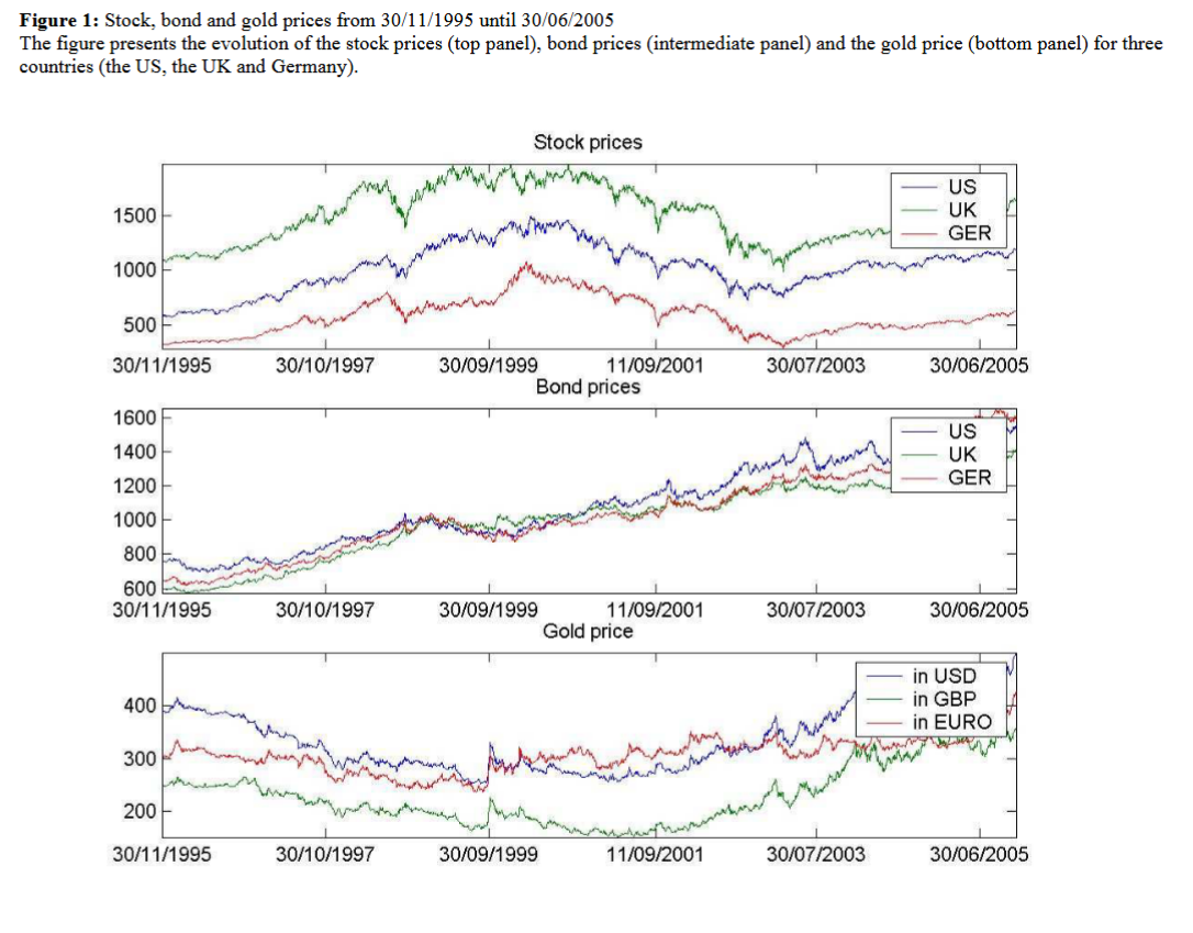 Source: “Is Gold a Hedge or a Safe Haven? An Analysis of Stocks, Bonds, and Gold”
3) Ghosh, Levin, Macmillan, and Wright (2004) in their research found a weak relationship between gold returns and inflation for the U.S. However, when the researchers expanded the study globally, gold demonstrated stronger inflation-hedging properties in countries like the UK and Japan (Ghosh, D., Levin, E.J., Macmillan, P., & Wright, R.E., 2004).
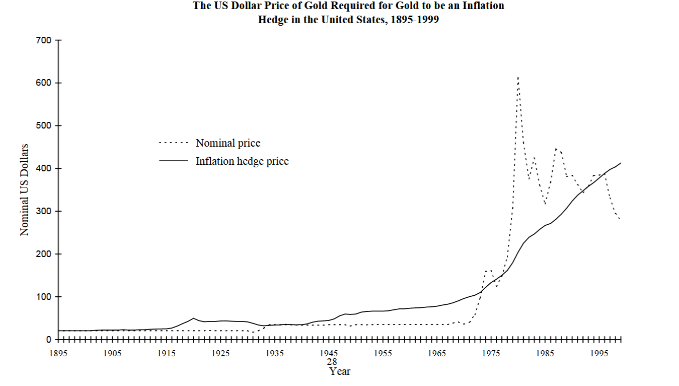 Source: “Gold as an Inflation Hedge”
Caveats
While historical performance and some academic research support gold’s role as an inflation hedge, there are important considerations:
Holding Costs: Unlike stocks or bonds that might pay dividends or interest, gold has associated storage and insurance costs.
Volatility: Gold prices can be volatile, influenced by factors beyond just inflation, such as geopolitical events, interest rates, and global economic conditions.
No Universal Agreement: As seen in the academic studies, there isn’t a unanimous agreement on gold’s efficacy as an inflation hedge across all scenarios.
Conclusion
So, is gold a good hedge against inflation?
Gold has historically performed well during periods of high inflation, and many investors incorporate it into their portfolios for diversification and as a potential hedge against inflationary pressures.
However, its role as an inflation hedge isn’t unequivocal and may vary based on time frames, geographical regions, and specific economic conditions. Like all investments, due diligence, continuous research, and a well-considered strategy are crucial when considering gold in a portfolio.
John Rothe, CMT
References
Bureau of Labor Statistics. (2020). Consumer Price Index Data from 1913 to 2020.
World Gold Council. (2021). Gold Investor: Risk management and capital preservation.
Fergusson, A. (1975). When Money Dies. Kimble Mead.
World Gold Council. (2011). Gold as a strategic asset for UK investors.
Baur, D.G., & Lucey, B.M. (2010). Is Gold a Hedge or a Safe Haven? An Analysis of Stocks, Bonds, and Gold. Journal of Banking & Finance, 34(8), 1886-1898.
Ghosh, D., Levin, E.J., Macmillan, P., & Wright, R.E. (2004). Gold as an Inflation Hedge? Studies in Economics and Finance, 22(1), 1-25.


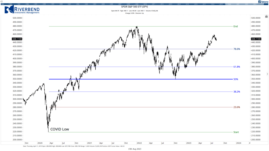 The Decline in the S&P 500 during 2022, stopped at its 50% retracement level from the COVID lows of 2020
 Different technicians may use different starting points in their analysis